AndroidPhotoshopColorPicker
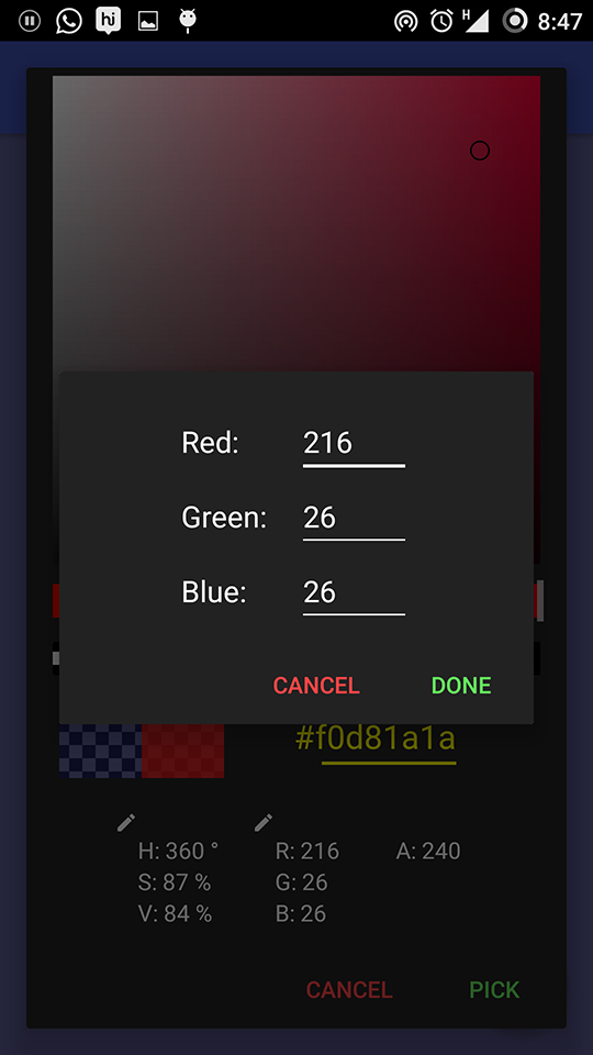
A full featured Color picker Library for Android! Just like the one in Photoshop!
Features
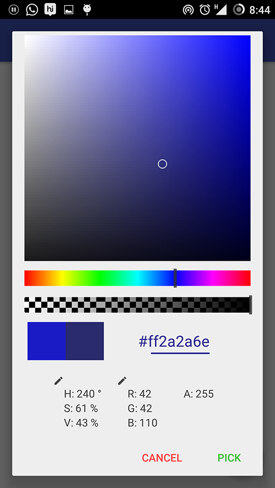
- Hue bar - Adjust hue using a slider
- Saturation & Value Box - Select the color from the Saturation & Value Box (like in Photoshop)
- Alpha bar - Adjust the alpha using a slider
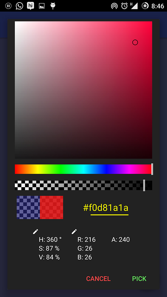
- Preview - You can see the current selected and previously picked colors side-by-side
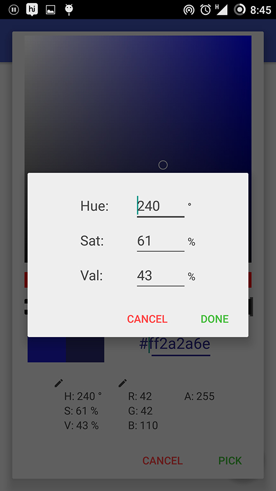
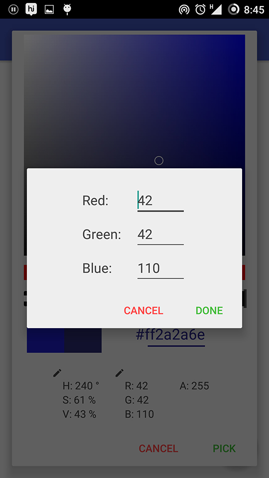
- Edit each component individually - You can edit Hue, Saturation, Value, Red, Green and Blue components individually
- Fully customizable - By default, there are two themes(Light and Dark). But you can define your own theme to customize the whole ColorPicker
- Easy to use - All the hardwork is done by us. Just a few lines of code is all you have to do
Requirements
Tested with APIv11, but will most probably work with earlier versions as well.
Installation (Adding to your project)
The library is posted on jcenter. So, just the following code should be enough to get you started:
Place this in your app module's build.gradle file:
dependencies {

compile 'com.azeesoft.lib.colorpicker:colorpicker:1.0.8@aar'
}
If there is any error while building the project using the above mentioned step, add the following code in that build.gradle file and build again:
repositories {

  maven {

url 'https://dl.bintray.com/azeesoft/maven'

}

}
After successful build, you can use ColorPickerDialog as a part of your project.
Usage
- Create a new ColorPickerDialog object using the static method createColorPickerDialog()
To create a default ColorPickerDialog with Light theme, use
ColorPickerDialog colorPickerDialog= ColorPickerDialog.createColorPickerDialog(this);
To create a ColorPickerDialog with Dark theme, use
ColorPickerDialog colorPickerDialog= ColorPickerDialog.createColorPickerDialog(this,ColorPickerDialog.DARK_THEME);
-
Set an OnColorPickedListener to call when the color is picked:
colorPickerDialog.setOnColorPickedListener(new ColorPickerDialog.OnColorPickedListener() { @Override public void onColorPicked(int color, String hexVal) { //Your code here } } ); -
Customize the colorPickerDialog if needed using appropriate methods and show the dialog:
colorPickerDialog.setHexaDecimalTextColor(Color.parse("#ffffff")); //There are many functions like this colorPickerDialog.show(); -
To create a ColorPickerDialog with Custom theme, create a new style with any of the ColorPicker themes as parent and use the following attributes:
- cp_showOpacityBar (boolean) : Show/Hide Opacity Bar
- cp_showHexaDecimalValue (boolean) : Show/Hide Hexadecimal Value
- cp_showColorComponentsInfo (boolean) : Show/Hide Color components information(HSV, RGB, Alpha)
- cp_backgroundColor (color) : Background color for the dialog
- cp_hexaDecimalTextColor (color) : Text color for the Hexadecimal value
- cp_colorComponentsTextColor (color) : Text color for the Color components information(HSV, RGB, Alpha)
- cp_positiveActionTextColor (color) : Text color for the Positive Action
- cp_negativeActionTextColor (color) : Text color for the Negative Action
- cp_sliderThumbColor (color) : Color for the thumb of the slider of Hue bar and Opacity bar
Use any of the following as parent:
- ColorPicker
- ColorPicker.Dark
- ColorPicker.Light
For eg:
styles.xml:
<style name="CustomColorPicker" parent="ColorPicker">
  <item name="cp_backgroundColor">#4745e5</item>
  <item name="cp_hexaDecimalTextColor">#000046</item>
  <item name="cp_colorComponentsTextColor">#fff</item>
  <item name="cp_positiveActionTextColor">@color/colorAccent</item>
  <item name="cp_negativeActionTextColor">@color/colorPrimaryDark</item>
  <item name="cp_sliderThumbColor">#accc</item> </style>
In Java:
ColorPickerDialog colorPickerDialog = ColorPickerDialog.createColorPickerDialog(this,R.style.CustomColorPicker);
 colorPickerDialog.setOnColorPickedListener(new ColorPickerDialog.OnColorPickedListener() {

  @Override
  public void onColorPicked(int color, String hexVal) {

System.out.println("Got color: " + color);

System.out.println("Got color in hex form: " + hexVal);

// Make use of the picked color here

}

}
);
 colorPickerDialog.show();
