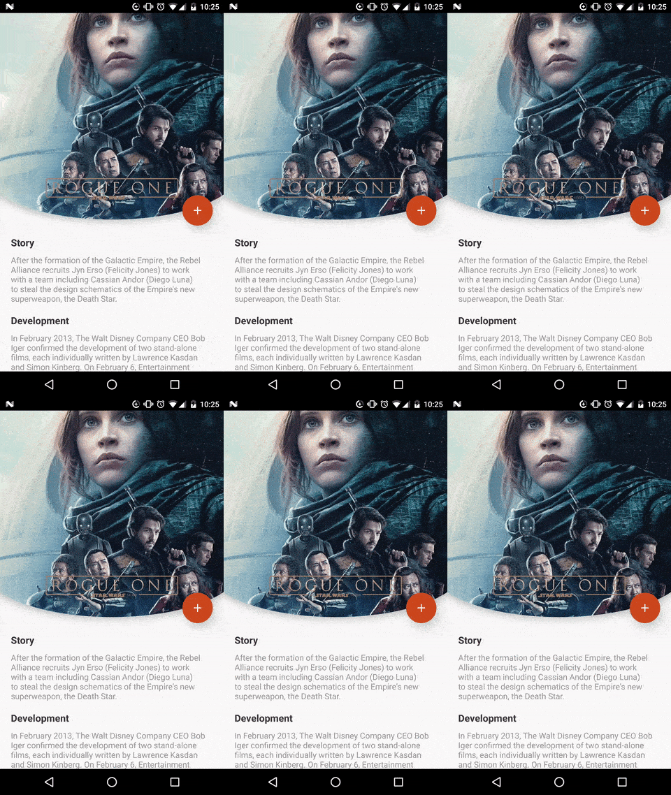
ArcLayout
With Arc Layout explore new styles and approaches on material design
Usage
<com.github.florent37.arclayout.ArcLayout

 android:layout_width="match_parent"

 android:layout_height="200dp"

 app:arc_cropDirection="cropOutside|cropInside"

 app:arc_position="bottom|top|left|right"

 app:arc_height="90dp"

 android:elevation="5dp"

 >

  <!-- YOUR CONTENT -->  </com.github.florent37.arclayout.ArcLayout>
Sample
Crop Outside
<com.github.florent37.arclayout.ArcLayout

  android:layout_width="match_parent"

  android:layout_height="200dp"

  app:arc_cropDirection="cropOutside"

  app:arc_height="90dp"

  app:arc_padding="30dp"

  android:elevation="5dp"

  >

 <ImageView

  android:layout_width="match_parent"

  android:layout_height="match_parent"

  android:scaleType="centerCrop"

  android:src="@drawable/road" />

  </com.github.florent37.arclayout.ArcLayout>
Crop Inside
<com.github.florent37.arclayout.ArcLayout

  android:layout_width="match_parent"

  android:layout_height="200dp"

  app:arc_cropDirection="cropInside"

  app:arc_height="90dp"

  app:arc_padding="30dp"

  android:elevation="5dp"

  >

 <ImageView

  android:layout_width="match_parent"

  android:layout_height="match_parent"

  android:scaleType="centerCrop"

  android:src="@drawable/road" />

  </com.github.florent37.arclayout.ArcLayout>
KenBurns
Using https://github.com/flavioarfaria/KenBurnsView
<com.github.florent37.arclayout.ArcLayout

  android:layout_width="match_parent"

  android:layout_height="200dp"

  app:arc_cropDirection="cropInside"

  app:arc_height="90dp"

  app:arc_padding="30dp"

  >

 <com.flaviofaria.kenburnsview.KenBurnsView

 android:layout_width="match_parent"

 android:layout_height="match_parent"

 android:scaleType="centerCrop"

 android:src="@drawable/road"

 />

 ...  </com.github.florent37.arclayout.ArcLayout>
Download
compile 'com.github.florent37:arclayout:1.0.2'Inspirations
Cinema Application by Zsolt Szilvai
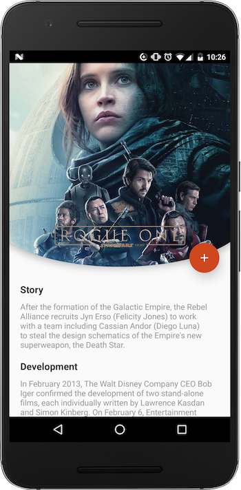
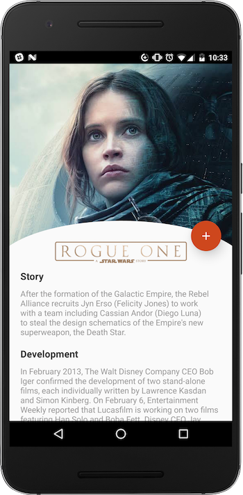
The new Star Wars movie is coming soon, so I decided to design this cinema app screen with one of the Rogue One posters. Also, I tried something new: notice, that the white rectangle on the bottom is bended, which makes the design a bit more lively. The app bar has a reduced opacity and the image behind it is blurred to get a unique look. I'd appreciate any feedback.
https://material.uplabs.com/posts/cinema-application-interface
Credits
Author: Florent Champigny http://www.florentchampigny.com/


License
Copyright 2016 florent37, Inc.  Licensed under the Apache License, Version 2.0 (the "License");
 you may not use this file except in compliance with the License. You may obtain a copy of the License at
http://www.apache.org/licenses/LICENSE-2.0 Unless required by applicable law or agreed to in writing, software distributed under the License is distributed on an "AS IS" BASIS, WITHOUT WARRANTIES OR CONDITIONS OF ANY KIND, either express or implied. See the License for the specific language governing permissions and limitations under the License. 

