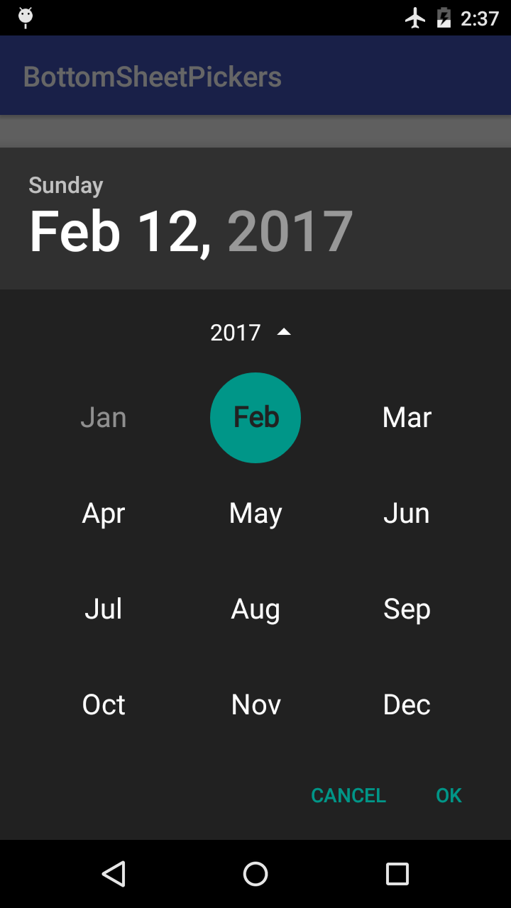
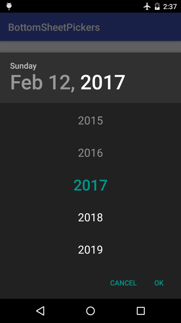
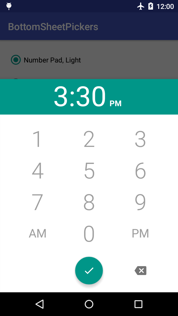
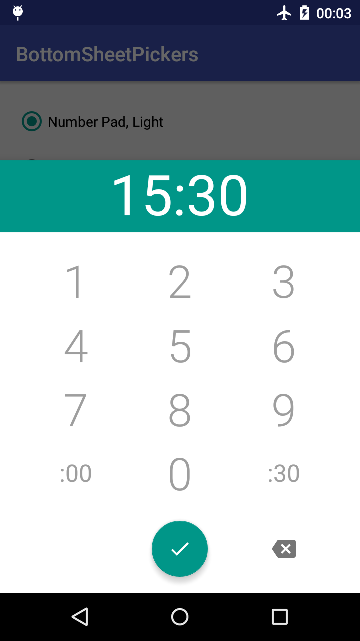
BottomSheetPickers
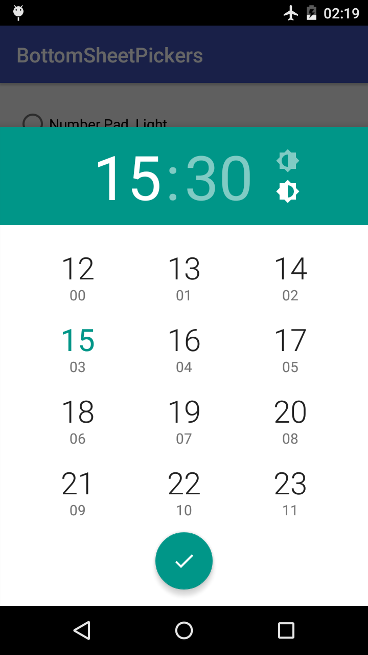
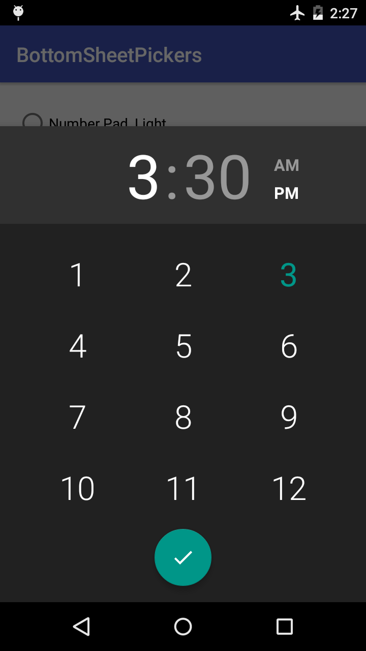
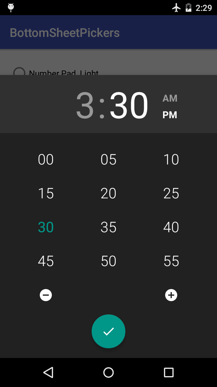
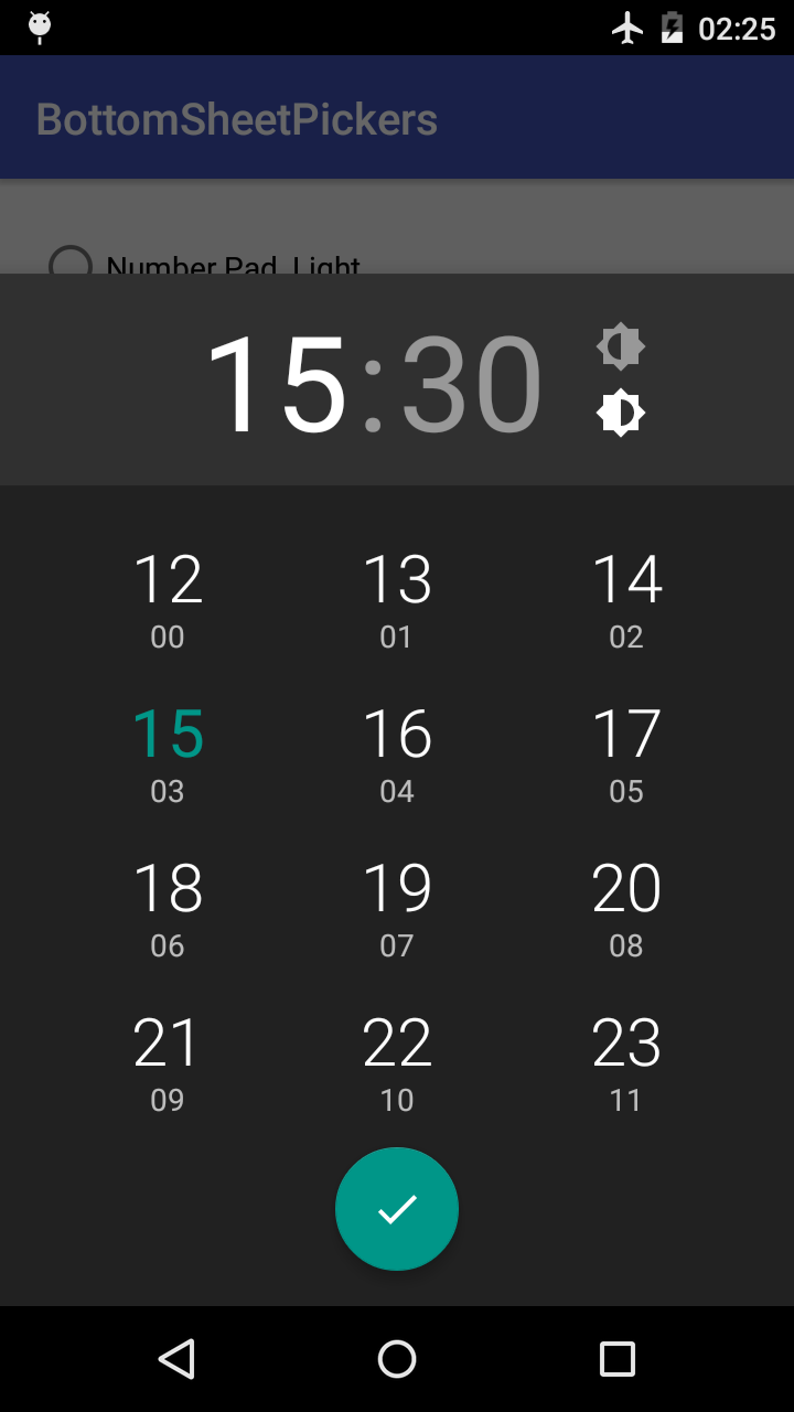
BottomSheetPickers is a library of new date and time pickers for Android, supporting API level 14 and up.
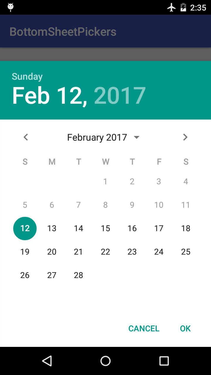
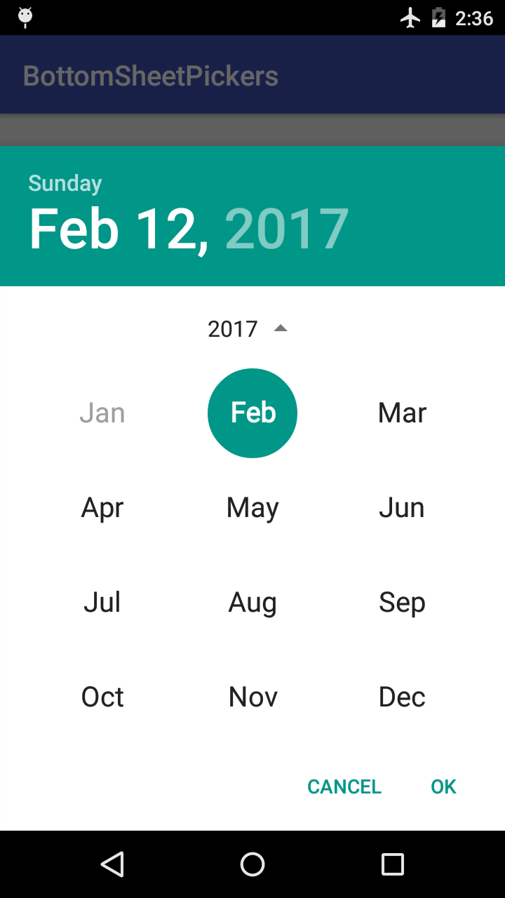
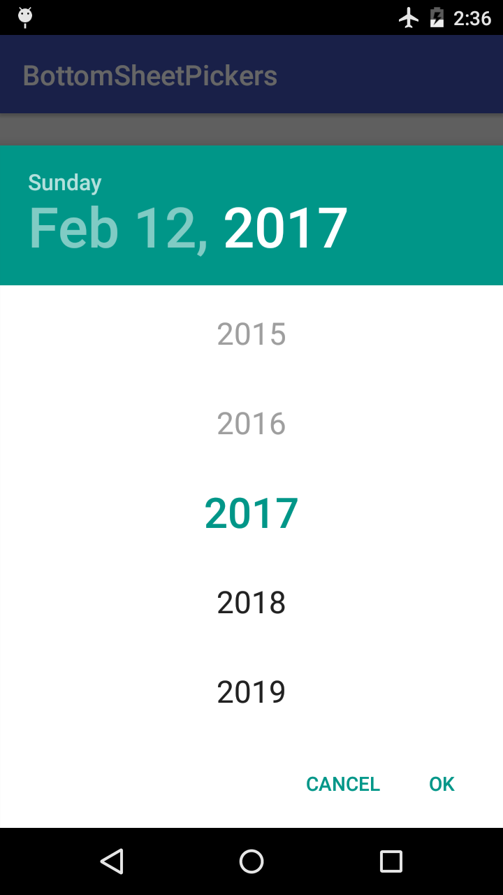
Date Picker
Time Pickers
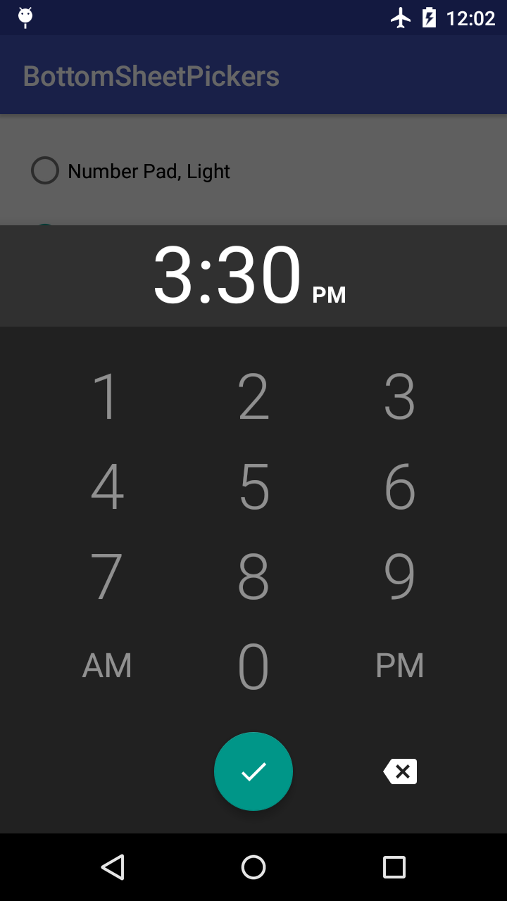
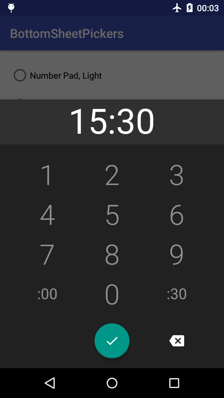
Number Pad
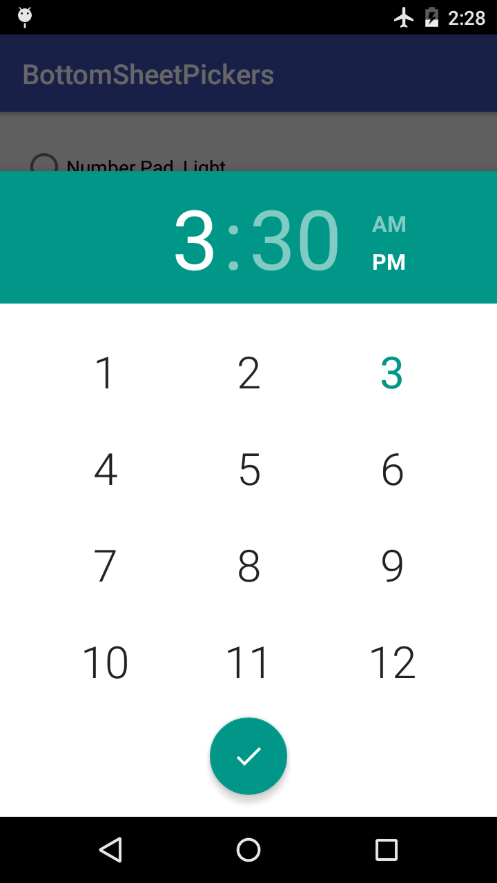
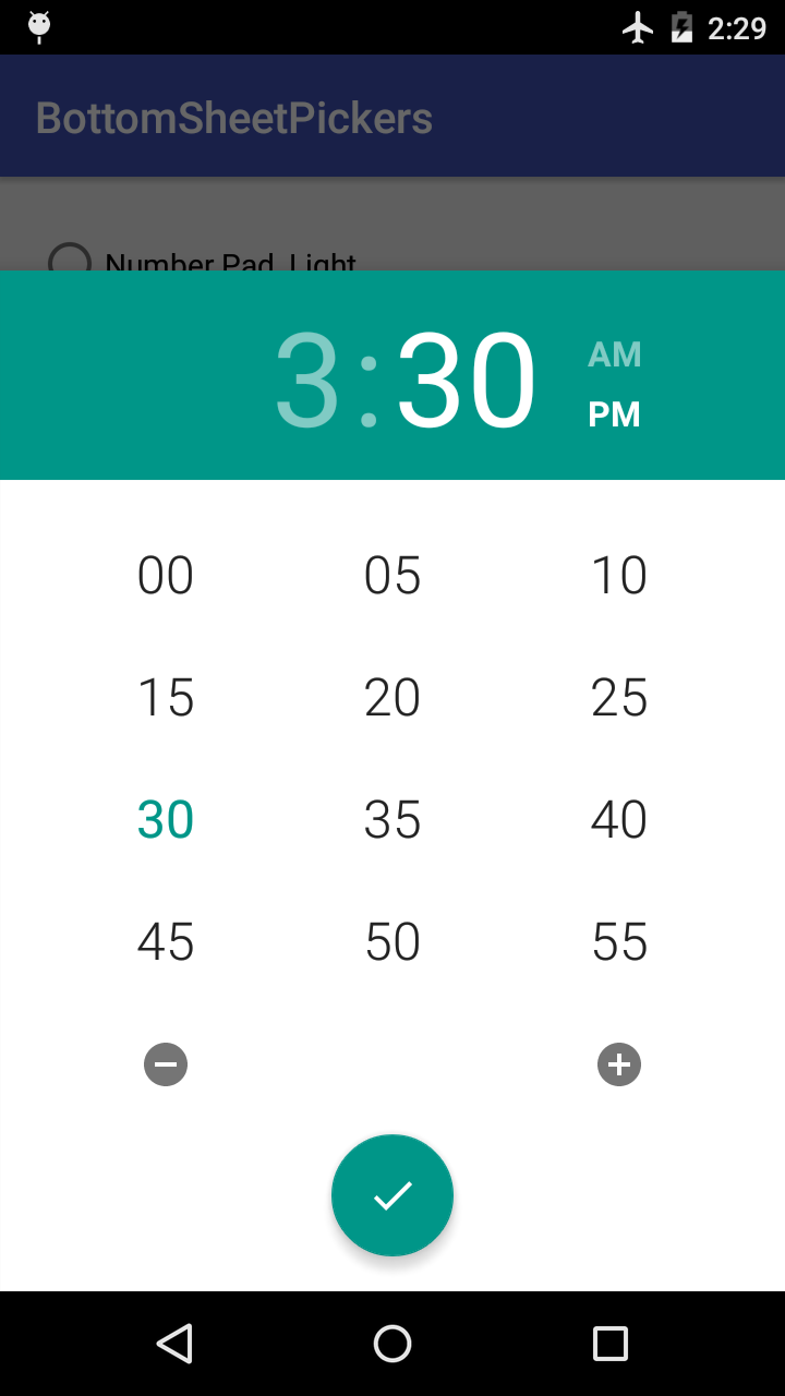
Grid Picker
Table of Contents
Installation
This library depends on the appcompat-v7, design, and gridlayout-v7 support libraries. It is recommended that you exclude them from the library and add those dependencies on your own. This will ensure both your project and this library are using the same versions of the support libraries.
dependencies {

  // Recommended
  compile('com.philliphsu:bottomsheetpickers:2.4.1') {

exclude group: 'com.android.support', module: 'appcompat-v7'

exclude group: 'com.android.support', module: 'design'

exclude group: 'com.android.support', module: 'gridlayout-v7'

}

  compile 'com.android.support:appcompat-v7:[LATEST_VERSION]'
  compile 'com.android.support:design:[LATEST_VERSION]'
  compile 'com.android.support:gridlayout-v7:[LATEST_VERSION]'

// Standard -- not recommended!
  compile 'com.philliphsu:bottomsheetpickers:2.4.1'
}
Usage
You must be using a android.support.v4.app.FragmentActivity or android.support.v4.app.Fragment. The pickers are indirect subclasses of android.support.v4.app.DialogFragment.
Implement Callbacks
To retrieve the date or time set in the pickers, implement an appropriate callback interface.
com.philliphsu.bottomsheetpickers.date.DatePickerDialog.OnDateSetListenerBottomSheetTimePickerDialog.OnTimeSetListener
@Override public void onDateSet(DatePickerDialog dialog, int year, int monthOfYear, int dayOfMonth) {

  Calendar cal = new java.util.GregorianCalendar();

  cal.set(Calendar.YEAR, year);

  cal.set(Calendar.MONTH, monthOfYear);

  cal.set(Calendar.DAY_OF_MONTH, dayOfMonth);

  mText.setText("Date set: " + DateFormat.getDateFormat(this).format(cal.getTime()));

}
  @Override public void onTimeSet(ViewGroup viewGroup, int hourOfDay, int minute) {

  Calendar cal = new java.util.GregorianCalendar();

  cal.set(Calendar.HOUR_OF_DAY, hourOfDay);

  cal.set(Calendar.MINUTE, minute);

  mText.setText("Time set: " + DateFormat.getTimeFormat(this).format(cal.getTime()));

}
Create Pickers
Calendar now = Calendar.getInstance();
 // As of version 2.3.0, `BottomSheetDatePickerDialog` is deprecated. DatePickerDialog date = DatePickerDialog.newInstance(
  MainActivity.this,
  now.get(Calendar.YEAR),
  now.get(Calendar.MONTH),
  now.get(Calendar.DAY_OF_MONTH));
  // Configured according to the system preference for 24-hour time. NumberPadTimePickerDialog pad = NumberPadTimePickerDialog.newInstance(MainActivity.this);
 // Alternatively, you can set 24-hour mode on your own. boolean is24HourMode = ... NumberPadTimePickerDialog pad = NumberPadTimePickerDialog.newInstance(MainActivity.this, is24HourMode);
  GridTimePickerDialog grid = GridTimePickerDialog.newInstance(
  MainActivity.this,
  now.get(Calendar.HOUR_OF_DAY),
  now.get(Calendar.MINUTE),
  DateFormat.is24HourFormat(MainActivity.this));
As of version 2.3.0, you have the option to create pickers using the Builder pattern. This is helpful if you want to chain together additional options before creating the dialog. Of course, you can continue creating a dialog with newInstance() as usual, and then just call setters on the dialog itself.
DatePickerDialog date = new DatePickerDialog.Builder(
  MainActivity.this,
  now.get(Calendar.YEAR),
  now.get(Calendar.MONTH),
  now.get(Calendar.DAY_OF_MONTH))
  /* ... Set additional options ... */
  .build();
  // Configured according to the system preference for 24-hour time. NumberPadTimePickerDialog pad = new NumberPadTimePickerDialog.Builder(MainActivity.this)
  /* ... Set additional options ... */
  .build();
 // Alternatively, you can set 24-hour mode on your own. NumberPadTimePickerDialog pad = new NumberPadTimePickerDialog.Builder(MainActivity.this, is24HourMode)
  /* ... Set additional options ... */
  .build();
  GridTimePickerDialog grid = new GridTimePickerDialog.Builder(
  MainActivity.this,
  now.get(Calendar.HOUR_OF_DAY),
  now.get(Calendar.MINUTE),
  DateFormat.is24HourFormat(MainActivity.this))
  /* ... Set additional options ... */
  .build();
Show the Dialog
Pass in a android.support.v4.app.FragmentManager to the dialog's show().
// For a `android.support.v4.app.FragmentActivity`: dialog.show(getSupportFragmentManager(), TAG);
  // For a `android.support.v4.app.Fragment`: dialog.show(getFragmentManager(), TAG);
Theming
The pickers automatically use your current theme's colorAccent defined in your styles.xml.
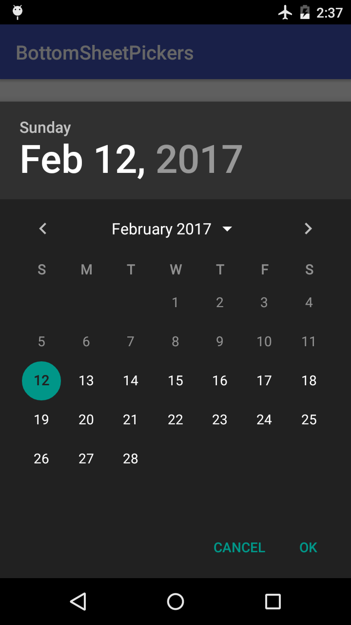
You can specify whether to use a light (default) or dark theme:
- in
styles.xmlby specifying a boolean value for the attributethemeDarkin your theme.
<item name="themeDark">true</item>- in code with the dialog's
setThemeDark(boolean dark)method. This overwrites the value specified in XML.
Additional Options
These additional APIs can be used to customize the appearance of the picker. They are available both as setter methods and as Builder options, unless otherwise noted.
Basic Options
These APIs are available in all pickers.
-
setThemeDark(boolean dark)Set a dark or light theme. -
setAccentColor(@ColorInt int color)Set the accent color. This color is primarily used to tint views in the picker. If this picker is using the light theme and you did not callsetHeaderColor(int), this color will also be applied to the dialog's header. -
setBackgroundColor(@ColorInt int color)Set the background color. If this color is dark, consider setting the theme dark to ensure text in the picker has enough contrast. -
setHeaderColor(@ColorInt int color)Set the header color. If this color is light, consider setting the header text dark to ensure it has enough contrast. -
setHeaderTextDark(boolean dark)Set the header text to use a light or dark color. The default is false, so a light color is applied.
DatePickerDialog and DatePickerDialog.Builder
-
setFirstDayOfWeek(int startOfWeek)Use this to set the day (Calendar.SUNDAYthroughCalendar.SATURDAY) that a week should start on. -
setYearRange(int startYear, int endYear)Sets the range of years to be displayed by this date picker. If a minimal date and/or maximal date were set usingsetMinDate(Calendar)orsetMaxDate(Calendar), dates in the specified range of years that lie outside of the minimal and maximal dates will be disallowed from being selected. This does NOT change the minimal date's year or the maximal date's year. -
setMinDate(Calendar calendar)Sets the minimal date that can be selected in this date picker. Dates before (but not including) the specified date will be disallowed from being selected. -
setMaxDate(Calendar calendar)Sets the maximal date that can be selected in this date picker. Dates after (but not including) the specified date will be disallowed from being selected. -
setHeaderTextColorSelected(@ColorInt int color)Set the color of the header text when it is selected. -
setHeaderTextColorUnselected(@ColorInt int color)Set the color of the header text when it is not selected. -
setDayOfWeekHeaderTextColorSelected(@ColorInt int color)Set the color of the day-of-week header text when it is selected. -
setDayOfWeekHeaderTextColorUnselected(@ColorInt int color)Set the color of the day-of-week header text when it is not selected.
NumberPadTimePickerDialog and NumberPadTimePickerDialog.Builder
setHeaderTextColor(@ColorInt int color)Set the color of the header text that stores the inputted time.
GridTimePickerDialog and GridTimePickerDialog.Builder
-
setHeaderTextColorSelected(@ColorInt int color)Set the color of the header text when it is selected. -
setHeaderTextColorUnselected(@ColorInt int color)Set the color of the header text when it is not selected. -
setTimeSeparatorColor(@ColorInt int color)Set the color of the time separator that separates the hour and minute views in the header. -
setAmPmTextColorSelected(@ColorInt int color)Set the color of the AM/PM text when it is selected. This is equivalent tosetHalfDayButtonColorSelected(int)in 24-hour time. -
setAmPmTextColorUnselected(@ColorInt int color)Set the color of the AM/PM text when it is not selected. This is equivalent tosetHalfDayButtonColorUnselected(int)in 24-hour time. -
setHalfDayButtonColorSelected(@ColorInt int color)Set the color of the half-day image button when it is selected. This is equivalent tosetAmPmTextColorSelected(int)in 12-hour time. -
setHalfDayButtonColorUnselected(@ColorInt int color)Set the color of the half-day image button when it is not selected. This is equivalent tosetAmPmTextColorUnselected(int)in 12-hour time.
Setters Only
These are only available as setter methods in NumberPadTimePickerDialog.
-
setHint(String hint)orsetHint(@StringRes int resid)Sets the hint of the input time TextView. -
setInputTextSize(int textSize)Sets the text size in px of the input time TextView. -
getInputTextView()Returns theTextViewthat stores the inputted time.
Attribution
This library is based on code from the following AOSP repositories:
- https://android.googlesource.com/platform/frameworks/opt/datetimepicker
- https://android.googlesource.com/platform/packages/apps/Calculator
License
Copyright 2017 Phillip Hsu  Licensed under the Apache License, Version 2.0 (the "License");
 you may not use this file except in compliance with the License. You may obtain a copy of the License at
http://www.apache.org/licenses/LICENSE-2.0 Unless required by applicable law or agreed to in writing, software distributed under the License is distributed on an "AS IS" BASIS, WITHOUT WARRANTIES OR CONDITIONS OF ANY KIND, either express or implied. See the License for the specific language governing permissions and limitations under the License. 