CFAlertDialog 
CFAlertDialog is a library that helps you display and customise alert dialogs on Android. It offers an adaptive UI support. It’s functionality is almost similar to the native AlertDialog.
You can also check out this library for ? iOS by clicking here
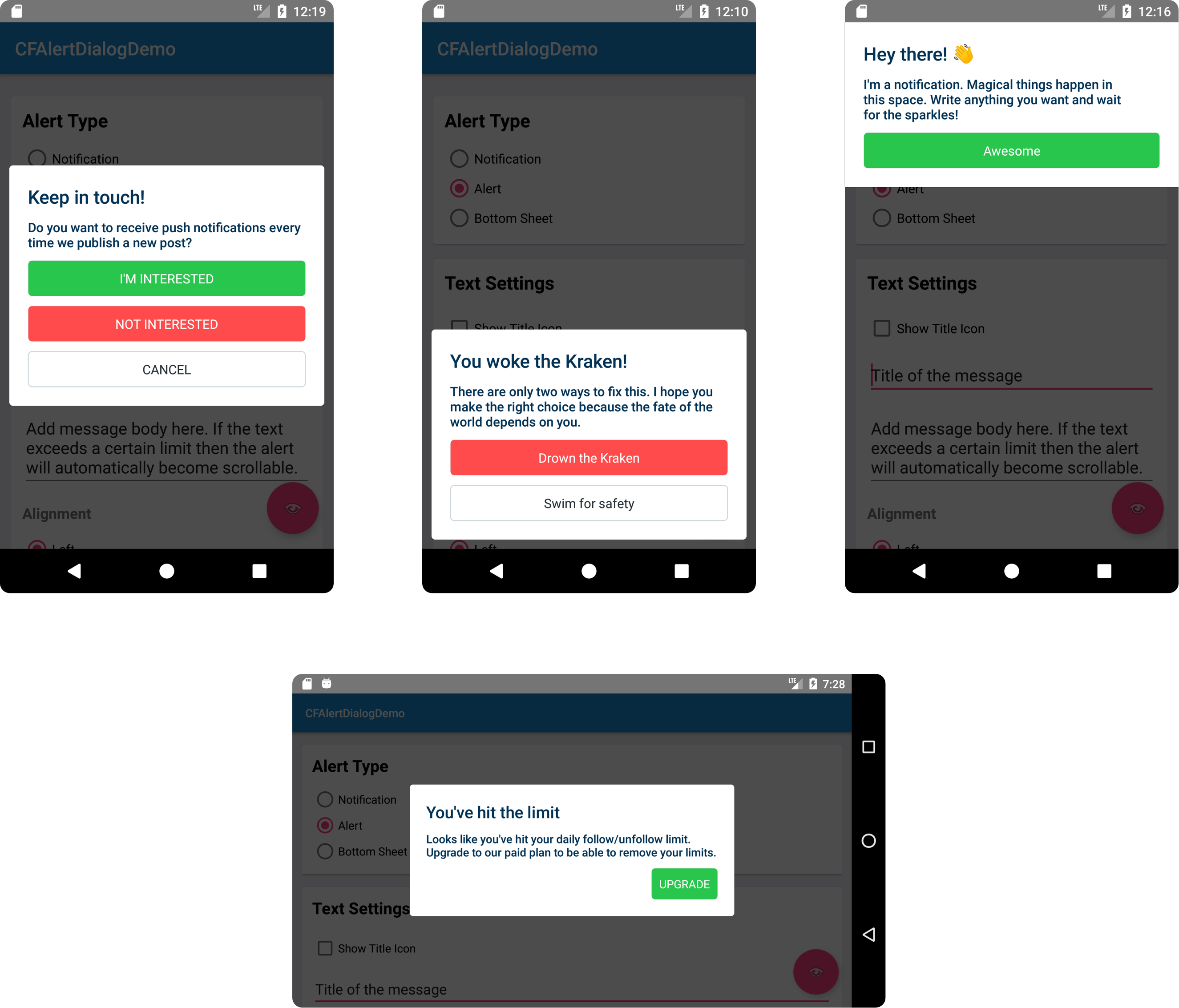
Types of use cases:
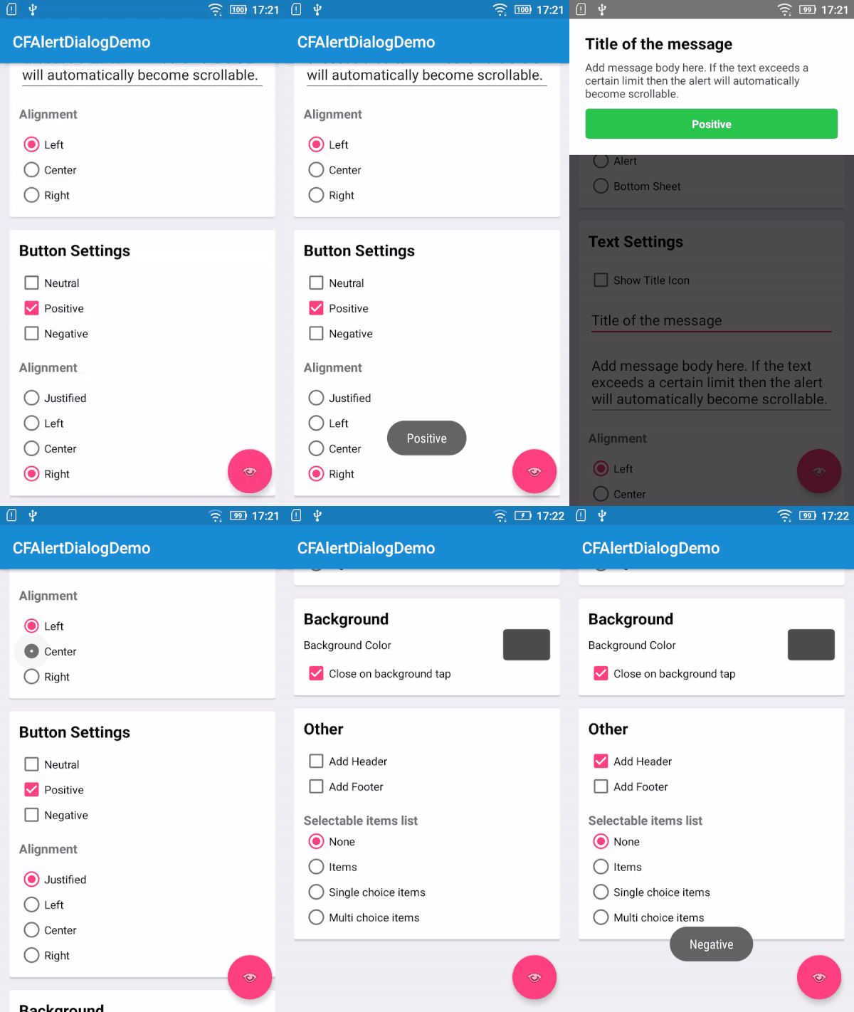
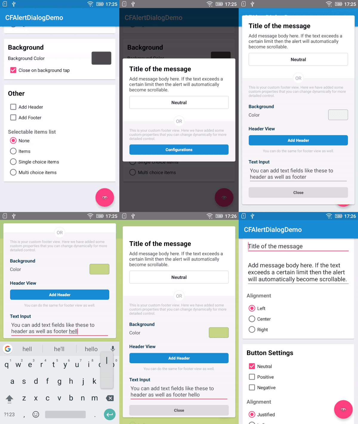
Configuration options:
Requirements :
- CFAlertDialog works on any device with Android API level 14 and above.
Install using gradle
In your project's build.gradle. Add the following under repositories
maven {
 url "https://dl.bintray.com/crowdfire/cfalertdialog"
}
Add the following under dependencies
compile 'com.crowdfire.cfalertdialog:cfalertdialog:1.0.1'Usage :
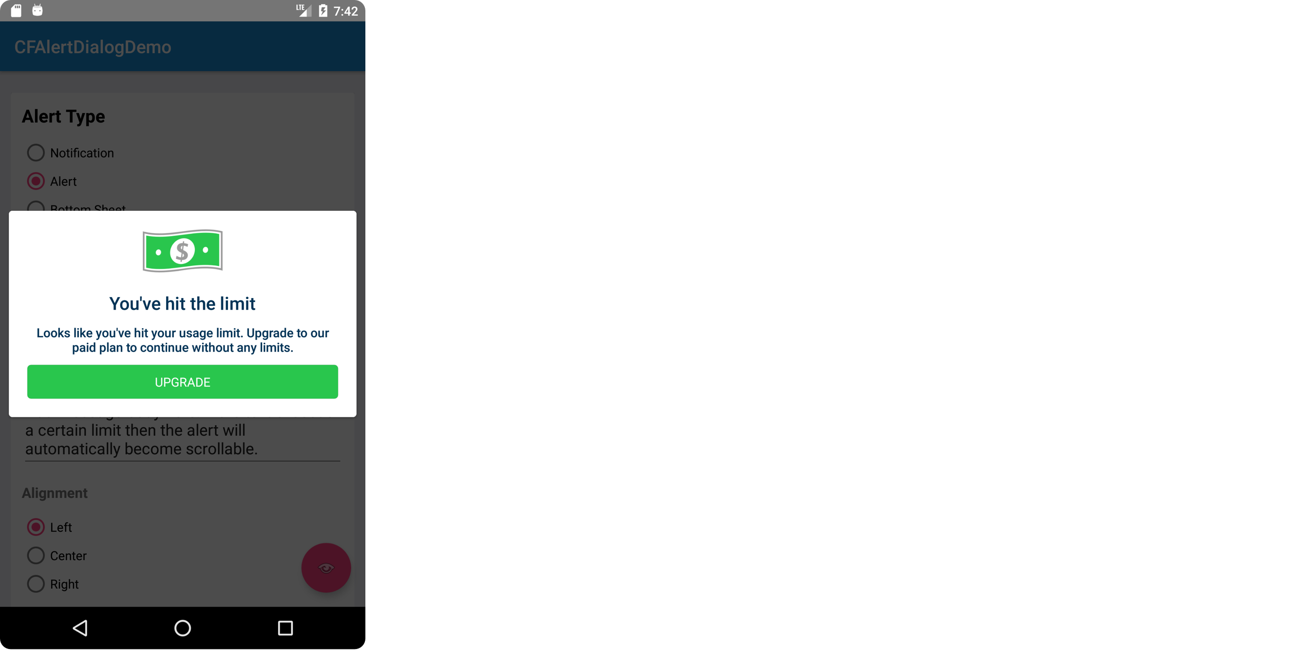
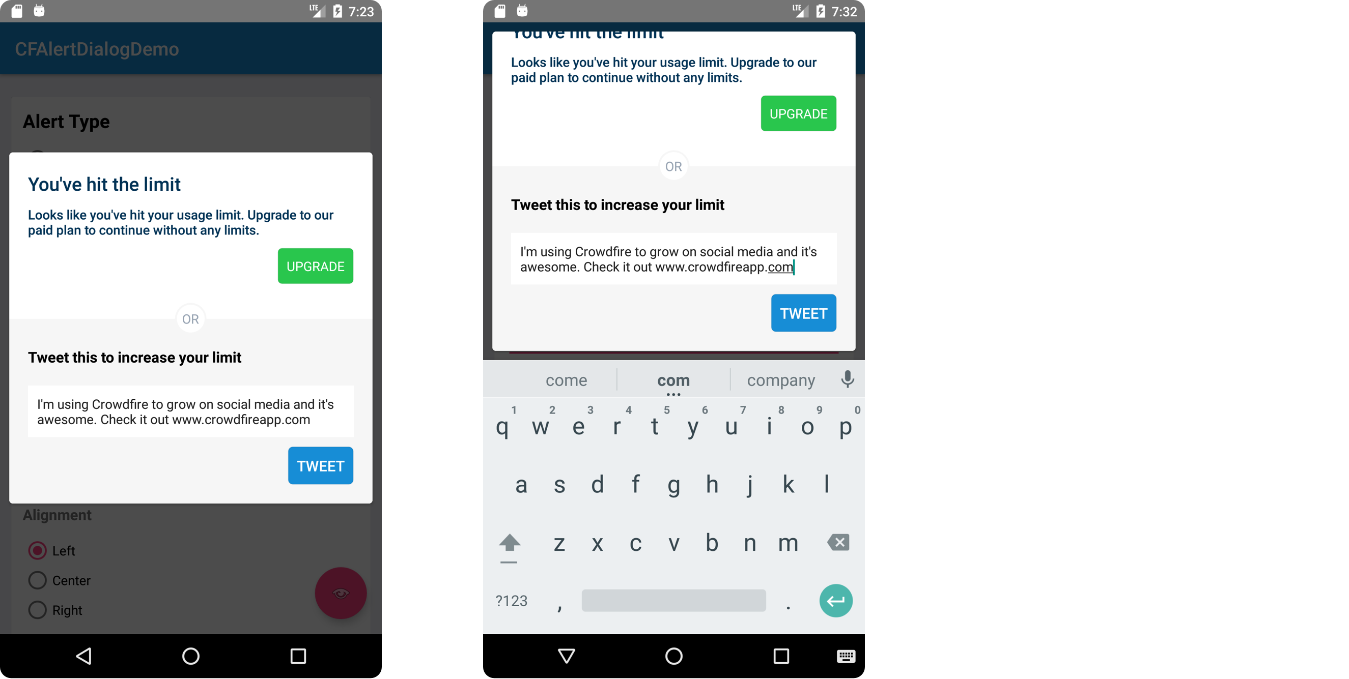
The above shown alert types can easily be implemented using the code snippet given below by some small tweaks
// Create Alert using Builder CFAlertDialog.Builder builder = new CFAlertDialog.Builder(this)
  .setDialogStyle(CFAlertDialog.CFAlertStyle.ALERT)
  .setTitle("You've hit the limit")
  .setMessage("Looks like you've hit your usage limit. Upgrade to our paid plan to continue without any limits.")
  .addButton("UPGRADE", -1, -1, CFAlertActionStyle.POSITIVE, CFAlertActionAlignment.END, (dialog, which) -> {

Toast.makeText(BaseActivity.this, "Upgrade tapped", Toast.LENGTH_SHORT).show();

dialog.dismiss();


}
)

 // Show the alert builder.show();
Customisations :
Alert Type
The alert type will determine the position and animation style for the dialog. You may set this by calling the setAlertStyle method with any of the following values.
CFAlertStyle.NOTIFICATION, CFAlertStyle.ALERT, CFAlertStyle.BOTTOM_SHEETThe default type is ALERT.
Title and Message
You can set a custom title and message text in the alert, using the setTitle method on the builder (pass null if you don’t need them).
Title Color and Message Color
You can set a custom title and message text color in the alert, using the setTextColor on the builder.
Text Alignment
You can customise alignment of the title and message. Use the setTextGravity method on the builder with any of the following values:
Gravity.START, Gravity.CENTER_HORIZONTAL, Gravity.ENDBackground color
You can change the background (overlay) color of the alert using the method setBackgroundColor on the builder with the color of your choice.
Dismiss on background tap
This determines whether the Alert dialog is dismissed when user taps on the background. Use the method setCancelable with a boolean value. By default it is set to true. The user will be able to interactively swipe to dismiss the notification dialog if this field is true.
Header / Footer
You can add header and footer to the dialog. Use the method setHeaderView and setFooterView with any custom View. You can also pass the layout resource directly into the header/footer. Pass null to remove any existing header/footer.
- Some examples where you can make the use of header in alert (the dollar image is in header)
builder.setHeaderView(R.layout.dialog_header_layout);
 OR builder.setHeaderView(headerView);
- Some examples where you can make the use of footer in alert
builder.setFooterView(R.layout.dialog_footer_layout);
 OR builder.setFooterView(footerView);
Dismiss Callback
You may set a callback when dialog is dismissed with the native setOnDismissListener on the alert object.
CFAlertDialog alertDialog = builder.show();
 alertDialog.setOnDismissListener(new DialogInterface.OnDismissListener() {

  @Override
  public void onDismiss(DialogInterface dialog) {

// Do something here when dialog dismissed.

}

}
);
Action Buttons
You may add as many action buttons with the required styles. Use the addButton method on the builder.
builder.addButton("UPGRADE", Color.parseColor("#FFFFFF"), Color.parseColor("#429ef4"), CFAlertActionStyle.POSITIVE, CFAlertActionAlignment.CENTER, new DialogInterface.OnClickListener() {

  @Override
  public void onClick(DialogInterface dialog, int which) {

Toast.makeText(context, "Upgrade tapped", Toast.LENGTH_SHORT).show();

dialog.dismiss();


}

}
);
Title
You can set the title of action button to be added.
Action Style
Configure the style of the action button that is to be added to alert view. Set style property of the above method with one of the following Action style
CFAlertActionStyle.DEFAULT, CFAlertActionStyle.POSITIVE, CFAlertActionStyle.NEGATIVEActions Alignment
Configure the alignment of the action button added to the alert view. Set alignment property of CFAction constructor with one of the following action types
CFAlertActionAlignment.START,
 CFAlertActionAlignment.END, CFAlertActionAlignment.CENTER, CFAlertActionAlignment.JUSTIFIED
// Action Button occupies the full width
Callback
Pass an onClickListener to receive callbacks when the action buttons are tapped.
Items
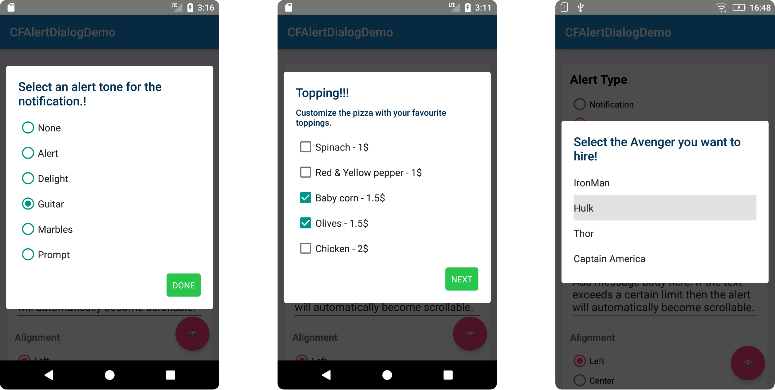
There are 3 types of list supported by default.
Simple List
This will show a simple list view and give a callback when any of the item is tapped.
CFAlertDialog.Builder builder = new CFAlertDialog.Builder(this);
 builder.setDialogStyle(CFAlertDialog.CFAlertStyle.ALERT);
 builder.setTitle("Select notification tone!");
 builder.setItems(new String[]{
"None", "Alert", "Delight", "Guitar", "Marbles", "Prompt"
}
, new OnClickListener() {

  @Override
  public void onClick(DialogInterface dialogInterface, int index) {

Toast.makeText(context, "Selected:"+index, Toast.LENGTH_SHORT).show();

dialogInterface.dismiss();


}

}
);
 builder.show();
Single Choice
This will show a list view with single choice items. It will give a callback when any of the items is selected.
CFAlertDialog.Builder builder = new CFAlertDialog.Builder(this);
 builder.setDialogStyle(CFAlertDialog.CFAlertStyle.ALERT);
 builder.setTitle("Select notification tone!");
 builder.setSingleChoiceItems(new String[]{
"None", "Alert", "Delight", "Guitar", "Marbles", "Prompt"
}
, 3, new OnClickListener() {

  @Override
  public void onClick(DialogInterface dialogInterface, int index) {

Toast.makeText(context, "Selected:"+index, Toast.LENGTH_SHORT).show();


}

}
);
 builder.addButton("DONE", -1, -1, CFAlertActionStyle.POSITIVE, CFAlertActionAlignment.END, new OnClickListener() {

  @Override
  public void onClick(DialogInterface dialogInterface, int i) {

dialogInterface.dismiss();


}

}
);
 builder.show();
Multiple choice
This will show a list view with multi choice items. It will give a callback when any item is selected/unselected.
CFAlertDialog.Builder builder = new CFAlertDialog.Builder(this);
 builder.setDialogStyle(CFAlertDialog.CFAlertStyle.ALERT);
 builder.setMessage("Select the topping for your pizza!!!");
 builder.setMultiChoiceItems(new String[]{
"Spinach", "Red & Yellow pepper", "Baby corn", "Olives", "Chicken"
}
, new boolean[]{
false, false, false, false, false
}
, new DialogInterface.OnMultiChoiceClickListener() {

  @Override
  public void onClick(DialogInterface dialogInterface, int index, boolean b) {

Toast.makeText(context, "Row:"+index+" "+(b? "Selected":"Unselected"), Toast.LENGTH_SHORT).show();


}

}
);
 builder.addButton("NEXT", -1, -1, CFAlertActionStyle.POSITIVE, CFAlertActionAlignment.END, new OnClickListener() {

  @Override
  public void onClick(DialogInterface dialogInterface, int i) {

dialogInterface.dismiss();


}

}
);
 builder.show();
License
This code is distributed under the terms and conditions of the MIT license.
