Compound Button Group Android
An Android library to easily implement compound buttons
Installation
Gradle
Add Gradle dependency:
dependencies {

compile 'com.llollox.androidprojects:compoundbuttongroup:1.0.2'
}
Maven
<dependency>
<groupId>com.llollox.androidprojects</groupId>
<artifactId>compoundbuttongroup</artifactId>
<version>1.0.2</version>
<type>pom</type> </dependency>
Usage
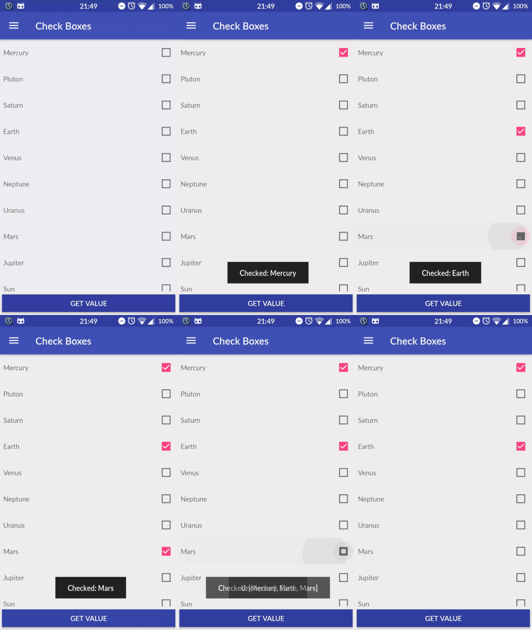
Check Box
<com.llollox.androidprojects.compoundbuttongroup.CompoundButtonGroup
  android:layout_width="match_parent"
  android:layout_height="wrap_content"
  app:entries="@array/planets"
  app:compoundType="check_box"/>
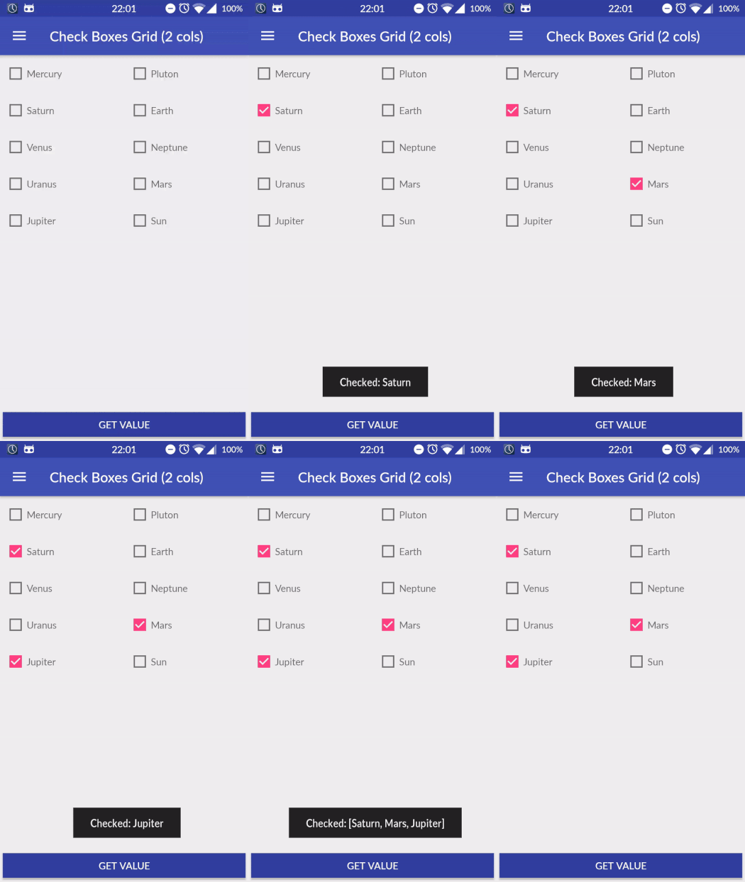
Check Box Grid (2 Cols, Label After)
<com.llollox.androidprojects.compoundbuttongroup.CompoundButtonGroup
  android:layout_width="match_parent"
  android:layout_height="wrap_content"
  app:entries="@array/planets"
  app:compoundType="check_box"
  app:numCols="2"
  app:labelOrder="after"/>
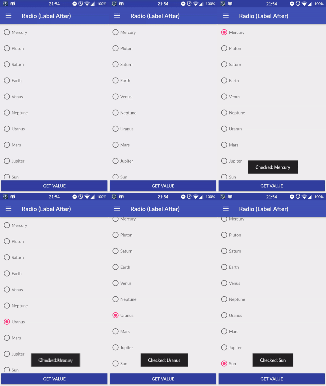
Radio
<com.llollox.androidprojects.compoundbuttongroup.CompoundButtonGroup
  android:layout_width="match_parent"
  android:layout_height="wrap_content"
  app:entries="@array/planets"
  app:compoundType="radio"
  app:labelOrder="after"/>
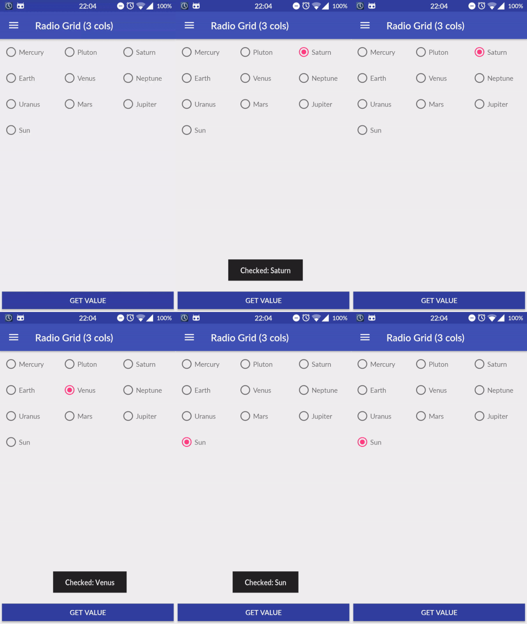
Radio Grid (3 Cols)
<com.llollox.androidprojects.compoundbuttongroup.CompoundButtonGroup
  android:layout_width="match_parent"
  android:layout_height="wrap_content"
  app:entries="@array/planets"
  app:compoundType="radio"
  app:numCols="3"
  app:labelOrder="after"/>
Getters
List<Integer> getCheckedPositions()Returns the current checked positions
List<Integer> positions = compoundButtonGroup.getCheckedPositions();
CompoundType getCompoundType()Get the type of the compound buttons.
compoundButtonGroup.getCompoundType();
LabelOrder getLabelOrder()Get the label order of the compound buttons. This determines if the label is before or after the compound button.
compoundButtonGroup.getLabelOrder();
int getNumCols()Get the current number of cols.
compoundButtonGroup.getNumCols();
Setters
void setCheckedPosition(int position)Checks the button at the position passed as argument. Typically to be used withradiobuttons.
int position = 3; compoundButtonGroup.setCheckedPosition(position);
void setCheckedPositions(List<Integer> positions)Checks all the buttons at the positions passed as argument. Typically to be used withcheck boxbuttons.
List<Integer> positions = new ArrayList<Integer>(){
{
add(2);
 add(4);

}

}
; compoundButtonGroup.setCheckedPositions(positions);
void setCompoundType(CompoundType compoundType)Set the type of the compound buttons. Allowed values are:CompoundType.CHECK_BOX,CompoundType.RADIO. In order to see the changes on UI please call thereDraw()method.
compoundButtonGroup.setCompoundType(CompoundButtonGroup.CompoundType.RADIO);
void setEntries(List<String> entries)Set the entries for the compound button group. In order to see the changes on UI please call thereDraw()method.
List<String> entries = new ArrayList<String>(){
{
add("Mars");
 add("Mercury");
 add("Earth");

}

}
; compoundButtonGroup.setEntries(entries);
void setEntries(HashMap<String, String> entries)Set the entries for the compound button group. The key / value pair represent the value / label of the entry respectively. In order to see the changes on UI please call thereDraw()method.
LinkedHashMap<String, String> map = new LinkedHashMap<>();
 map.put("house", getString(R.string.house));
 map.put("orange", getString(R.string.orange));
 compoundButtonGroup.setEntries(map);
 compoundButtonGroup.reDraw();
void setLabelOrder(LabelOrder LabelOrder)Set the label order of each compound button. This determines if the label is before or after the compound button. Allowed values are:LabelOrder.BEFORE,LabelOrder.AFTER. In order to see the changes on UI please call thereDraw()method.
compoundButtonGroup.setLabelOrder(CompoundButtonGroup.LabelOrder.AFTER);
void setNumCols(int numCols)Set the number of cols. If it is greater than 1 the compound buttons are shown as a grid. NB. It cannot be smaller than 1! In order to see the changes on UI please call thereDraw()method.
int numCols = 2; compoundButtonGroup.setNumCols(numCols);
Listeners
OnButtonSelectedListener
compoundButtonGroup.setOnButtonSelectedListener(new CompoundButtonGroup.OnButtonSelectedListener() {

  @Override
  public void onButtonSelected(int position, String value, boolean isChecked) {

// Your code

}

}
);
Attributes
It is possible to customize the compound button group applying the following options:
| Option Name | Format | Description |
|---|---|---|
| w | app:compoundType | check_box or radio |
| app:entries | array | String array of the entries of the compound button group. |
| app:labelOrder | before or after | This determines if the label is before or after the compound button. By default is before. |
| app:numCols | int | Setting this parameter the compound buttons are shown as a grid and it indicates the number of cols of the grid. |


