Source link: https://github.com/skydoves/ProgressView
Here an example how to create ProgressView with Animations in Android. You can add this libary on your project. Thanks for @skydoves,
ProgressView 


Including in your project


Gradle
Add below codes to your root build.gradle file (not your module build.gradle file).
allprojects {

  repositories {

jcenter()

}

}
And add a dependency code to your module s build.gradle file.
dependencies {

  implementation "com.github.skydoves:progressview:1.0.1"
}
Usage
Add following XML namespace inside your XML layout file.
xmlns:app="http://schemas.android.com/apk/res-auto"ProgressView
Here is a basic example of implementing ProgressView.
<com.skydoves.progressview.ProgressView
android:id="@+id/progressView1"
android:layout_width="match_parent"
android:layout_height="35dp"
app:progressView_colorBackground="@color/white" // the color of the container.
app:progressView_colorProgress="@color/skyBlue" // the color of the progress bar.
app:progressView_progress="40" // progress value.
app:progressView_max="100" // max progress value.
app:progressView_autoAnimate="true" // starts filling animation automatically when finishing inflate.
app:progressView_radius="12dp" // the corner radius of the progressView and progress bar.
app:progressView_padding="1dp" // the padding of the progress bar.
app:progressView_labelColorInner="@color/white" // the text color when the label placed on the progress bar.
app:progressView_labelColorOuter="@color/black" // the text color when the label placed out of the progress bar.
app:progressView_labelSize="13sp" // the label text size.
app:progressView_labelSpace="10dp" // the space size of the between label and progress bar.
app:progressView_labelText="achieve 65%" // the text of the label.
app:progressView_labelTypeface="bold" // the typeface of the label.  />
Gradient
We can give a gradient effect to the progress bar using the below attributes.
app:progressView_colorGradientStart="@color/md_yellow_100" // starting color of the gradient. app:progressView_colorGradientEnd="@color/md_yellow_200" // ending color of the gradient.Filling Animation
We can implement the filling animation using below attributes or method.
app:progressView_autoAnimate="true" // starts filling animation automatically when progress is changed.or we can animate manually using below method.
progressView.progressAnimate()Hilighting Effect
We can give a highlighting effect on the progress bar when clicked.
app:progressView_highlighting="true" // gives the highlighting effect or not. app:progressView_highlightAlpha="0.8" // the alpha of the highlight. app:progressView_highlightColor="@color/skyBlue" // the color of the highlight. app:progressView_highlightWidth="1.5dp" // the thickness of the highlight. app:progressView_padding="1.5dp" // the padding of the progress bar.OnProgressChangeListener, OnProgressClickListener
We can listen to the progress value is changed or the progressbar is clicked.
progressView.setOnProgressChangeListener(new OnProgressChangeListener() {

@Override
public void onChange(float progress) {

  progressView.setLabelText(progress + "% archived");

}

}
);
  progressView.setOnProgressClickListener(new OnProgressClickListener() {

@Override
public void onClickProgress(boolean highlighting) {

  // do something

}

}
);
We can simplify it using kotlin.
progressView.setOnProgressChangeListener {
 progressView.labelText = "achieve ${
it.toInt()
}
%"
}
 progressView.setOnProgressClickListener {
 Toast.makeText(baseContext, "clicked", Toast.LENGTH_SHORT).show()
}
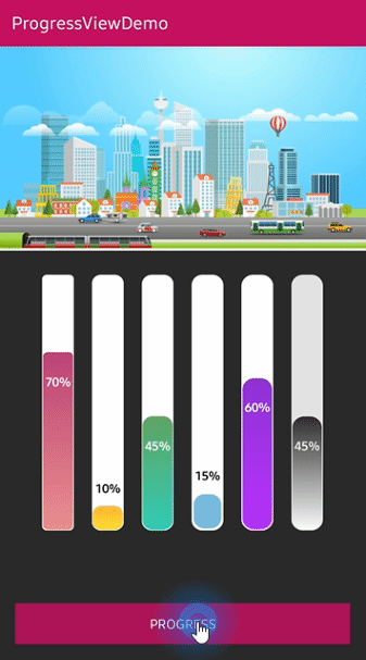
Vertical Orientation
We can implement the ProgressView vertically using the below option.
We should set the width and height value like vertical shape.
<com.skydoves.progressview.ProgressView
android:layout_width="35dp"
android:layout_height="300dp"
app:progressView_orientation="vertical"

...
TextForm
TextFrom is an attribute class that has some attributes about TextView for customizing ProgressView s label.
TextForm textForm = TextForm.Builder(context)
  .setText("This is a TextForm")
  .setTextColor(R.color.colorPrimary)
  .setTextSize(14f)
  .setTextTypeFace(Typeface.BOLD)
  .build();
  progressView.setTextForm(textForm);
This is how to create TextForm using kotlin dsl.
val form = textForm(context) {

text = "This is a TextForm"
textColor = ContextCompat.getColor(baseContext, R.color.white_87)
textSize = 14f
textTypeface = Typeface.BOLD
}
Create using Builder
We can create the ProgressView using ProgressView.Builder.
ProgressView progressView = new ProgressView.Builder(context)
  .setSize(300, 35)
  .setProgress(70f)
  .setMax(100f)
  .setRadius(12f)
  .setDuration(1200L)
  .setAutoAnimate(true)
  .setLabelColorInner(ContextCompat.getColor(context, R.color.white))
  .setLabelColorOuter(ContextCompat.getColor(context, R.color.black))
  .setLabelText("archive 70%")
  .setLabelSize(13f)
  .setLabelSpace(10f)
  .setLabelTypeface(Typeface.BOLD);
This is how to create an instance of the ProgressView using kotlin dsl.
val myProgressView = progressView(context) {

  setSize(300, 35)
  setProgress(70f)
  setMax(100f)
  setRadius(12f)
  setDuration(1200L)
  setAutoAnimate(true)
  setLabelColorInner(ContextCompat.getColor(context, R.color.white))
  setLabelColorOuter(ContextCompat.getColor(context, R.color.black))
  setLabelText("archive 70%")
  setLabelSize(13f)
  setLabelSpace(10f)
  setLabelTypeface(Typeface.BOLD)
}
ProgressView Attributes
Here are attributes of the ProgressView and ProgressView.Builder.
Progressbar
| Attributes | Type | Default | Description |
|---|---|---|---|
| orientation | ProgressViewOrientation | Horizontal | ProgressView s orientation. |
| progress | Float | 0f | value of the progress. |
| max | Float | 100f | value of the maximum progress. the progress value can not over the max value. |
| radius | Dimension | 8dp | corner radius of the ProgressView. |
| padding | Dimension | 0dp | padding of the prograssbar. |
| duration | Long | 1000L | duration of the animation. |
| colorProgress | Int(Color) | colorPrimary | color of the progressbar. |
| colorBackground | Int(Color) | Color.WHITE | color of the container. |
| colorGradientStart | Int(Color) | colorPrimary | starting color of the gradient. |
| colorGradientEnd | Int(Color) | colorPrimary | ending color of the gradient. |
| autoAnimate | Boolean | true | starts filling animation automatically when finishing inflate. |
Label
| Attributes | Type | Default | Description |
|---|---|---|---|
| labelText | String | "" | text of the progressbar label. |
| labelSize | Dimension | 12p | text size of the progressbar label. |
| labelColorInner | Int(Color) | colorPrimary | text color when the label placed on the progress bar. |
| labelColorOuter | Int(Color) | colorPrimary | text color when the label placed out of the progress bar. |
| labelSpace | Dimension | 8dp | space size of the between label and progress bar. |
| labelTypeface | Typeface | Typeface.NORMAL | typeface of the label. |
Highlighting
| Attributes | Type | Default | Description |
|---|---|---|---|
| highlighting | Boolean | false | highlights the progressbar when clicked. |
| highlightColor | Int(Color) | colorPrimary | color of the highlighting effect. |
| highlightAlpha | Float | 1f | alpha of the highlighting effect. |
| highlightWidth | Float | 0dp | thickness of the highlighting effect. |
Find this library useful? ❤️
Support it by joining stargazers for this repository.
License
Copyright 2019 skydoves (Jaewoong Eum)  Licensed under the Apache License, Version 2.0 (the "License");
 you may not use this file except in compliance with the License. You may obtain a copy of the License at
  http://www.apache.org/licenses/LICENSE-2.0  Unless required by applicable law or agreed to in writing, software distributed under the License is distributed on an "AS IS" BASIS, WITHOUT WARRANTIES OR CONDITIONS OF ANY KIND, either express or implied. See the License for the specific language governing permissions and limitations under the License.