Note: This libarary is not dead. I will be updating it as soon as I can. I am simply caught up with other projects right now which is why I was unable to work on it. Suggestions and Pull Requests are welcome.
Table Of Contents
- Installation Instructions
- Camera Kit
- Dialog Kit
- Tool Kit
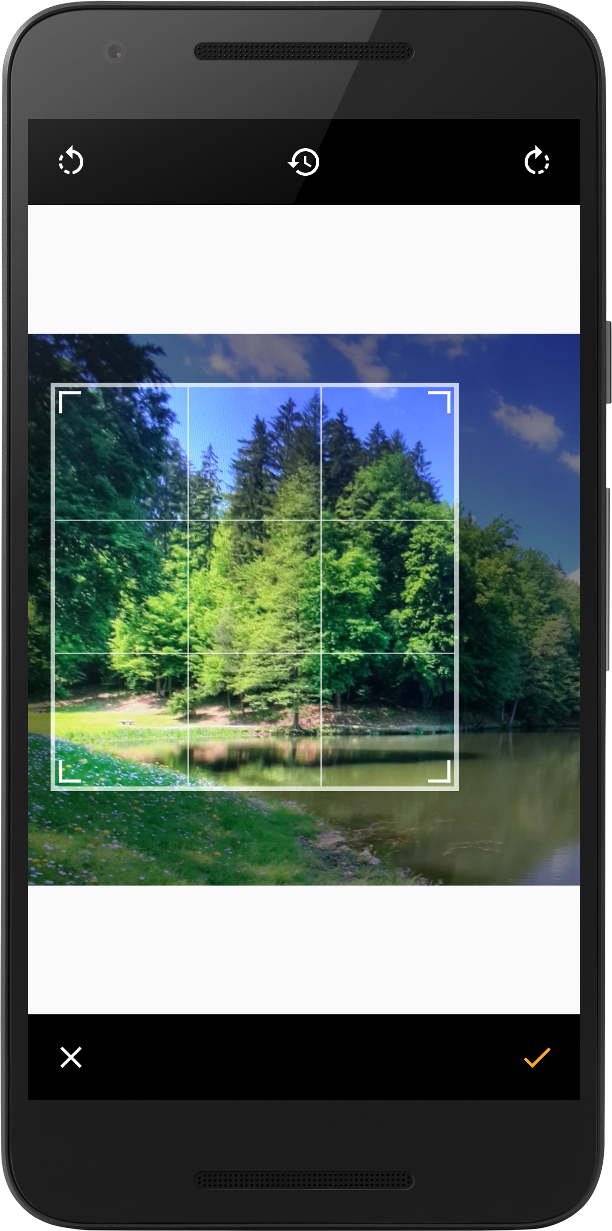
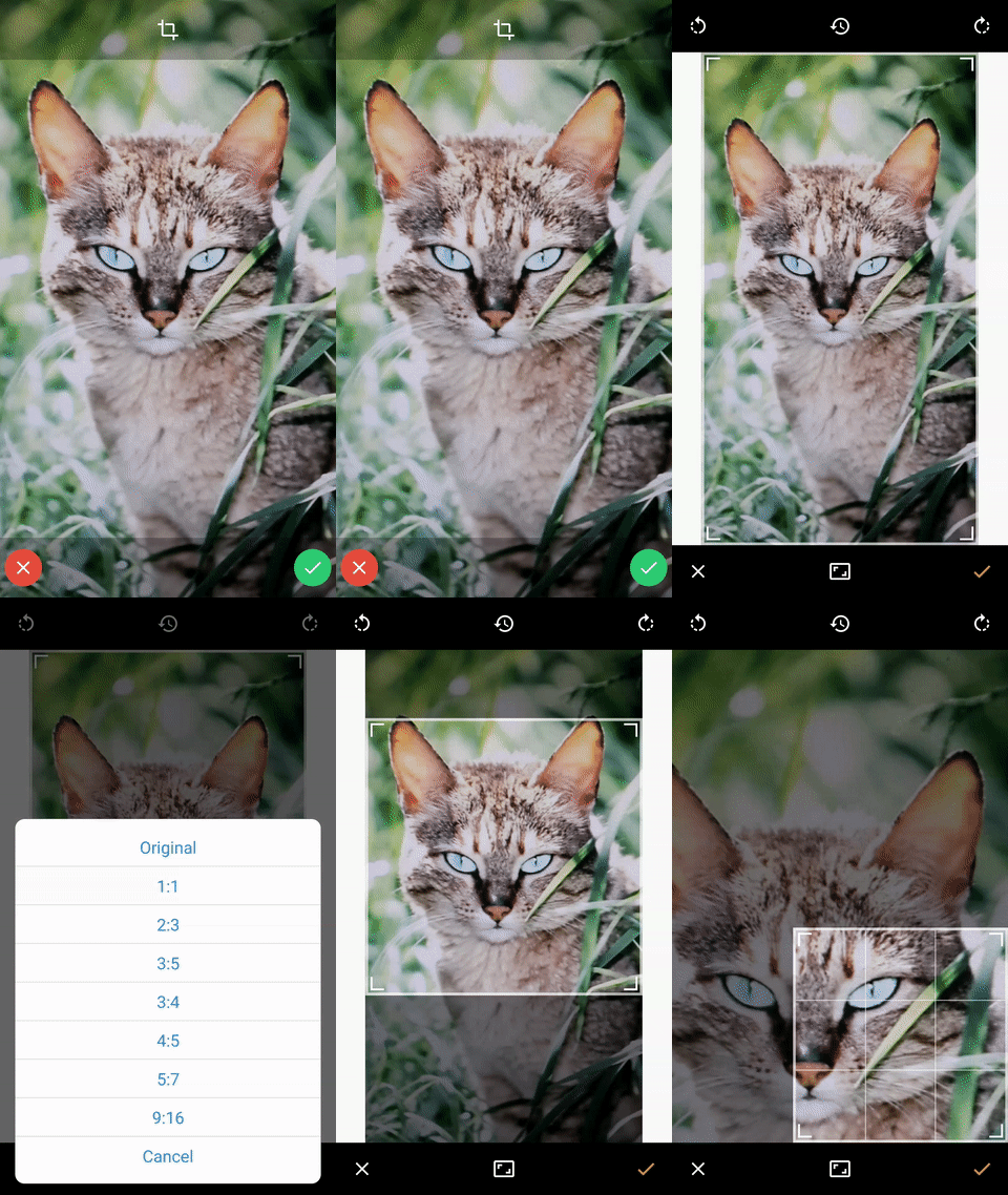
- Image Cropper Activity
- Image Picker Activity
- Credits
Installation Instructions
JCenter
Add this line to your dependencies if you are using JCenter:
compile 'net.crofis:ui:1.0.3'Maven Central
Add this in your project build.gradle:
repositories {

  maven {

url 'https://dl.bintray.com/minitour/maven/'

}

}
And add this in your app module build.gradle.
dependencies {

 compile 'net.crofis:ui:1.0.3'
}
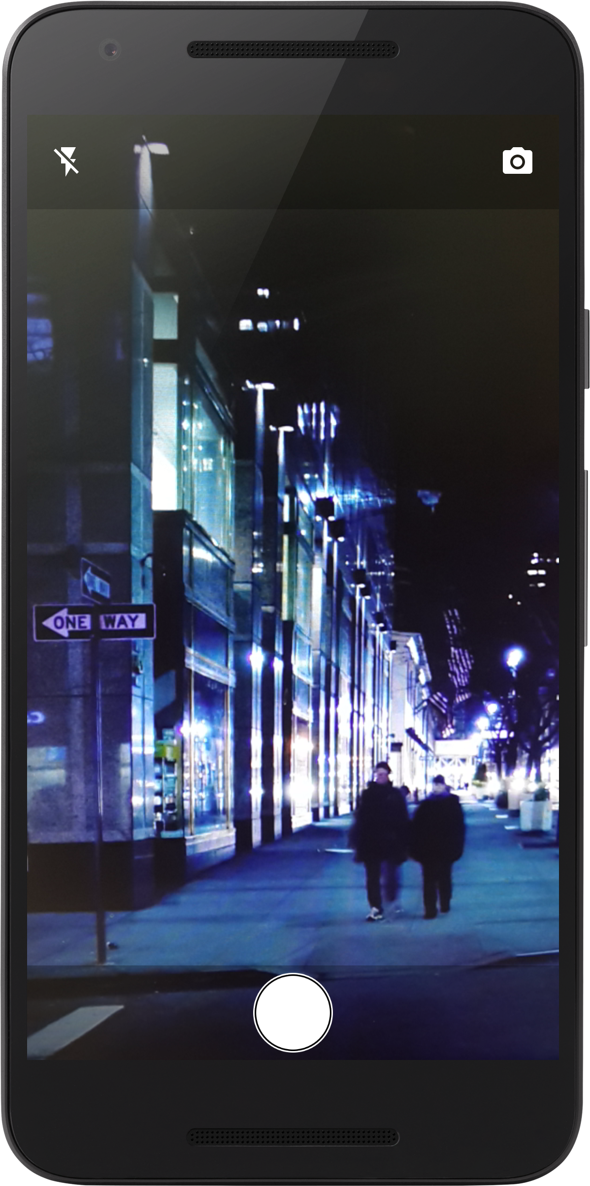
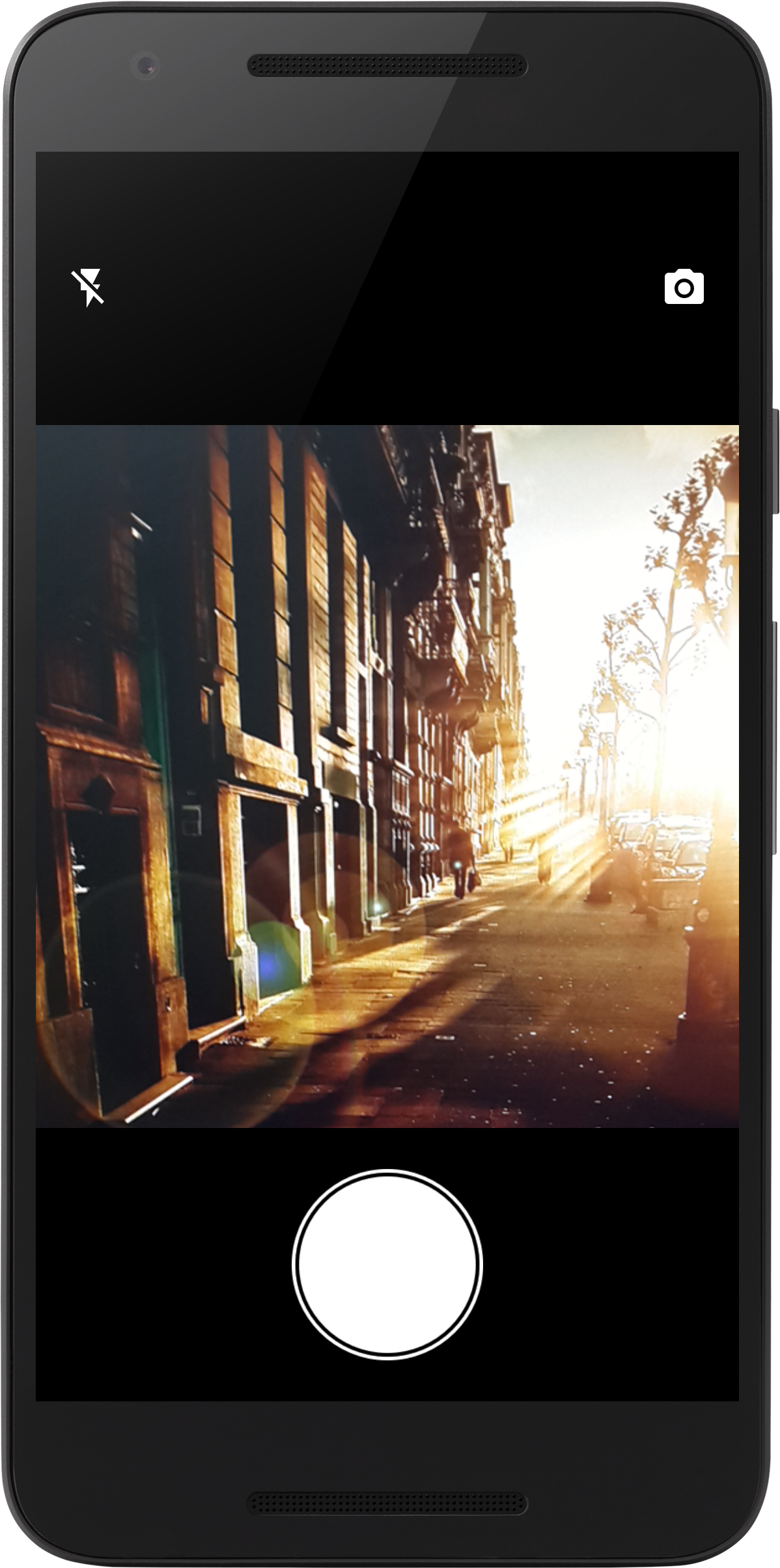
Camera Kit
Normal Camera:
import net.crofis.ui.camera.CameraActivity;
 CameraActivity.activity()

 .setCropOptional(true)

 .showZoomBar(false)

 .saveFileToStorage(true)

 .setCropAspectRatio(4,3)

 .openWithCamera(1)

 .start(this);
Square Camera:
import net.crofis.ui.camera.SquareCameraActivity;
 SquareCameraActivity.activity()

 .displayFlashToggle(true)

 .displayCameraSwitchToggle(true)

 .setCropOptional(true)

 .setCropAspectRatio(1,1)

 .start(this);
Dialog Kit
Loading Dialog
This Dialog is used to indicate the user of a activity that is taking place in the background of the application. It is best used in the AsyncTask class, where you delcare it as a member of your extend class. Display it in the pre-excute method, change the text on it using .getMessage().setText("text");
in the do-in-background method, and finally call .complete() in the post-excecute method.
Usage:
import net.crofis.ui.dialog.LoadingDialog;
 final LoadingDialog dialog = new LoadingDialog(this,"Loading...");

  dialog.show();

 dialog.setPostComplete(new LoadingDialog.PostCompleted() {

@Override

public void onComplete(LoadingDialog dialog) {

 //Do something when finished.

}


}
);
And when ready to dismiss you can use one of the following:
//Dismiss with animation. dialog.complete(true);
Or
 //Dismiss without waiting for the progress bar to finish the animation.
  dialog.dismiss();
And to display a message on the dialog use the following method:
 /**
  * .complete() method is used to stop the progress bar (call "finish loading" animation)
  *
  * @param autoDismiss - whether the dialog should dismiss after calling .complete().
  * @param isPositive - if the button that will be dismissed will look postive (Green) or negative (red).
  * @param newTitle - the new title that will be shown after .complete() is called, will be ignored if autoDismiss is true.
  * @param newMsg - the new message that will be shown after .complete() is called, will be ignored if autoDismiss is true.
  */
  public void complete(final boolean autoDismiss,final boolean isPositive,final String newTitle,final String newMsg);
Action Dialog
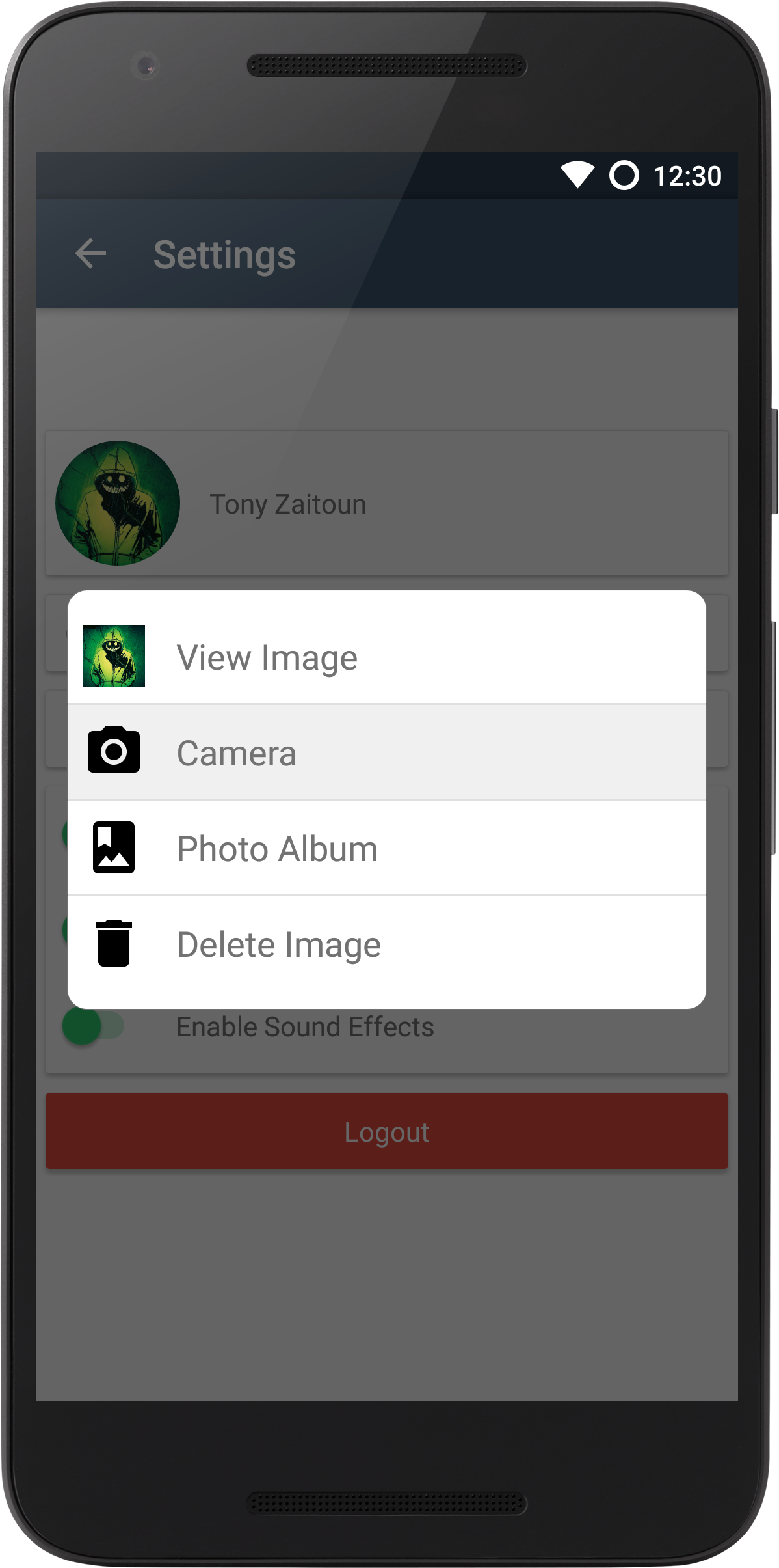
This dialog was inspired by the iOS UIAlertController class. And its main usage is to present a ListView with custom actions inside a dialog. I made this dialog because I simply needed a dialog that can hold more than 3 buttons, So now I can have as many as I want. Note that even if the list view exceeds the screen's limit, there is the built in ScrollView that comes with the ListView. Another important thing to note is that I made this as dynamic as possible, so other developers can also create their own custom action items.
Usage:
 import net.crofis.ui.custom.actionitem.ActionItem;
  import net.crofis.ui.custom.actionitem.ActionItemClickListener;
  import net.crofis.ui.dialog.ActionDialog;
 //First we have to create the list that will contain the action items
  List <ActionItem> items = new ArrayList<>();

 //Fill the list with our desired actions
  Drawable icon = getResources().getDrawable(R.drawable.common_ic_googleplayservices);

  for (int i = 0; i < 4; i++) {

final int finalI = i;

//Create the action item with constructor ActionItem(Drawable,String, ActionItemClickListner);


ActionItem item = new ActionItem(icon, "item " + (i + 1), new ActionItemClickListener() {

 @Override

 public void onActionSelected() {

  //This is what will be triggered when the action is selected.

  Toast.makeText(context,"item "+(finalI +1)+" selected.",Toast.LENGTH_SHORT).show();


}

}
);

 items.add(item);


}

 //Create the ActionDialog object with constuctor ActionDialog(Context,List<ActionItem>)
  final ActionDialog dialog = new ActionDialog(this, items);

 //Optionl customization - set the gravity of the dialog (TOP or BOTTOM)
  //Must import net.crofis.ui.dialog.DialogManager;
  DialogManager.setDialogPosition(dialog,dialog.getDialog(), Gravity.BOTTOM);

 //Set the text - if not set, the TextViews will disappear.
  dialog.setDialogTitle("Select Action");

  dialog.setDialogDescription("Select an action to close the dialog.");

 //Finall, show the dialog
  dialog.show();
Info Dialog
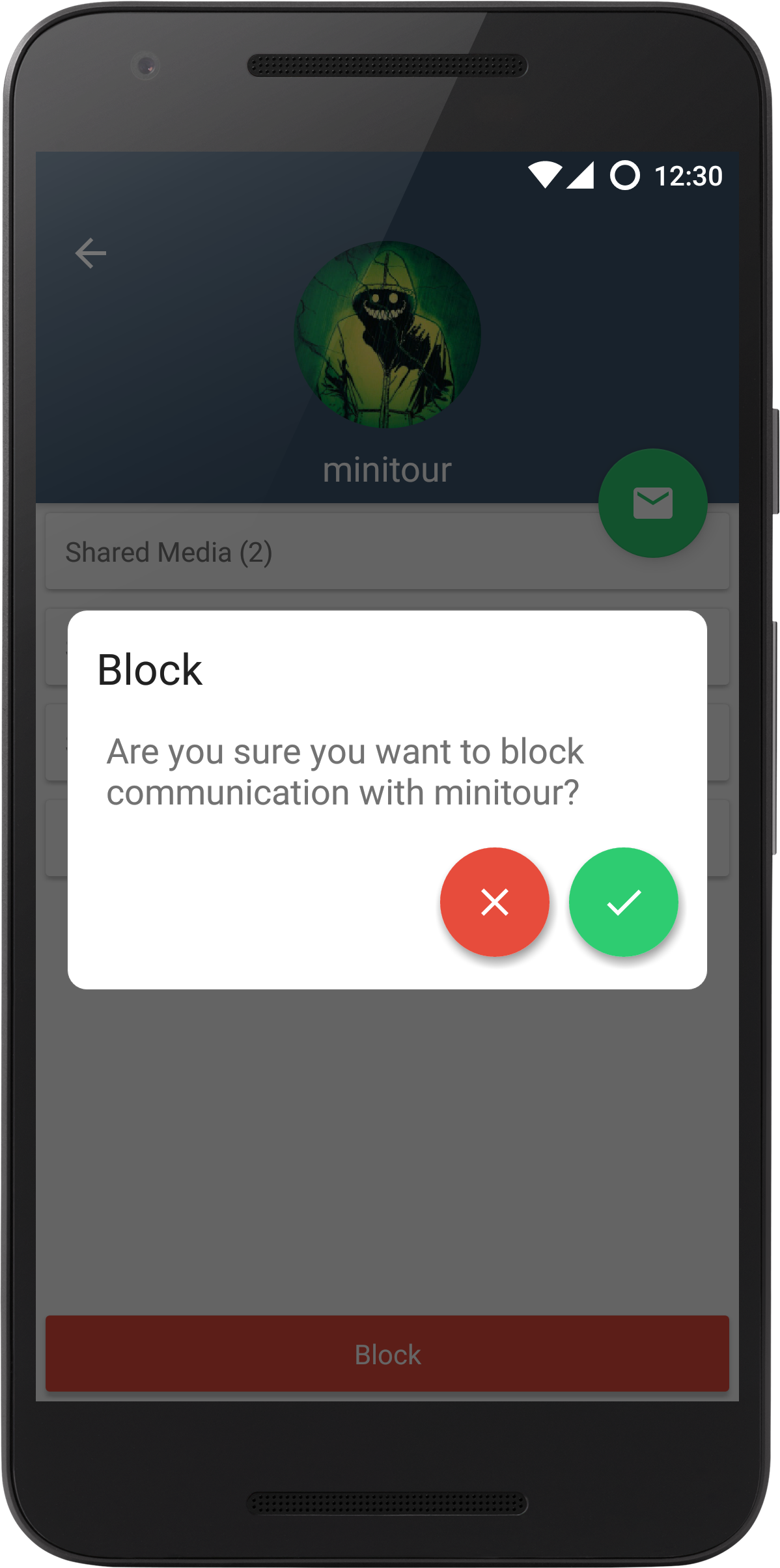
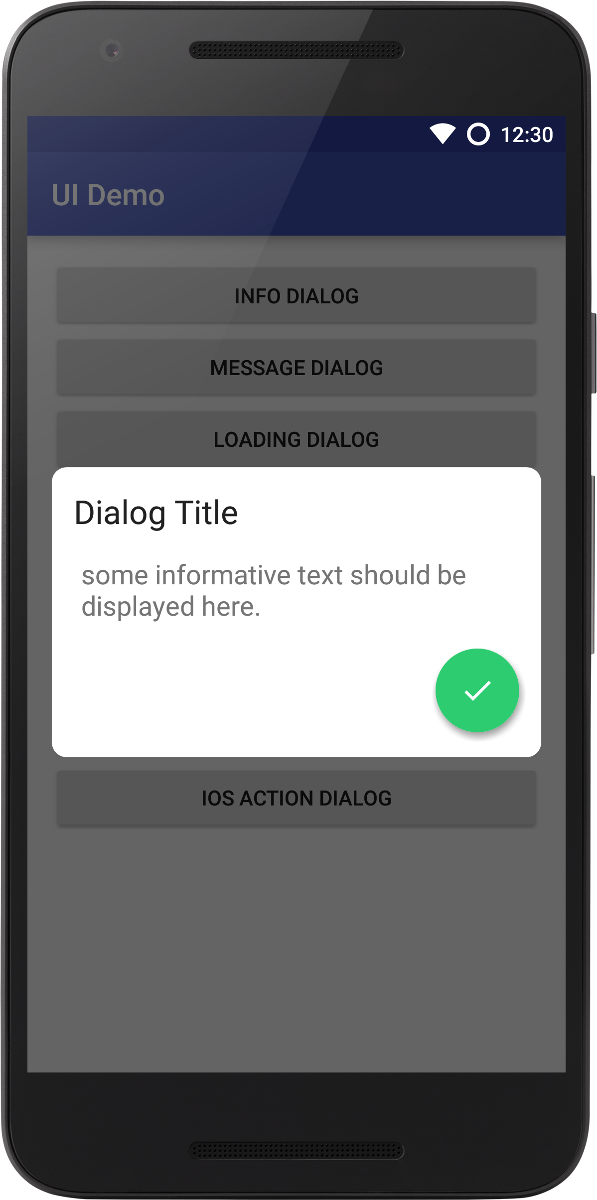
InfoDialog, is the standard dialog, and the best tool in the kit to display the user a message which may or may not be involved with decision making. For example, asking the user if they want to delete an entry. Or using it for verfication, or simply display an informative message.
Usage:
import net.crofis.ui.dialog.InfoDialog;
 DialogManager

.makeDialog(this,"Dialog Title","some informative text should be displayed here.")

.show();
Or if you want something more complex:
 InfoDialog infoDialog = new InfoDialog(this);

  infoDialog.setTitle("My Awesome Title");

  infoDialog.setMessage("Something I want to tell the user");

  infoDialog.setPostiveButtonOnClickListener(new BaseAlertDialog.OnClickListener() {

 @Override

 public void onClick(View v, BaseAlertDialog dialog) {

//Do whatever

//You must add this otherwise the dialog will not dismiss.

dialog.dismiss();


}


}
);

infoDialog. setNegativeButtonOnClickListener(new BaseAlertDialog.OnClickListener() {

 @Override

 public void onClick(View v, BaseAlertDialog dialog) {

//Do whatever

dialog.dismiss();


}


}
);

 infoDialog.show();
Message Dialog
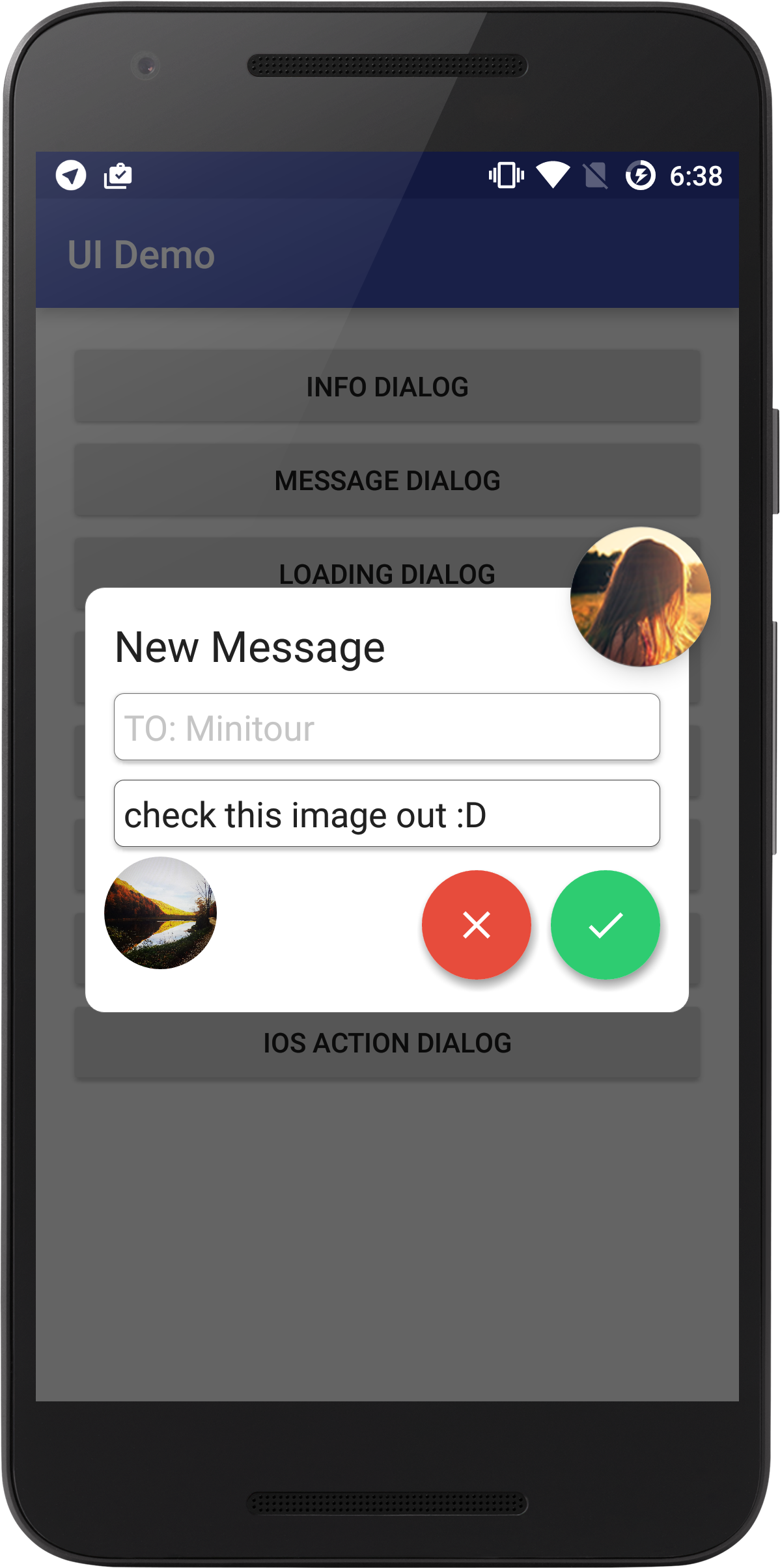
This dialog is meant for application in which a user must submit some sort of input. This dialog has a built in camera dialog - for image attachments, It can also hold an image on the top right of the it, to display a profile picture or an icon.
Usage:
import net.crofis.ui.dialog.NewMessageDialog;
 NewMessageDialog messageDialog = DialogManager.makeMessageDialog(this, "New Message", true);

  messageDialog.setTitle("New Message");

  messageDialog.getInputTitle().setText("TO: Minitour");

  messageDialog.getInputTitle().setEnabled(false);

  messageDialog.setImageBitmap(BitmapFactory.decodeResource(getResources(),R.drawable.demo_pic));

  messageDialog.setPostiveButtonOnClickListener(new BaseAlertDialog.OnClickListener() {

 @Override

 public void onClick(View v, BaseAlertDialog dialog) {

dialog.getDialog().dismiss();

NewMessageDialog d = (NewMessageDialog) dialog;

String message = d.getInputMessage().getText().toString();

Toast.makeText(context, "["+message+"] Message Sent!", Toast.LENGTH_SHORT).show();


}


}
);

 messageDialog.setNegativeButtonOnClickListener(new BaseAlertDialog.OnClickListener() {

  @Override

  public void onClick(View v, BaseAlertDialog dialog) {

dialog.dismiss();


}


}
);

  messageDialog.show();
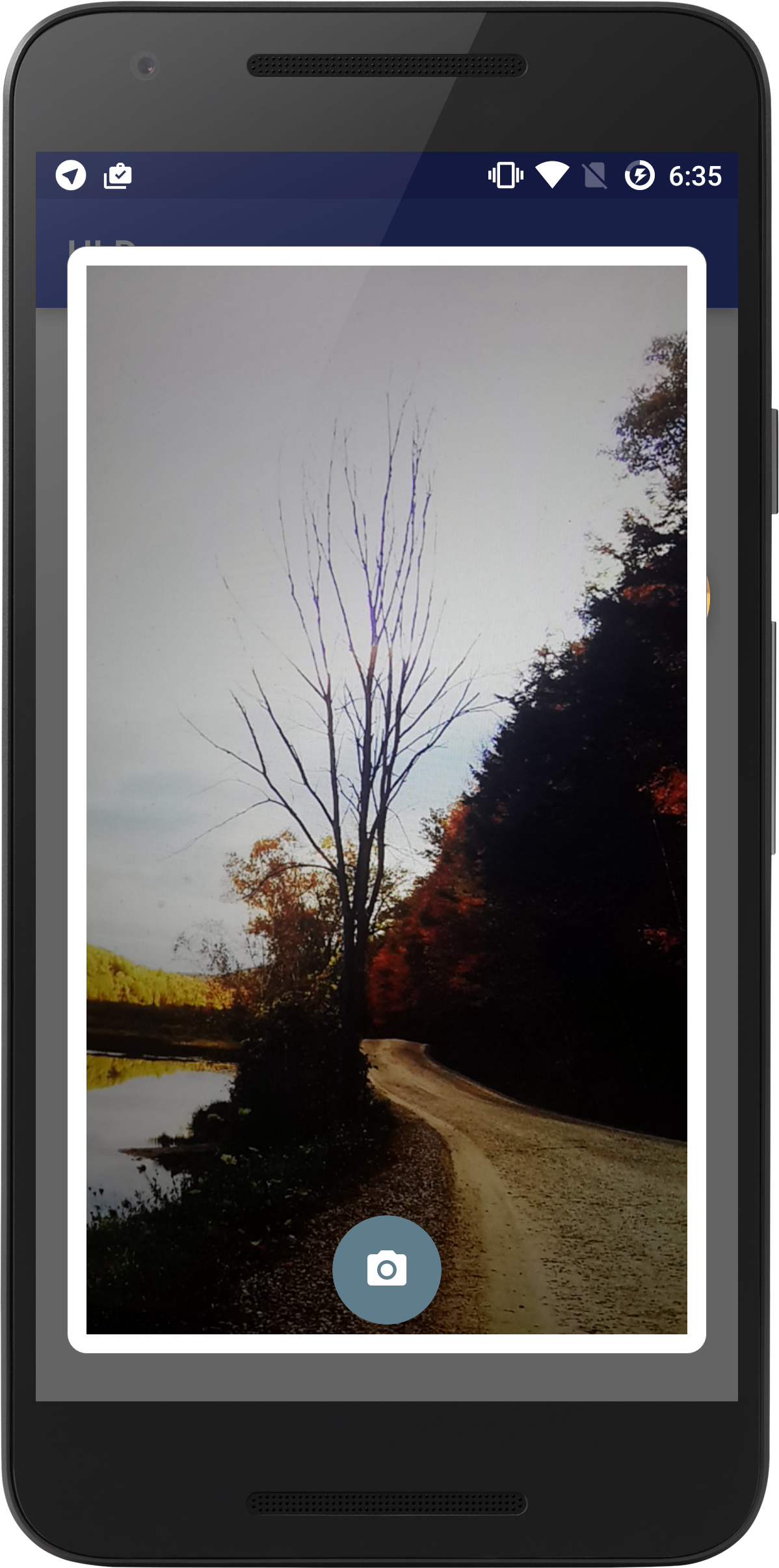
Camera Dialog
Use this camera dialog if you want to give your users something simple to take picture with. Note this may be unstable, thus I recommended you use it in activities where your orientation is fixed.
**Usage:**
import net.crofis.ui.dialog.CameraDialog; Must declare it as a global object - this is due to Android 23 permission system.
private CameraDialog camDialog;Initaliaze & Show:
 public void initCameraDialog(){

camDialog = new CameraDialog(this);

camDialog.show();

camDialog.setPostImageTaken(new CameraDialog.PostPictureTaken() {

  @Override

  public void onConfirmPictureTaken(Bitmap imageTaken, CameraDialog dialog) {

//Do whatever you want with the image that was taken.


}

}
);


}
Grant Permissions - Note that you don't have to do this step, however if you wish to support Android 6.0+ devices (which I recommended) then include the following in your activity:
 @Override
  public void onRequestPermissionsResult(int requestCode, @NonNull String[] permissions, @NonNull int[] grantResults) {

camDialog.onRequestPermissionsResult(requestCode, permissions, grantResults);

super.onRequestPermissionsResult(requestCode, permissions, grantResults);


}
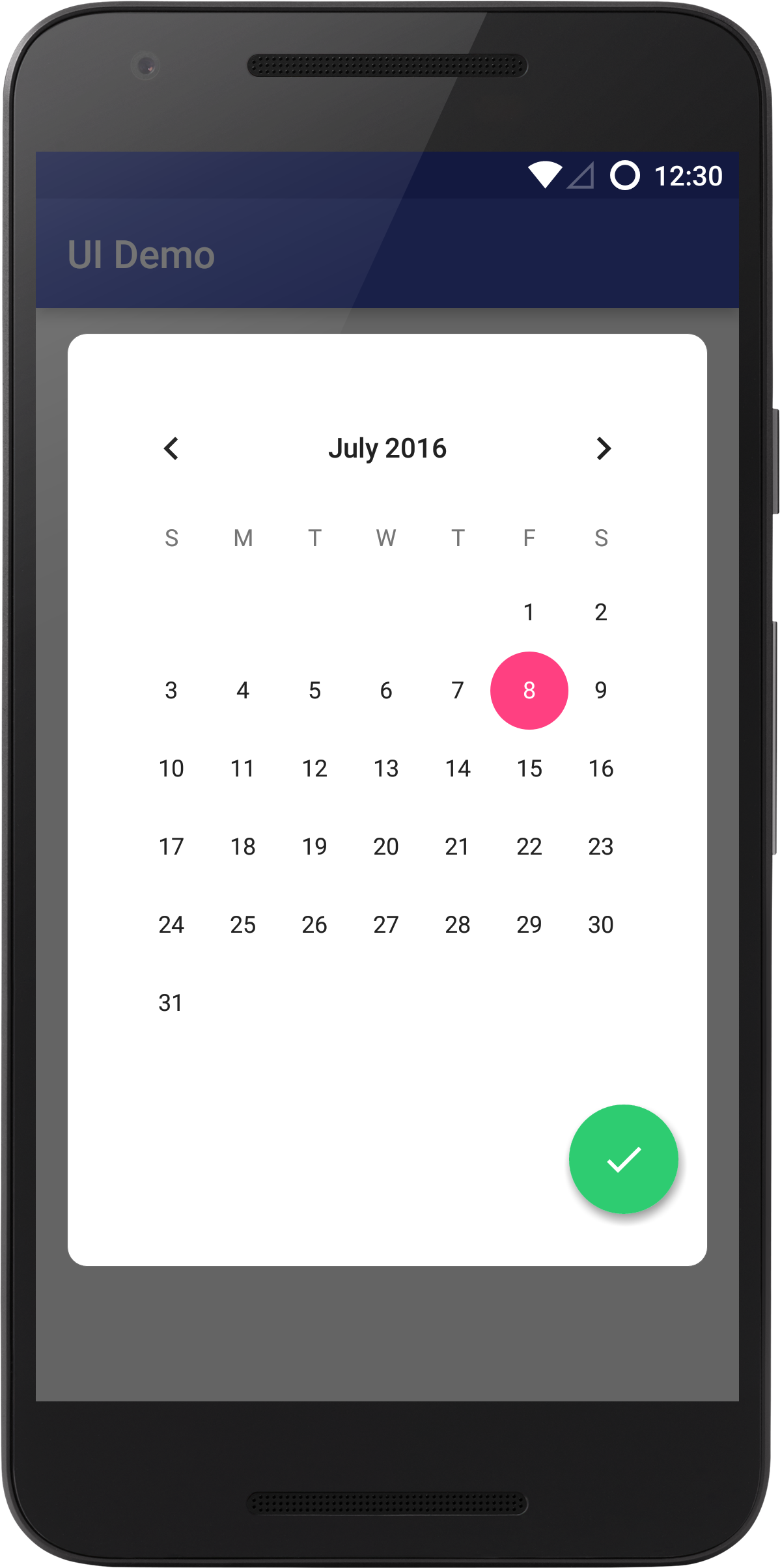
Custom View Dialog
Use this dialog if you want to include your own views, such as sign-up or sign-in.
Usage:
import net.crofis.ui.dialog.CustomViewDialog;
 CustomViewDialog dialog = new CustomViewDialog(this);

 //For this example I will added a CalenderView.
  CalendarView calendarView = new CalendarView(this);

  calendarView.setOnDateChangeListener(new CalendarView.OnDateChangeListener() {

  @Override

  public void onSelectedDayChange(CalendarView view, int year, int month, int dayOfMonth) {


}


}
);

 //Setup Button listener.
  dialog.setPositiveListener(new BaseAlertDialog.OnClickListener() {

 @Override

 public void onClick(View v, BaseAlertDialog dialog) {

dialog.dismiss();


}


}
);

 //Set your custom view.
  dialog.setCustomView(calendarView);

 //show dialog.
  dialog.show();
Credits
This Library makes use of the following dependencies:
SmoothProgressBar by castorflex
android-permission-manager by buchandersenn
