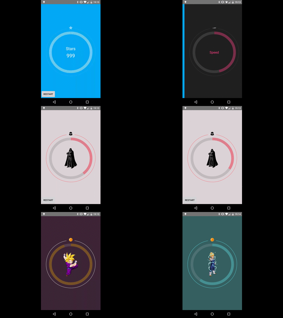
Dashed Circular Progress
A Circular progress animated where you can put any view inside
The minimal sdk supported version is 11
Example
Usage
<com.github.glomadrian.dashedcircularprogress.DashedCircularProgress
android:id="@+id/simple"
android:layout_width="match_parent"
android:layout_height="match_parent"

custom:external_color="#1affffff"
custom:base_color="#6effffff"
custom:min="0"
custom:max="999"
custom:progress_color="#000000"
custom:progress_icon="@drawable/my_awesome_icon"
custom:duration="3500" >
//Put here any view you like to be inside progress bar  </com.github.glomadrian.dashedcircularprogress.DashedCircularProgress>
Remember
Remember put this for custom attribute usage
xmlns:custom="http://schemas.android.com/apk/res-auto" Custom attributes
- External color: The color of the outside line
custom:external_color="#1affffff" - Base color: The color base of the progress bar
custom:base_color="#6effffff" - Progress color: The color of the progress line
custom:progress_color="#000000" - Progress icon: The icon that appears on top
custom:progress_icon="@drawable/my_awesome_icon" - Min: Minimum value for progress
custom:min="0"- Max: Maximun value for progress
custom:max="999"- Duration: Animation duration time in milliseconds
custom:duration="1000"custom:progress_stroke_width="48" // see the simple.xml example for setting the width thicker More xml examples
Code Usage
Attributes
dashedCircularProgress.setExternalColor(awesomeColor);
 dashedCircularProgress.setProgressColor(awesomeColor2);
 dashedCircularProgress.setInternalBaseColor(awesomeColor3);
 dashedCircularProgress.setDuration(2000);
 dashedCircularProgress.setIcon(awesomeIcon);
 dashedCircularProgress.setMin(min);
 dashedCircularProgress.setMax(max);
Animation
dashedCircularProgress.setInterpolator(interpolator);
Update Listener
dashedCircularProgress.setOnValueChangeListener(new DashedCircularProgress.OnValueChangeListener() {

  @Override

  public void onValueChange(float value) {

  //Your code here


}


}
);
Reset, set the value to 0 without animation
dashedCircularProgress.reset();
Transformer
If you put a viewpager inside the Dashed Circular Progress maybe want to use a fade in / out on page change for a more comfortable user experience, use this transformer in your adapter (included in the library)
com.github.glomadrian.dashedcircularprogress.utils.ViewPagerTransformer viewPager.setPageTransformer(true, new ViewPagerTransformer());
Gradle
Repository
repositories {

maven {

  url "http://dl.bintray.com/glomadrian/maven"

}

}
Dependency
compile 'com.github.glomadrian:DashedCircularProgress:1.0@aar'Developer By
Adrián García Lomas
License
Copyright 2015 Adrián García Lomas
Licensed under the Apache License, Version 2.0 (the "License"); you may not use this file except in compliance with the License. You may obtain a copy of the License at
http://www.apache.org/licenses/LICENSE-2.0
Unless required by applicable law or agreed to in writing, software distributed under the License is distributed on an "AS IS" BASIS, WITHOUT WARRANTIES OR CONDITIONS OF ANY KIND, either express or implied. See the License for the specific language governing permissions and limitations under the License.
