DecoView
Powerful animated circular wheel chart library for Android developers.
DecoView is a powerful library that enables creation of highly configurable animated circular charts in your Android apps. It makes it simple to reproduce a user experience like the Google Fit circular wheel view within your own Android app. With extensive customization options it is simple and quick to change the look and feel of the charts to match your UI.

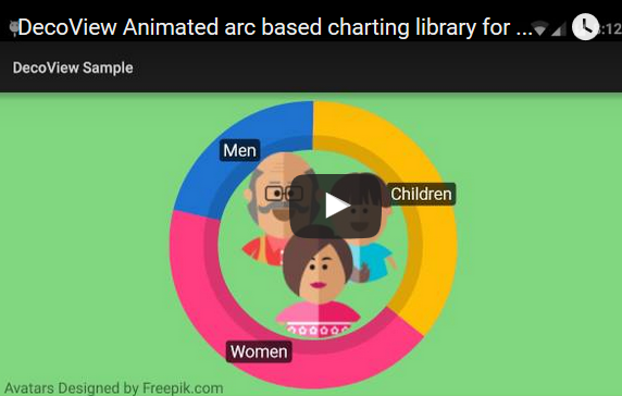
To see DecoView in action take a look at the promo video.
Sample app available from the play store.

Including DecoView in your project
Step 1. Add the repositories into your build.gradle
repositories {

  // ...
  maven {
 url "https://jitpack.io"
}

}
Step 2. Add the dependency in the form
dependencies {

  compile 'com.github.bmarrdev:android-DecoView-charting:v1.2'
}
Usage
DecoView is subclassed from the Android View class. Just like other View subclasses, such as TextView and ImageView, it can be added and configured from your layout XML then controlled in your Activity code.
This repository includes a number of samples for constructing and animating a DecoView. You will find the code for the samples in the sampleapp project.
The main concepts you need to understand are:
- DecoView is a View, it subclasses android.view.View
- Use SeriesItem.Builder to build one or more data series or your DecoView will not be visible
- Use DecoEvent.Builder to schedule animating events for each data series
Add DecoView to your xml layout
<com.hookedonplay.decoviewlib.DecoView
  android:layout_width="match_parent"
  android:layout_height="match_parent"
  android:id="@+id/dynamicArcView"/>
Configure DecoView data series in your Java code
DecoView arcView = (DecoView)findViewById(R.id.dynamicArcView);
  // Create background track arcView.addSeries(new SeriesItem.Builder(Color.argb(255, 218, 218, 218))

.setRange(0, 100, 100)

.setInitialVisibility(false)

.setLineWidth(32f)

.build());
  //Create data series track SeriesItem seriesItem1 = new SeriesItem.Builder(Color.argb(255, 64, 196, 0))

.setRange(0, 100, 0)

.setLineWidth(32f)

.build();
  int series1Index = arcView.addSeries(seriesItem1);
Add events to animate the data series
arcView.addEvent(new DecoEvent.Builder(DecoEvent.EventType.EVENT_SHOW, true)

.setDelay(1000)

.setDuration(2000)

.build());
  arcView.addEvent(new DecoEvent.Builder(25).setIndex(series1Index).setDelay(4000).build());
 arcView.addEvent(new DecoEvent.Builder(100).setIndex(series1Index).setDelay(8000).build());
 arcView.addEvent(new DecoEvent.Builder(10).setIndex(series1Index).setDelay(12000).build());
Chart Shape and orientation
The chart can be a full circle (360 degrees) or part of a circle. The number of degrees and the orientation can be set in the DecoView.
void DecoView.configureAngles(int totalAngle, int rotateAngle);
  decoView.configureAngles(360, 0);
To set the DecoView to be a complete circle pass 360 as the totalAngle. Alternatively 300 degrees will produce a horseshoe shape and 180 will produce a semi-circle.
By default when using a full circle the data series will originate at the top of the screen. By passing 90 as the rotate angle the initial point of the chart will shift 90 degrees clockwise to start at the rightmost point of the circle.
When the view is not a complete circle the default initial point is the bottom of the view. Passing 90 will set the initial point to the leftmost point and 180 the topmost.
Chart Gravity
By default the chart will maintain a square shape regardless of the dimensions of the DecoView in the layout.
You can define the gravity of the chart to stick to the left, center, right or fill horizontally and also the vertical gravity to the top, middle, bottom or fill.
Gravity can be defined in the layout XML:
<com.hookedonplay.decoviewlib.DecoView
  xmlns:custom="http://schemas.android.com/apk/res-auto"
  android:layout_width="match_parent"
  android:layout_height="match_parent"
  android:id="@+id/dynamicArcView"
  custom:dv_arc_gravity_horizontal="Fill"
  custom:dv_arc_gravity_vertical="Bottom"
  android:layout_margin="8dp"/>
Alternatively gravity can be defined within the Java source code:
decoView.setHorizGravity(DecoView.HorizGravity.GRAVITY_HORIZONTAL_FILL);
 decoView.setVertGravity(DecoView.VertGravity.GRAVITY_VERTICAL_BOTTOM);
Constructing a data series
One or more data series can be added to the DecoView. These are created using the SeriesItem.Builder(...) class.
The minimum required to construct a new series is done as follows:
decoView.addSeries(new SeriesItem.Builder(Color.argb(255, 218, 218, 218)).build());
The Builder class has allows you to configure all the options to customize the view to look and behave as you require. Below is a more detailed construction of a SeriesItem that overrides more of the defaults settings
SeriesItem seriesItem1 = new SeriesItem.Builder(Color.argb(255, 64, 196, 0))

.setRange(0, seriesMax, 0)

.setInitialVisibility(false)

.setLineWidth(32f)

.addEdgeDetail(new EdgeDetail(EdgeDetail.EdgeType.EDGE_OUTER, Color.parseColor("#22000000"), 0.4f))

.setSeriesLabel(new SeriesLabel.Builder("Percent %.0f%%").build())

.setInterpolator(new OvershootInterpolator())

.setShowPointWhenEmpty(false)

.setCapRounded(false)

.setInset(new PointF(32f, 32f))

.setDrawAsPoint(false)

.setSpinClockwise(true)

.setSpinDuration(6000)

.setChartStyle(SeriesItem.ChartStyle.STYLE_DONUT)

.build();
Adding a listener to a data series
Once you have a SeriesItem created you can optionally add a SeriesItem.SeriesItemListener() that will allow you to use a callback to monitor the progress of an animation for the data series.
The most common reason to add a listener to a data series will be to display the current percentage or value of the data series.
String format = "%.0f%%";  seriesItem.addArcSeriesItemListener(new SeriesItem.SeriesItemListener() {

  @Override
  public void onSeriesItemAnimationProgress(float percentComplete, float currentPosition) {

if (format.contains("%%")) {

 float percentFilled = ((currentPosition - seriesItem.getMinValue()) / (seriesItem.getMaxValue() - seriesItem.getMinValue()));

 view.setText(String.format(format, percentFilled * 100f));

}
 else {

 view.setText(String.format(format, currentPosition));

}


}

@Override
  public void onSeriesItemDisplayProgress(float percentComplete) {

}

}
);
Note that the progress callback includes a percentComplete parameter. This is the percent complete of the current animation being executed, you can calculate the percent filled using the current position.
Animating the data series
Each data series in the DecoView can be animated in a number of ways.
public enum EventType {

  EVENT_MOVE, /* Move the current position of the chart series */
  EVENT_SHOW, /* Show the chart series using reveal animation */
  EVENT_HIDE, /* Hide the chart series using an animation */
  EVENT_EFFECT, /* Apply effect animation on the series */
  EVENT_COLOR_CHANGE /* Change the color of the series over time */
}
The EventManager allows you to execute the above operations on the data series. These can be performed immediately, or triggered at a future time.
To move the current position of a data series create a new DecoEvent and pass it to the DecoView:
decoView.addEvent(new DecoEvent.Builder(50).setIndex(mSeriesIndex).build());
If you want to execute the event at a future time you can add the delay to the DecoEvent through the DecoEvent.Builder.setDelay(long ms) function.
decoView.addEvent(new DecoEvent.Builder(50).setIndex(mSeriesIndex).setDelay(8000).build());
In the above example some important points to note are:
- The argument '50' passed to the builder function is the position in relation to the range of data initialized with the SeriesItem.Builder().setRange(min, max, initial) function call
- The index that is passed was returned from the DecoView.addSeries(...) function call
- All durations are specified in milliseconds
Adding a listener to an DecoEvent
Adding a listener to a DecoEvent is useful for getting a callback when an event starts and also when an event finishes.
decoView.addEvent(new DecoEvent.Builder(EventType.EVENT_HIDE, false)

.setDelay(19500)

.setDuration(2000)

.setLinkedViews(linkedViews)

.setListener(new DecoEvent.ExecuteEventListener() {

 @Override

 public void onEventStart(DecoEvent event) {

  Log.d(TAG, "Hide of DecoView Starting");


}

  @Override

 public void onEventEnd(DecoEvent event) {

  Log.d(TAG, "Hide of DecoView Complete");


}

}
)

.build());
Configuring animation
Animating the movement when moving the current position of a data series is done using the built-in Android Interpolator classes.
This allows you to set a range of different movements and even use your own algorithm to control the rate of change.
It is possible to configure the Interpolator class used at two different stages. The first opportunity is you can set the Interpolator when you initially add the data series. If you set the Interpolator at creation all animations for that data series will use the Interpolator you specify, unless you override the Interpolator when creating a DecoEvent.
decoView.addSeries(new SeriesItem.Builder(Color.argb(255, 218, 218, 218))

.setRange(0, seriesMax, 0)

.setInterpolator(new AccelerateInterpolator())

.build());
If no Interpolator is set when creating the data series all animations will use the default AccelerateDecelerateInterpolator().
It is also possible to override the Interpolator for each event that is applied to a data series. This will override the Interpolator (if any) set during the creation of the data series.
decoView.addEvent(new DecoEvent.Builder(10)

.setIndex(mSeries1Index)

.setDelay(3000)

.setInterpolator(new OvershootInterpolator())

.build());
Configuring the animation duration
Much like configuring the Interpolator, the total duration taken to complete an animation can be set when creating the data series, or overridden for each event.
decoView.addSeries(new SeriesItem.Builder(Color.argb(255, 218, 218, 218))

.setRange(0, seriesMax, 0)

.setSpinDuration(3000)

.build());
The SpinDuration is the duration that a complete revolution will take. That is the time taken to animate the move from the start to the end of the series. Based on this duration when a DecoEvent moves the current position the duration is automatically calculated based on the amount of rotation required.
To illustrate this with an example, if you set the spin duration to 3 seconds (3000 ms) then move the current position to 50% of the total arc range, then the animation will take 1.5 seconds to complete.
It is also possible to override the duration for each DecoEvent that is applied to the data series.
decoView.addEvent(new DecoEvent.Builder(10)

.setIndex(mSeries1Index)

.setDelay(3000)

.setDuration(2000)

.build());
Adding labels to a data series
Labels can be added to one or more data series. The labels will only be shown when the data series is visible.

Create a SeriesLabel using the SeriesLabel.Builder(String) function. Optionally set the color of the text and background as well as the font typeface.
SeriesItem seriesItem = new SeriesItem.Builder(Color.argb(255, 64, 196, 0))

.setRange(0, seriesMax, 0)

.setSeriesLabel(new SeriesLabel.Builder("Percent %.0f%%")

  .setColorBack(Color.argb(218, 0, 0, 0))

  .setColorText(Color.argb(255, 255, 255, 255))

  .setTypeface(customTypeface)

  .build())

.build();
It is possible to use a custom font for the text used on the data labels. Load the font from your Android assets folder and use the SeriesLabel.Builder().setTypeface(...) to set the font.
Note: Labels are currently not supported on DecoViews which have a data series that move in an anti-clockwise direction.
Insetting arc radius
By default each arc in a series will be located at the center of the widest series of data. The result of this is that two arcs with the same line width will be drawn at the same radius from the center of the view.
It is possible to adjust the radius from the center each series by setting an inset when creating the data series. The image below demonstrates what is possible when changing the inset for each series.

To set an inset during series creation use SeriesItem.Builder#setInset(PointF)
SeriesItem seriesItem = new SeriesItem.Builder(Color.parseColor("#FF00FF00")

.setRange(0, 100, 0)

.setInset(new PointF(20f, 20f))

.build();
It is also possible to move a data series in an outward direction by using a negative inset. To do this you need to ensure that you don't move the data series outside the viewable area of the View.
Animating color change
Solid color change can be animated from one color to another. This can be done as a stand alone event or during a move event.
To animate color change during a move event, construct the event using the builders setColor(int color) function:
decoView.addEvent(new DecoEvent.Builder(10)

.setIndex(mSeries1Index)

.setDelay(3000)

.setColor(Color.parseColor("#FF555555"))

.build());
For another example, the sample fit tracker demonstrates color change during a move event.
The following code demonstrates how to animate color change as a stand alone event. Calling setDuration(...) is mandatory when creating a EVENT_COLOR_CHANGE event.
decoView.addEvent(new DecoEvent.Builder(EventType.EVENT_COLOR_CHANGE, Color.parseColor("#FF555555"))

.setIndex(index)

.setDelay(10000)

.setDuration(2000)

.build());
Note: It is not possible to animate color change on series with a color gradient.
Adding an EdgeDetail to a data series
The EdgeDetail class allows you to apply an effect to the edge of a data series. The image below shows an EdgeDetail applied to each data series.
Construct an EdgeDetail object by passing which edge of the arc to apply the detail and the color and size of the edge detail. The size of the edge detail is specified as a float ranging from 0f to 1.0f where 1.0f will cover the complete arc.
Adding a Edge to a series is done using the SeriesItem.Builder.addEdgeDetail(EdgeDetail) function.
SeriesItem seriesItem = new SeriesItem.Builder(Color.argb(255, 64, 196, 0))

.setRange(0, seriesMax, 0)

.addEdgeDetail(new EdgeDetail(EdgeDetail.EdgeType.EDGE_OUTER, Color.parseColor("#22000000"), 0.4f))

.build();
Note that in the example above the color uses transparency to give the edge of the arc a darker tint of the existing arc color.
NOTE: On Android 4.0 to 4.3 Adding an EdgeDetail to a data series will result in Hardware acceleration being turned off for that DecoView. This is due to these platforms not supporting the clipPath() functions with hardware acceleration. It would be unusual for this cause any noticeable difference to the performance of the View.
Adding a shadow to a SeriesItem
Shadows were introduced in DecoView 1.1, check you gradle dependency before adding shadows.

There are a couple of very important notes before adding shadows.
When creating a DecoView with shadows you must call java DecoView.disableHardwareAccelerationForDecoView();
to disable hardware acceleration for the view. The shadow functionality built into the Android canvas operations are not supported with hardware acceleration. Please note that this may cause performance issues if you are animating multiple views concurrently.
If you are setting a shadow you will most likely want to also add the size of your shadow to the inset of the series item. The reason for this is the the decoView cannot draw outside of the given view canvas. If you don't inset your series then at the top and side edges of the view the shadow will be clipped.
mDecoView = (DecoView) findViewById(R.id.dynamicArcView);
 mDecoView.disableHardwareAccelerationForDecoView();
  final SeriesItem seriesItem = new SeriesItem.Builder(Color.parseColor("#FFFF8800"))

.setRange(0, mSeriesMax, 0)

.setInset(new PointF(30, 30))

.setShadowSize(30)

.setShadowColor(Color.DKGRAY)

.setInitialVisibility(false)

.build();
Fitness tracker Sample
In addition to the samples built in this repository a Fitness tracker sample is available on GitHub.
The steps required to build this sample are detailed in the following article:
https://androidbycode.wordpress.com/2015/08/16/creating-a-google-fit-style-circular-animated-view/
Requirements
Android 2.2+
Credits
- Continuous integration is provided by Travis CI.
- Jake Wharton for NineOldAndroids allowing support for Android 2.2+ devices.
- Infographic vector designed by Freepik
- Avatars designed by Freepik
License
Copyright 2016 Brent Marriott  Licensed under the Apache License, Version 2.0 (the "License");
 you may not use this file except in compliance with the License. You may obtain a copy of the License at
  http://www.apache.org/licenses/LICENSE-2.0  Unless required by applicable law or agreed to in writing, software distributed under the License is distributed on an "AS IS" BASIS, WITHOUT WARRANTIES OR CONDITIONS OF ANY KIND, either express or implied. See the License for the specific language governing permissions and limitations under the License.