 Dividers


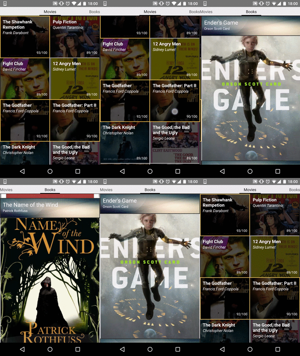
Dividers is an Android library to easily create separators for your RecyclerViews. It supports a wide range of dividers from simple ones, that apply to all your items equally, to a system of selectors that apply different styles to each item.
Screenshots
Usage
The easiest way to start using Dividers is to create a DividerItemDecoration with a layer and provide it to your RecyclerView as follows:
// Create a drawable for your divider Drawable exampleDrawable = getResources().getDrawable(R.drawable.example_drawable);
  // Create a DividerItemDecoration instance with a single layer and add it to your recycler view RecyclerView.ItemDecoration itemDecoration = new DividerItemDecoration(new Layer(DividerBuilder.get().with(exampleDrawable).build()));
 recyclerView.addItemDecoration(itemDecoration);
If you want to use all the features of Dividers follow these steps:
- Create a collection of instances of
Layerwith the help ofLayersBuilderto define the drawables you want to apply. EachLayeris composed of: - An implementation of the
Selectorinterface, defining which items are going to be affected by the layer. You can use one of the multiple implementations that come in the library or create your own.
public class HighRatingMovieSelector implements Selector {

 private final List<Movie> movies;
private final int maxHighRating;
 public HighRatingMovieSelector(List<Movie> movies, int maxHighRating) {

  this.movies = movies;
  this.maxHighRating = maxHighRating;

}

 @Override public boolean isPositionSelected(Position position) {

  return movies.get(position.getAbsoluteIndex()).getRating() >= maxHighRating;

}

 @Override public EnumSet<Direction> getDirectionsByPosition(Position position) {

  return EnumSet.allOf(Direction.class);

}

}
- An instance of
Divider, containing the drawable that is going to be used to render the separator. Create them using theDividerBuilderclass.
Drawable drawable = getResources().getDrawable(R.drawable.example_divider);
Divider divider = DividerBuilder.from(highlightedDrawable).build()- Finally, create a collection of
Layerinstances with the help ofLayersBuilder
Collection<Layer> layers = LayersBuilder.with(new Layer(new HighRatingMovieSelector(), divider)).build();
- Create a new instance of
DividerItemDecorationwith your newly created layers.
RecyclerView.ItemDecoration itemDecoration = new DividerItemDecoration(layers);
- Add your
DividerItemDecorationto yourRecyclerViewusing theaddItemDecorationmethod.
recyclerView.addItemDecoration(itemDecoration);
Selectors
Selectors give you the possibility to apply different configurations to a fixed set of items of your view. There are multiple implementations to apply the same separator to every item in a single row ( AllItemsInRowSelector) or column ( AllItemsInColumnSelector).
For example, to show the divider in all the elements except the header you can use the following snippet:
Drawable drawable = getResources().getDrawable(R.drawable.example_drawable);
  // Create a layer that applies to all the layers. It's the same as writing : // Layer allItemsLayer = new Layer(new AllItemsSelector(), DividerBuilder.from(drawable).build());
 Layer allItemsLayer = new Layer(DividerBuilder.from(drawable).build());
  // Create a layer that applies to all the items in the header with an empty drawable to avoid displaying anything Layer headerLayer = new Layer(new HeaderSelector(), DividerBuilder.fromEmpty().build());
  // Add your layers to the DividerItemDecoration class and provide it to your recycler view! recyclerView.addItemDecoration(new DividerItemDecoration(LayersBuilder.from(allItemsLayer, headerLayer).build()));
You can also create your own Selector to apply dividers to all items but the ones in the header:
public class NotInHeaderSelector implements Selector {

@Override public boolean isPositionSelected(Position position) {

  return !position.isFirstRow();

}

 @Override public EnumSet<Direction> getDirectionsByPosition(Position position) {

  return EnumSet.allOf(Direction.class);

}

}
As you have seen, selectors also let you apply a divider to some sides of every item depending on things such as the position. In this way you can create selectors to display items as a whole, you can take a look at some examples like RowGroupSelector:
public class RowGroupSelector extends AllItemsInRowSelector {

 protected final int row;
 public RowGroupSelector(int row) {

  this.row = row;

}

 @Override public boolean isPositionSelected(Position position) {

  return position.getRow() == row;

}

 @Override public EnumSet<Direction> getDirectionsByPosition(Position position) {

  // Every component of the row will need to draw, at least, SOUTH_WEST, WEST, NORTH_WEST,
  // NORTH_EAST, EAST and SOUTH_EAST directions
  EnumSet<Direction> directions = EnumSet.complementOf(

EnumSet.of(Direction.WEST, Direction.EAST));

// If we are the element of the left side we also need to draw the west direction
  if (position.isFirstColumn()) {

 directions.add(Direction.WEST);


}

  // If we are the element of the right side we also need to draw the east direction
  if (position.isLastColumn()) {

 directions.add(Direction.EAST);


}

return directions;

}

}
Dividers
Dividers are the smallest components that can be rendered and represent all the separators for a single cell. Internally, dividers are represented as a grid of 3x3 elements (ignoring the center). Each side can be referenced with a value from the enum Direction. This can prove useful when defining complex dividers such as the ones used in headers or footers.
Add it to your project
Add Dividers dependency to your build.gradle file
dependencies{

  compile 'com.karumi:dividers:1.0.1'
}
or to your pom.xml if you are using Maven instead of Gradle
<dependency>
  <groupId>com.karumi</groupId>
  <artifactId>dividers</artifactId>
  <version>1.0.1</version>
  <type>aar</type> </dependency>
Do you want to contribute?
Feel free to add any useful feature to the library, we will be glad to improve it :)
Libraries used in this project
External resources used in this project
- IMDB.com ©
License
Copyright 2015 Karumi  Licensed under the Apache License, Version 2.0 (the "License");
 you may not use this file except in compliance with the License. You may obtain a copy of the License at
http://www.apache.org/licenses/LICENSE-2.0 Unless required by applicable law or agreed to in writing, software distributed under the License is distributed on an "AS IS" BASIS, WITHOUT WARRANTIES OR CONDITIONS OF ANY KIND, either express or implied. See the License for the specific language governing permissions and limitations under the License. 