FlexboxLayout
FlexboxLayout is a library project which brings the similar capabilities of CSS Flexible Box Layout Module to Android.
Installation
Add the following dependency to your build.gradle file:
dependencies {

  compile 'com.google.android:flexbox:0.3.1'
}
Usage
There are two ways of using Flexbox in your layout.
FlexboxLayout
The first one is FlexboxLayout that extends the ViewGroup like LinearLayout and RelativeLayout. You can specify the attributes from a layout XML like:
<com.google.android.flexbox.FlexboxLayout
  xmlns:android="http://schemas.android.com/apk/res/android"
  xmlns:app="http://schemas.android.com/apk/res-auto"
  android:layout_width="match_parent"
  android:layout_height="match_parent"
  app:flexWrap="wrap"
  app:alignItems="stretch"
  app:alignContent="stretch" >

<TextView

android:id="@+id/textview1"

android:layout_width="120dp"

android:layout_height="80dp"

app:layout_flexBasisPercent="50%"

/>

<TextView

android:id="@+id/textview2"

android:layout_width="80dp"

android:layout_height="80dp"

app:layout_alignSelf="center"

/>

<TextView

android:id="@+id/textview3"

android:layout_width="160dp"

android:layout_height="80dp"

app:layout_alignSelf="flex_end"

/> </com.google.android.flexbox.FlexboxLayout>
Or from code like:
FlexboxLayout flexboxLayout = (FlexboxLayout) findViewById(R.id.flexbox_layout);
 flexboxLayout.setFlexDirection(FlexDirection.ROW);
  View view = flexboxLayout.getChildAt(0);
 FlexboxLayout.LayoutParams lp = (FlexboxLayout.LayoutParams) view.getLayoutParams();
 lp.order = -1; lp.flexGrow = 2; view.setLayoutParams(lp);
FlexboxLayoutManager (within RecyclerView)
The second one is FlexboxLayoutManager that can be used within RecyclerView.
RecyclerView recyclerView = (RecyclerView) context.findViewById(R.id.recyclerview);
 FlexboxLayoutManager layoutManager = new FlexboxLayoutManager(context);
 layoutManager.setFlexDirection(FlexDirection.COLUMN);
 layoutManager.setJustifyContent(JustifyContent.FLEX_END);
 recyclerView.setLayoutManager(layoutManager);
or for the attributes for the children of the FlexboxLayoutManager you can do like:
mImageView.setImageDrawable(drawable);
 ViewGroup.LayoutParams lp = mImageView.getLayoutParams();
 if (lp instanceof FlexboxLayoutManager.LayoutParams) {

  FlexboxLayoutManager.LayoutParams flexboxLp = (FlexboxLayoutManager.LayoutParams) lp;
  flexboxLp.setFlexGrow(1.0f);

  flexboxLp.setAlignSelf(AlignSelf.FLEX_END);

}
The advantage of using FlexboxLayoutManager is that it recycles the views that go off the screen for reuse for the views that are appearing as the user scrolls instead of inflating every individual view, which consumes much less memory especially when the number of items contained in the Flexbox container is large.

Supported attributes / features comparison
Due to some characteristics of RecyclerView, some Flexbox attributes are not available/not implemented to the FlexboxLayoutManager. Here is a quick overview of the attributes/features comparison between the two implementations.
| Attribute / Feature | FlexboxLayout | FlexboxLayoutManager (RecyclerView) |
|---|---|---|
| flexDirection |  | |
| flexWrap | | (except wrap_reverse) |
| justifyContent | | |
| alignItems | | |
| alignContent | | - |
| layout_order | | - |
| layout_flexGrow | | |
| layout_flexShrink | | |
| layout_alignSelf | | |
| layout_flexBasisPercent | | |
| layout_(min/max)Width | | |
| layout_(min/max)Height | | |
| layout_wrapBefore | | |
| Divider | | |
| View recycling | - | |
| Scrolling | *1 | |
*1 Partially possible by wrapping it with ScrollView. But it isn't likely to work with large set of views inside the layout. Because it doesn't consider view recycling.
Supported attributes
Attributes for the FlexboxLayout:
-
flexDirection
-
This attribute determines the direction of the main axis (and the cross axis, perpendicular to the main axis). The direction children items are placed inside the Flexbox layout. Possible values are:
- row (default)
- row_reverse
- column
- column_reverse

-
-
flexWrap
-
This attribute controls whether the flex container is single-line or multi-line, and the direction of the cross axis. Possible values are:
- nowrap (default)
- wrap
- wrap_reverse
-
-
justifyContent
-
This attribute controls the alignment along the main axis. Possible values are:
- flex_start (default)
- flex_end
- center
- space_between
- space_around
-
-
alignItems
-
This attribute controls the alignment along the cross axis. Possible values are:
- stretch (default)
- flex_start
- flex_end
- center
- baseline

-
-
alignContent
-
This attribute controls the alignment of the flex lines in the flex container. Possible values are:
- stretch (default)
- flex_start
- flex_end
- center
- space_between
- space_around
-
-
showDividerHorizontal (one or more of
none | beginning | middle | end) -
dividerDrawableHorizontal (reference to a drawable)
- Puts horizontal dividers between flex lines (or flex items when flexDirection is set to
columnorcolumn_rebase).
- Puts horizontal dividers between flex lines (or flex items when flexDirection is set to
-
showDividerVertical (one or more of
none | beginning | middle | end) -
dividerDrawableVertical (reference to a drawable)
- Puts vertical dividers between flex items (or flex lines when flexDirection is set to
columnorcolumn_rebase).
- Puts vertical dividers between flex items (or flex lines when flexDirection is set to
-
showDivider (one or more of
none | beginning | middle | end) -
dividerDrawable (reference to a drawable)
- Shorthand for setting both horizontal and vertical dividers. Note that if used with other attributes (such as
justifyContent="space_around"oralignContent="space_between"... etc) for putting spaces between flex lines or flex items, you may see unexpected spaces. Please avoid using these at the same time.
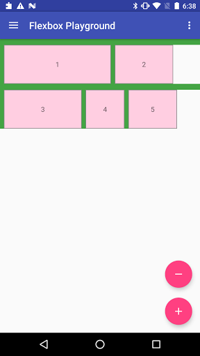
Example of putting both vertical and horizontal dividers.
res/drawable/divider.xml<shape xmlns:android="http://schemas.android.com/apk/res/android"> <size android:width="8dp" android:height="12dp" /> <solid android:color="#44A444" /> </shape>
res/layout/content_main.xml<com.google.android.flexbox.FlexboxLayout xmlns:android="http://schemas.android.com/apk/res/android" xmlns:app="http://schemas.android.com/apk/res-auto" android:layout_width="match_parent" android:layout_height="match_parent" app:alignContent="flex_start" app:alignItems="flex_start" app:flexWrap="wrap" app:showDivider="beginning|middle" app:dividerDrawable="@drawable/divider" > <TextView style="@style/FlexItem" android:layout_width="220dp" android:layout_height="80dp" android:text="1" /> <TextView style="@style/FlexItem" android:layout_width="120dp" android:layout_height="80dp" android:text="2" /> <TextView style="@style/FlexItem" android:layout_width="160dp" android:layout_height="80dp" android:text="3" /> <TextView style="@style/FlexItem" android:layout_width="80dp" android:layout_height="80dp" android:text="4" /> <TextView style="@style/FlexItem" android:layout_width="100dp" android:layout_height="80dp" android:text="5" />
- Shorthand for setting both horizontal and vertical dividers. Note that if used with other attributes (such as


Attributes for the children of a FlexboxLayout
-
layout_order (integer)
-
This attribute can change how the ordering of the children views are laid out. By default, children are displayed and laid out in the same order as they appear in the layout XML. If not specified,
1is set as a default value.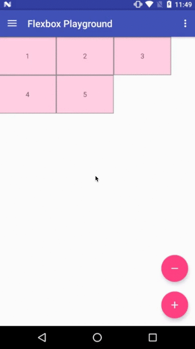
-
-
layout_flexGrow (float)
-
This attribute determines how much this child will grow if positive free space is distributed relative to the rest of other flex items included in the same flex line. If a flex item has a positive
layout_flexGrowvalue, the item will take up the remaining space in the flex line. If multiple flex items in the same flex line have positivelayout_flexGrowvalues, the remaining free space is distributed depending on the proportion of their declaredlayout_flexGrowvalue. (Similar to thelayout_weightattribute in theLinearLayout) If not specified,0is set as a default value.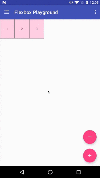
-
-
layout_flexShrink (float)
-
This attribute determines how much this child will shrink if negative free space is distributed relative to the rest of other flex items included in the same flex line. If not specified,
1is set as a default value.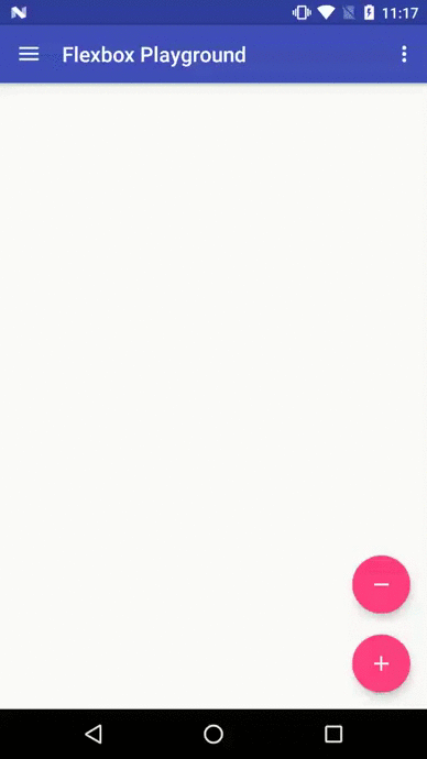
-
-
layout_alignSelf
-
This attribute determines the alignment along the cross axis (perpendicular to the main axis). The alignment in the same direction can be determined by the
alignItemsin the parent, but if this is set to other thanauto, the cross axis alignment is overridden for this child. Possible values are:- auto (default)
- flex_start
- flex_end
- center
- baseline
- stretch
-
-
layout_flexBasisPercent (fraction)
-
The initial flex item length in a fraction format relative to its parent. The initial main size of this child view is trying to be expanded as the specified fraction against the parent main size. If this value is set, the length specified from
layout_width(orlayout_height) is overridden by the calculated value from this attribute. This attribute is only effective when the parent's length is definite (MeasureSpec mode isMeasureSpec.EXACTLY). The default value is-1, which means not set.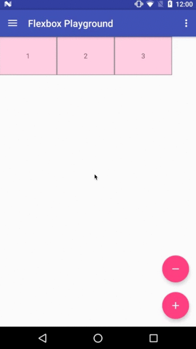
-
-
layout_minWidth / layout_minHeight (dimension)
-
These attributes impose minimum size constraints for the children of FlexboxLayout. A child view won't be shrank less than the value of these attributes (varies based on the
flexDirectionattribute as to which attribute imposes the size constraint along the main axis) regardless of thelayout_flexShrinkattribute.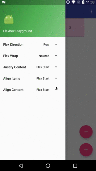
-
-
layout_maxWidth / layout_maxHeight (dimension)
-
These attributes impose maximum size constraints for the children of FlexboxLayout. A child view won't be expanded more than the value of these attributes (varies based on the
flexDirectionattribute as to which attribute imposes the size constraint along the main axis) regardless of thelayout_flexGrowattribute.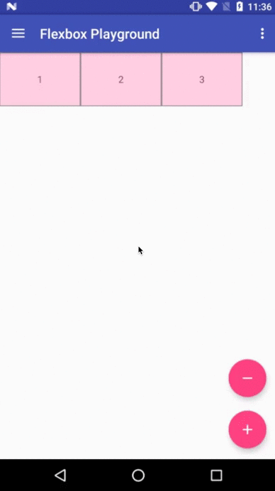
-
-
layout_wrapBefore (boolean)
-
This attribute forces a flex line wrapping, the default value is
false. i.e. if this is set totruefor a flex item, the item will become the first item of a flex line. (A wrapping happens regardless of the flex items being processed in the the previous flex line) This attribute is ignored if theflex_wrapattribute is set tonowrap. The equivalent attribute isn't defined in the original CSS Flexible Box Module specification, but having this attribute is useful for Android developers. For example, to flatten the layouts when building a grid like layout or for a situation where developers want to put a new flex line to make a semantic difference from the previous one, etc.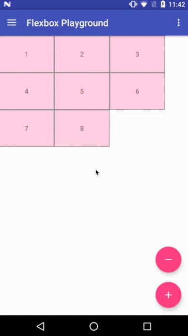
-


Others
Known differences from the original CSS specification
This library tries to achieve the same capabilities of the original Flexible Box specification as much as possible, but due to some reasons such as the way specifying attributes can't be the same between CSS and Android XML, there are some known differences from the original specification.
(1) There is no flex-flow equivalent attribute
- Because
flex-flowis a shorthand for setting theflex-directionandflex-wrapproperties, specifying two attributes from a single attribute is not practical in Android.
(2) There is no flex equivalent attribute
- Likewise
flexis a shorthand for setting theflex-grow,flex-shrinkandflex-basis, specifying those attributes from a single attribute is not practical.
(3) layout_flexBasisPercent is introduced instead of flexBasis
- Both
layout_flexBasisPercentin this library andflex-basisproperty in the CSS are used to determine the initial length of an individual flex item. Theflex-basisproperty accepts width values such as1em,10px, andcontentas strings as well as percentage values such as10%and30%.layout_flexBasisPercentonly accepts percentage values. However, specifying initial fixed width values can be done by specifying width (or height) values in layout_width (or layout_height, varies depending on theflexDirection). Also, the same effect can be done by specifying "wrap_content" in layout_width (or layout_height) if developers want to achieve the same effect as 'content'. Thus,layout_flexBasisPercentonly accepts percentage values, which can't be done through layout_width (or layout_height) for simplicity.
(4) layout_wrapBefore is introduced.
- The equivalent attribute doesn't exist in the CSS Flexible Box Module specification, but as explained above, Android developers will benefit by having this attribute for having more control over when a wrapping happens.
Xamarin Binding
Xamarin binding is now available on NuGet thanks to @btripp
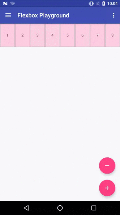
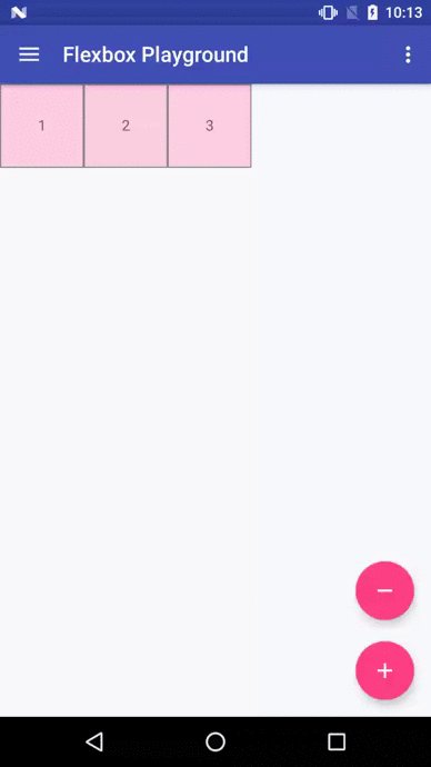
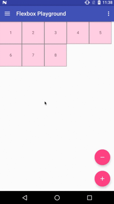
Demo apps
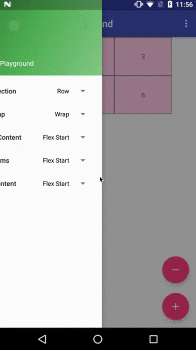
Flexbox Playground demo app
The demo-playground module works as a playground demo app for trying various values for the supported attributes. You can install it by
./gradlew demo-playground:installDebug Cat gallery demo app
The demo-cat-gallery module showcases the usage of the FlexboxLayoutManager inside the RecyclerView that handles various sizes of views aligned nicely regardless of the device width like the Google Photo app without loading all the images on the memory. Thus compared to using the {
@link FlexboxLayout
}
, it's much less likely to abuse the memory, which some times leads to the OutOfMemoryError.
./gradlew demo-cat-gallery:installDebug How to make contributions
Please read and follow the steps in CONTRIBUTING.md
License
Please see LICENSE