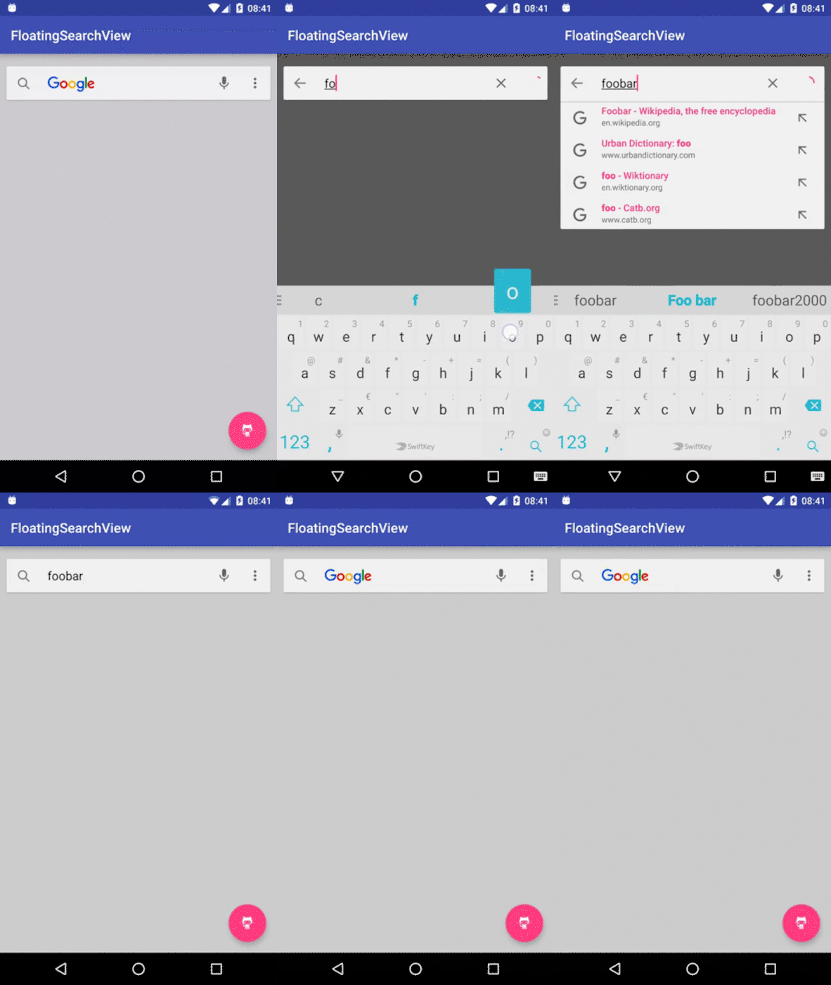
FloatingSearchView 
Yet another floating search view implementation, also known as persistent search: that implementation fully supports menu (including submenu), logo and animated icon. Dropdown suggestions are backed by a RecyclerView and you can provide your own RecyclerView.Adapter, ItemDecorator or ItemAnimator. No hiding.
Usage
Add a FloatingSearchView to your view hierarchy, make sure that it takes up the full width and height:
<com.mypopsy.widget.FloatingSearchView

android:id="@+id/search"

android:layout_width="match_parent"

android:layout_height="match_parent"

android:paddingTop="16dp"

android:paddingRight="8dp"

android:paddingLeft="8dp"

android:background="#90000000"

android:hint="@string/hint"

app:logo="@drawable/logo"

app:fsv_menu="@menu/search"/>
See the supported attributes.
Then, configure your instance and set your listeners to react accordingly:
mSuggestionsAdapter = new MySuggestionsAdapter();
 // use a RecyclerView.Adapter mSearchView.setAdapter(mSuggestionsAdapter);
 ... mSearchView.setOnIconClickListener(...);
 mSearchView.setOnSearchListener(...);

mSearchView.addTextChangedListener(...);
 mSearchView.setOnSearchFocusChangedListener(...);
Look at the sample.
Menu
The implementation fully supports menu (and submenu):
<com.mypopsy.widget.FloatingSearchView ... app:fsv_menu="@menu/search" />mSearchView.setOnMenuItemClickListener(...);
Menu items can be automatically hidden when the search view gets focus depending on the value of the MenuItem's showAsAction:
<?xml version="1.0" encoding="utf-8"?> <menu xmlns:android="http://schemas.android.com/apk/res/android" xmlns:app="http://schemas.android.com/apk/res-auto">
  <item android:id="@+id/menu1" ... app:showAsAction="always"/> // always shown
  <item android:id="@+id/menu2" ... app:showAsAction="ifRoom"/> // will hide on focus

<item android:id="@+id/menu3" ... app:showAsAction="never"/>  // will go into the overflow menu </menu>
Animated Icon
FloatingSearchView will automagically animate icons drawable, given they declare a progress property:
void setProgress(float)float getProgress()
example:
DrawerArrowDrawableor ToggleDrawable
Other
Since the implementation tries to focus on core logic instead of business logic as much as possible, common features like "tap to clear", "speech to text" or "loading progress" are voluntarily NOT built-in because they can be easily implemented using menu items as seen in the sample.
Styling
FloatingSearchView do not expose most of TextView's XML attributes ( textColor, textSize...). You can style them using theme attributes by applying app:theme for example:
First, create a dedicated theme, possibly heriting from your application theme:
<!-- your custom theme --> <style name="CustomFloatingSearchViewTheme" parent="AppTheme">
  <item name="editTextStyle">@style/searchViewEditTextStyle</item>
  <item name="android:divider">#c9c9c9</item>
  <item name="android:dividerHeight">1dp</item>
  <item name="colorControlNormal">#696969</item> </style>  <!-- your custom search view text style -->  <style name="searchViewEditTextStyle" parent="Widget.AppCompat.EditText">
  <item name="android:textSize">18sp</item>
  <item name="android:textColor">?android:attr/textColorPrimary</item>
  <item name="android:imeOptions">actionSearch</item> </style>
Then, apply your custom theme through app:theme:
<com.mypopsy.widget.FloatingSearchView ... app:theme="@style/CustomFloatingSearchViewTheme" />Look at the sample.
Install
This repository can be found on JitPack:
https://jitpack.io/#renaudcerrato/FloatingSearchView
Add it in your root build.gradle at the end of repositories:
allprojects {

repositories {

 ...
 maven {
 url "https://jitpack.io"
}

}

}
Add the dependency:
dependencies {

 compile 'com.github.renaudcerrato:FloatingSearchView:1.0.1'
}
