MagicaSakura
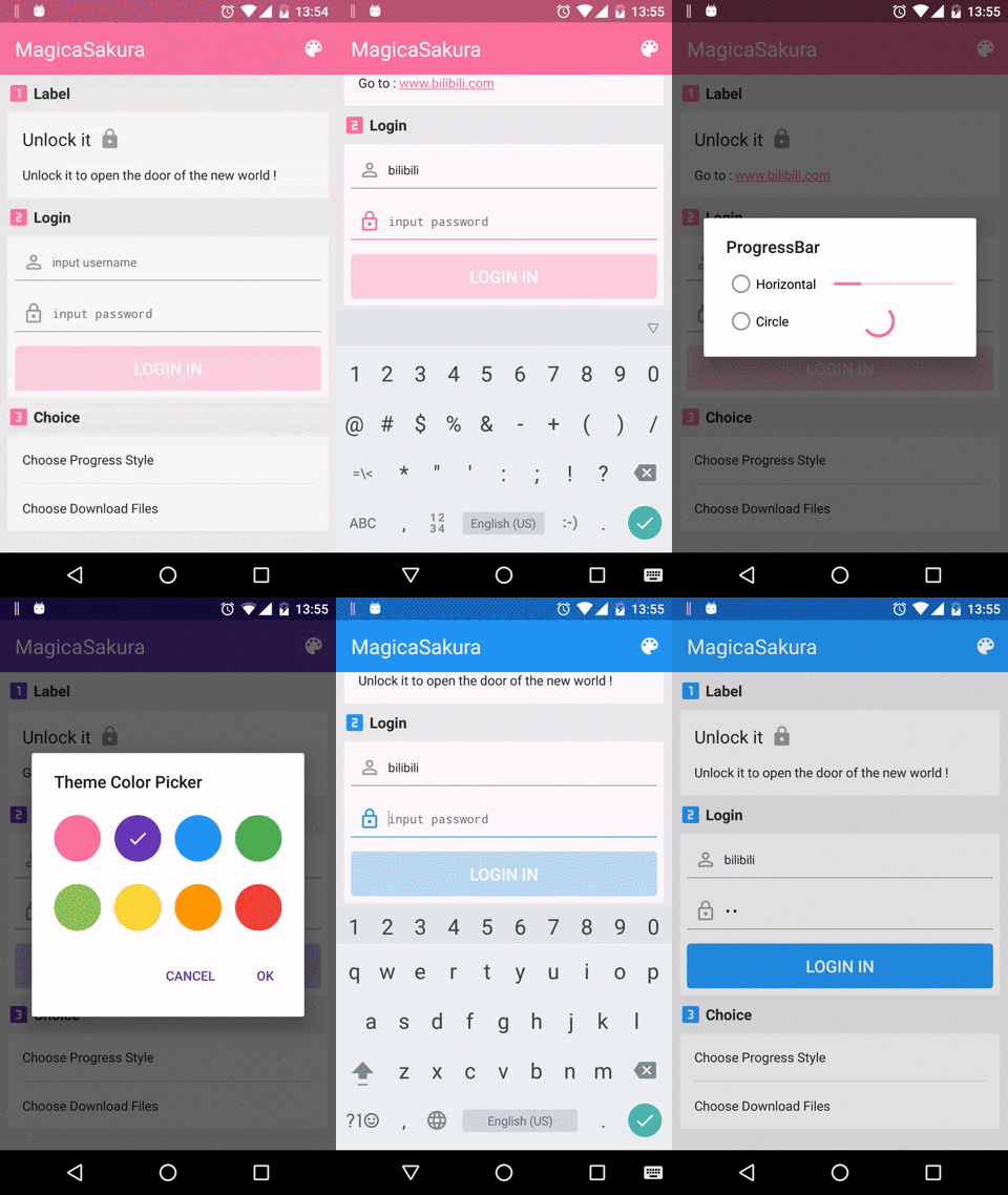
MagicaSakura is an Android multi theme library which supporting both daily colorful theme and night theme.
Feature
- Support both the daily colorful theme and the night theme.
- Switch different theme without recreating activities.
- Provide TintXXX Widgets for adapting multi theme to be more convenient and fast.
- Just writie a drawable.xml or layout.xml can be automatically adapted to different theme styles.
- Offer backward-compatible versions of the Android system that can be used with 4.0.3 or higher.
- Support Vector Drawable with appcompat-v7.
- Easy to integrate to your app.
Demo
You can download the lastest sample apk from Google Play.
Gradle Dependency
compile 'com.bilibili:magicasakura:0.1.8@aar' Maven Dependency
<dependency>
<groupId>com.bilibili</groupId>
<artifactId>magicasakura</artifactId>
<version>0.1.8</version>
<type>aar</type> </dependency>
Usage
- STEP1 :
Define your app global theme color variates in values/color.xml, like as:
<color name="theme_color_primary">#fb7299</color> <color name="theme_color_primary_dark">#b85671</color> <color name="theme_color_primary_trans">#99f0486c</color>Must use these color variates in layout xml , color xml or drawable xml when these xml files need to be automatically adapted to different theme styles. If you use direct color value or other color variates, adapting different theme styles will be out of work.
- STEP2 :
Implement ThemeUtils.switchColor interface in the app Applaction; You Define your own rules combining with the color variates(defining in Step 1) for switching different colors when choosing different themes.
public class MyApplication extends Application implements ThemeUtils.switchColor {

@Override

public void onCreate() {

 super.onCreate();

 //init

 ThemeUtils.setSwitchColor(this);

}

@Override

public int replaceColorById(Context context, @ColorRes int colorId) {

  ...

  if(ThemeHelper.getThemeId(context) == "blue"){

switch (colorId) {

  // define in Step 1

  case R.color.theme_color_primary:

 return R.color.blue;

 ...

}

  ...

}

 @Override

public int replaceColor(Context context, @ColorInt int originColor) {

  if (ThemeHelper.isDefaultTheme(context)) {

return originColor;


}

  ...

}

}
- STEP3 :
The library provides a series of TintXXX widgets which including most common android widgets.
When some place in your app needs to adapter multi theme, you can use these TintXXX widgets combining with the color variates(defining in Step 1) or color xml(using the color variates) or drawable xml(the color variates) , then they will be auto adapting.
-
Drawable Xml TintXXX widgets support common drawable xml tag, such as , , , , and etc in drawable xml.
(Note: when using not supporting drawable xml tag, just can't be adapted to multi theme)
Specially, TintXXX widgets additional support directly tint drawable with app:drawableTint and app:drawableTintMode and set color alpha with android:alpha.
Here is an example:
//drawable xml //tint directly <selector
xmlns:android="http://schemas.android.com/apk/res/android"
xmlns:app="http://schemas.android.com/apk/res-auto">
<item android:drawable="@drawable/icon " android:state_pressed="true" app:drawableTint="@color/theme_color_primary" />
<item android:drawable="@drawable/icon" app:drawableTint="@color/gray_dark" /> </selector>
// set color alpha in color <selector xmlns:android="http://schemas.android.com/apk/res/android">
  <item android:state_enabled="true" android:state_pressed="true">

<shape>

  <corners android:radius="4dp" />

  <solid android:color="@color/theme_color_primary_dark" />

</shape>
  </item>
  <item android:state_enabled="true">

<shape>

  <solid android:color="@color/theme_color_primary" />

  <corners android:radius="4dp" />

</shape>
  </item>
  <item android:state_enabled="false">

<shape>

  <solid android:alpha="0.3" android:color="@color/theme_color_primary" />

  <corners android:radius="4dp" />

</shape>
  </item> </selector>
-
Layout Xml TintXXX widgets can be tinted directly in layout xml that supporting most common android drawable attrs , such as background , src , drawableLeft, button and etc.
(Note: when tinting directly in layout xml , must use the color variates(defining in Step 1), otherwise adapting different theme styles will be out of work)
Here is an example:
// shape_lock.xml <shape xmlns:android="http://schemas.android.com/apk/res/android"
  android:shape="rectangle">
  <size android:width="1dp" />
  <solid android:color="@color/theme_color_primary" />
  <stroke android:color="@color/gray_dark" /> </shape>  // TintTextView // The selector_lock and selector_text is a ColorStateList // The shape_lock is a shape drawable. <com.bilibili.magicasakura.widgets.TintTextView

xmlns:app="http://schemas.android.com/apk/res-auto"

android:layout_width="wrap_content"

android:layout_height="wrap_content"

android:drawablePadding="@dimen/padding_half"

android:drawableRight="@drawable/selector_lock"

android:drwableLeft="@drawable/shape_lock"

android:text="@string/textview_title"

android:textColor="@color/selector_text"

android:textSize="19sp"

 app:drawableRightTint="@color/selector_lock"

 app:drawableRightTintMode="src_in"/>
Here is the table that supporting attr of TintXXX widgets:
attr tint tintMode background backgroundTint backgroundTintMode src imageTint imageTintMode button compoundButtonTint compoundButtonTintMode drawableXxx drawableXxxTint drawableXxxTintMode progress progressTint,progressIndeterminateTint track trackTint trackTintMode thumb thumbTint thumbTintMode -
Java code TintXXX widgets can also be tinted in java code. The way of tinting drawable is the same as android native methods.
Here is an example:
//the background of tintTextView is a shape selector, we can call method setBackgroundResource to tint the shape. tintTextView.setBackgroundResource(R.drawable.selector_shape_lock);
  //the src of tintImageView is a selector containing the png?we need call method setImageTintList than the android native method call once more. tintImageView.setImageResource(R.drawable.selecor_png_lock);
 tintImageView.setImageTintList(R.color.selector_color_lock);
-
STEP4 :
The library provides utility class ThemeUtils to meet some special needs or your own custom widgets.
Utility class ThemeUtils mainly provides the method of tinting drawable and convert the color variates(defining in Step 1) with the current theme including colorStateList and color.
// R.color.selector_color.lock is a colorStateList, the method of ThemeUtils.getThemeColorStateList return the colorStateList with the current theme. ThemeUtils.getThemeColorStateList(context, R.color.selector_color.lock);
 ThemeUtils.getThemeColorStateList(context, context.getResource().getColorStateList(R.color.selector_color.lock));
-
STEP5 :
About to support the night theme, there are two ways to choose.
-
Build night resource directories whitch are corresponding the default resource directories and put the independent night xml into corresponding directories, such as values-night/values, color-night/night ...
-
Define a series of color variates both in values-night/values which are same name but different value, then you just write a xml once with using the colors variates to adapt the night theme.
// in value/color.xml <color name="theme_color_primary">#2EA200</color> <color name="theme_color_primary_dark">#057748</color> <color name="theme_color_primary_trans">#992EA200</color> <color name="theme_color_secondary">#2EA200</color> // special used for night theme primary color // in values-night/color.xml <color name="theme_color_primary">#2d2d2d</color> <color name="theme_color_primary_dark">#242424</color> <color name="theme_color_primary_trans">#992d2d2d</color> <color name="theme_color_secondary">#057748</color> // special used for night theme primary color
-
-
STEP6 :
About to switch daily colorful theme, you can directly call the method Theme.refreshUI in main thread and this method also provides optional callback params to meet your custom needs during switching theme.
About to switch night theme, when the version of your android support library is below 23.2.0, you can call the method of ThemeUtils.updateNightMode to switch in the night and daily theme, and when the version is above 23.2.0, you can use android native method in android support library.
Download
License
Copyright 2016 Bilibili
Licensed under the Apache License, Version 2.0 (the "License"); you may not use this file except in compliance with the License. You may obtain a copy of the License at
http://www.apache.org/licenses/LICENSE-2.0
Unless required by applicable law or agreed to in writing, software distributed under the License is distributed on an "AS IS" BASIS, WITHOUT WARRANTIES OR CONDITIONS OF ANY KIND, either express or implied. See the License for the specific language governing permissions and limitations under the License.

