Material Preference 


Material theme for preference widgets.
Backporting dat material look and functionality.
Available from API 9. Connecting preference-v7 to appcompat-v7.
Table of contents
How to get the preference library? 

dependencies {

  compile 'net.xpece.android:support-preference:1.3.1'

 ext.supportLibsVersion = "26.1.0"
  compile "com.android.support:appcompat-v7:$supportLibsVersion"
  compile "com.android.support:preference-v7:$supportLibsVersion"
}
Always specify preference-v7 version explicitly!
Version 1.3.0 is compatible with support libraries down to 23.2.0.
How to get color picker preference too? 
dependencies {

  compile 'net.xpece.android:support-preference-color:1.3.0'
}
How to get just custom Material popup menu and spinner? 
dependencies {

  compile 'net.xpece.android:support-spinner:1.3.0'
}
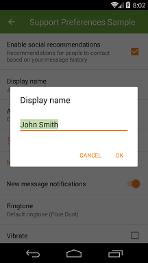
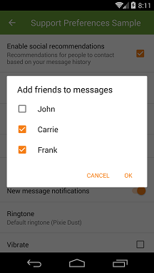
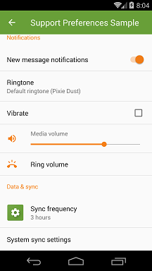
Screenshots
Library version 0.6.0. Android version 4.4.
Showcasing simple menu/dialog, custom title and summary text appearance and color picker.
Library version 0.5.1. Android version 4.4.
Contents
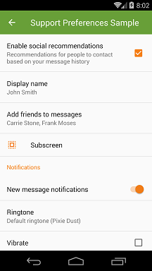
Support preference
-
PreferenceCheckBoxPreferenceSwitchPreference- Using
SwitchCompatavailable from API 7
DialogPreference- Uses AppCompat AlertDialog Material theme
EditTextPreferenceListPreference- Optionally can display as a simple menu or simple dialog.
- Subclasses support custom adapter.
MultiSelectListPreference- Available since API 7
SeekBarDialogPreferenceextendsDialogPreference- Made public
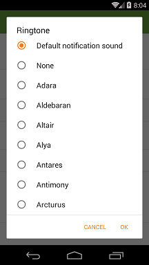
SeekBarPreferenceRingtonePreference- Coerced Ringtone Picker Activity from AOSP
XpPreferenceFragment- Handles proper Preference inflation and DialogPreference dialogs
SharedPreferencesCompatgetStringSetandputStringSetmethods allow persisting string sets even before API 11
XpPreferenceManagersetDefaultValuesmethod takes into account preference classes in custom packages
XpPreferenceHelpers- Tinted icons and text appearance support for preferences outside of this library
Support color preference
ColorPreference
Support spinner
Spinner, popup menu and adapters behaving according to Material Design specs. Read https://www.google.com/design/spec/components/menus.html#menus-behavior.
XpAppCompatSpinnerSpinnervariant that uses simple menu or simple dialog.
XpListPopupWindow- Popup window that supports minimum distance from edges, multiple size measuring modes,
ListViewpadding etc.
- Popup window that supports minimum distance from edges, multiple size measuring modes,
CheckedTypedItemAdapter<T>ListAdapterplusSpinnerAdapterthat highlights one item.- Open methods for converting
TtoCharSequence. - Allows different string representations for selected spinner item and drop down menu.
Features on top of preference-v7
- Using appcompat-v7 features.
- Material preference item layouts out of the box.
- Icon and dialog icon tinting and padding.
EditTextPreferenceunderstandsEditTextXML attributes.- Use
EditTextPreference.setOnCreateEditTextListener(OnCreateEditTextListener)to setup your input field.
- Use
- Several preference widgets not publicly available in preference-v7 or SDK.
RingtonePreference,SeekBarPreference,SeekBarDialogPreference,MultiSelectListPreference
- Subscreen navigation implementation.
ListPreferencecan optionally show as a simple menu in a popup instead of a dialog.ColorPreference- Preference long click listeners.
- Title/summary text color and text appearance defined in Java or XML.
How to use the library?
Basic setup
Your preference fragment needs to extend XpPreferenceFragment.
Setup your preference items in the following method:
public void onCreatePreferences2(final Bundle savedInstanceState, final String rootKey) {

  // ...
}
Your settings activity theme needs to specify the following values:
<style name="AppTheme" parent="Theme.AppCompat.Light.NoActionBar">
  <!-- Used to theme preference list and items. -->
  <item name="preferenceTheme">@style/PreferenceThemeOverlay.Material</item>
  <!-- Default icon tint for preferences. -->
  <item name="asp_preferenceIconTint">?colorAccent</item>
  <item name="asp_preferenceDialogIconTint">?asp_preferenceIconTint</item> </style>
Recommended tint colors are ?colorAccent or ?colorControlNormal.
Styling alertDialogTheme is recommended for a proper color theme. See the sample project.
Dividers
Preference-v7 r23.2.0 provides a divider implementation out of the box. If you want to customize how this divider looks you can call setDivider(...) and setDividerHeight(...). Preference-v7 divider will be drawn just between items and at the bottom of the list. It will not be drawn before the end of category.
If you want more control over where the dividers are drawn, disable the default implementation and use my own instead:
@Override public void onViewCreated(View view, Bundle savedInstanceState) {

  super.onViewCreated(view, savedInstanceState);

  getListView().addItemDecoration(new PreferenceDividerDecoration(getContext()).drawBottom(true));

  setDivider(null);

}
Preference-v7 r23.1.1 does not provide a default divider so you don't need to call setDivider(null).
Ringtone picker
RingtonePicker will show only system ringtones/notification sounds by default. If you want to include sounds from the external storage your app needs to request android.permission.READ_EXTERNAL_STORAGE permission in its manifest. Don't forget to check this runtime permission before opening ringtone picker on API 23.
ListPreference custom adapter
If you subclass ListPreference you can supply your own SpinnerAdapter which may or may not use getEntries() as its data set. Here follow the methods you need to override:
SpinnerAdapter buildSimpleMenuAdapter(Context)- Used in simple menus.SpinnerAdapter buildSimpleDialogAdapter(Context)- Used in simple dialogs.- Override the following methods if your
SpinnerAdapterdoes not usegetEntries()as data set:CharSequence[] getEntries()- Item captions.CharSequence[] getEntryValues()- Persisted item values.
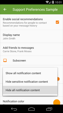
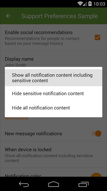
Simple menu and Simple dialog
Simple menu is described in Material Design specs.
If you want to show your ListPreference in a popup instead of a dialog use this configuration:
<ListPreference
  style="@style/Preference.Material.DialogPreference.ListPreference.SimpleMenu"/>
Above code will ensure that:
- If all items fit on one line a popup window is shown.
- Otherwise a simple dialog is shown.
- Popup window width will round up to nearest multiply of 56dp on phones and 64dp on tablets.
These are the attributes and values for manual setup:
| Attribute | Values | Description |
|---|---|---|
app:asp_menuMode | dialog | Default behavior. Alert dialog with radio buttons and optional window title. |
simple_menu | Menu is shown in a popup window. Selected option is highlighted. Less disruptive than dialog. | |
simple_dialog | Menu is shown in a dialog with no other controls. Selected option is highlighted. | |
simple_adaptive | Menu is shown in a popup window if it contains single line items only . Otherwise simple dialog is shown. | |
app:asp_simpleMenuWidthUnit | 0dp | Default behavior. Popup window width is determined by the width of its content. |
*X*dp | Popup width is determined by the width of its content and rounded up to the nearest multiply of Xdp. | |
match_parentwrap_content | Popup width will stretch to match underlying ListPreference width. |
Material Spinner

New XpAppCompatSpinner widget is built according to Material Design specs.
Menus are positioned over their emitting elements such that the currently selected menu item appears on top of the emitting element.
Example setup:
<net.xpece.android.support.widget.XpAppCompatSpinner
  style="@style/Widget.Material.Spinner.Underlined"
  android:theme="ThemeOverlay.Material.Spinner"
  android:layout_width="wrap_content"
  android:layout_height="wrap_content"
  android:entries="@array/my_entries"
  app:asp_spinnerMode="dialog|dropdown|adaptive"/>
The above setup will ensure the following:
- Popup
ListViewwill have top and bottom padding.- Theme overlay applied via
android:themedirectly limits its effects on this widget. - Is not supported by AppCompat or platform popup windows.
- Theme overlay applied via
Spinnerwill have proper space around its caret before API 23.- If using
style="@style/Widget.Material.Spinner"orstyle="@style/Widget.Material.Spinner.Underlined".
- If using
If you need to alter entries programmatically create by CheckedItemAdapter.newInstance(Context, CharSequence[], int) or supply your own adapter (responsible for its own styling) to XpAppCompatSpinner.setAdapter(SpinnerAdapter).
| Attribute | Values | Description |
|---|---|---|
app:asp_spinnerMode | dropdown | Menu is shown in a popup window. Selected option is highlighted. Less disruptive. |
dialog | Menu is shown in a dialog with no other controls. Selected option is highlighted. | |
adaptive | Default behavior. Menu is shown in a popup window if it contains only single line items. Otherwise simple dialog is shown. | |
app:asp_simpleMenuWidthUnit | 0dp | Default behavior. Popup window width is determined by the width of its content. |
Xdp | Popup width is determined by the width of its content and rounded up to the nearest multiply of Xdp. | |
match_parentwrap_content | Popup width will stretch to match underlying ListPreference width. |
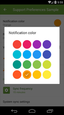
Color preference
Version 0.6.0 introduced color preference as a separate module. An example would look like this:
<ColorPreference
  android:defaultValue="?colorPrimary"
  android:entries="@array/colors_material_names"
  android:entryValues="@array/colors_material"
  android:key="notif_color"
  android:title="Notification color"/>  <array name="colors_material">

<item>@color/material_red_500</item>

<item>@color/material_light_blue_500</item>

<item>@color/material_light_green_500</item>

<item>@color/material_orange_500</item> </array>  <string-array name="colors_material_names">
  <item>Red</item>
  <item>Light Blue</item>
  <item>Light Green</item>
  <item>Orange</item> </string-array>
Attributes include:
| Attribute | Values | Description |
|---|---|---|
android:entryValues | Array of colors | Specifies an array of colors to display. |
android:entries | Array of text | Specifies textual description of each color. |
app:asp_columnCount | Integer | Specifies the number of columns in the color picker. Use an integer resource which will allow you to specify greater number on tablets. Default is 4. |
-1 | Number of columns will be computed automatically to fill space available in window. | |
app:asp_swatchSize | small | Default option. Swatches will be 48dp in width and height plus 4dp margin on each side. |
large | Swatches will be 64dp in width and height plus 8dp margin on each side. |
Finally you need to make your preference fragment fire up the color picker dialog when the preference is clicked and optionally update summary when a color is chosen. Please review sample SettingsActivity.java and SettingsFragment.java respectively.
If you need to change the default style either use style attribute or override it in your theme:
<item name="colorPreferenceStyle">@style/Preference.Material.DialogPreference.ColorPreference</item>The color is stored internally as a 32-bit integer.
Subscreen navigation
Possible solution is implemented in PreferenceScreenNavigationStrategy.ReplaceFragment class. This class will help you replace the whole preference fragment with a new instance with specified root preference. It is using fragment transactions and back stack allowing for transition animations and saved states.
Known issues with support library
In appcompat-v7 r23.1.1 and r24.1.x there is a bug which prevents tinting of checkmarks in lists. Call Fixes.updateLayoutInflaterFactory(getLayoutInflater()) right after super.onCreate(savedInstanceState) in your Activity.
@Override protected void onCreate(Bundle savedInstanceState) {

  super.onCreate(savedInstanceState);

  Fixes.updateLayoutInflaterFactory(getLayoutInflater());

  setContentView(R.layout.activity_settings);

  //...
}
You may have experienced unexpected background color which manifests as holo blue on Android 4 and grey on Android 5. This is caused by PreferenceFragment's RecyclerView grabbing focus on fragment start. We can disable this behavior while still being able to navigate between individual preferences with a D-pad.
@Override public void onViewCreated(View view, @Nullable Bundle savedInstanceState) {

  super.onViewCreated(view, savedInstanceState);

  final RecyclerView listView = getListView();

// We don't want this. The children are still focusable.
  listView.setFocusable(false);

}
Icon tinting
All preferences:
app:asp_tintapp:asp_tintModeapp:asp_tintEnabled
All dialog preferences:
app:asp_dialogTintapp:asp_dialogTintModeapp:asp_dialogTintEnabled
Icon padding
Application icons (48dp x 48dp) require no extra padding. For smaller icons extra padding of 4dp on each side is needed. Achieve this by using app:asp_iconPaddingEnabled and app:asp_dialogIconPaddingEnabled attributes. Icon padding is enabled by default.
Handling PreferenceScreen icons
As PreferenceScreen class is final and hardwired into preference system I was unable to automate icon tinting and padding. However you are able to do this yourself:
Preference subs = findPreference("subs_screen");
 PreferenceIconHelper subsHelper = new PreferenceIconHelper(subs);
 subsHelper.setIconPaddingEnabled(true);
 // Call this BEFORE setIcon! subsHelper.setIcon(R.drawable.some_icon);
 subsHelper.setTintList(AppCompatResources.getColorStateList(subs.getContext(), R.color.accent));
 subsHelper.setIconTintEnabled(true);
 /* or */ PreferenceIconHelper.setup(subs /* preference */,
  R.drawable.some_icon /* icon */,
  R.color.accent /* tint */,
  true /* padding */);
You can use this class even on preference classes from preference-v7 package in case you're not using XpPreferenceFragment.
Proguard
Since version 0.5.1 Proguard rules are bundled with the library.
Changelog
See CHANGELOG.md.
Known issues
- MultiSelectListPreference items may be incorrectly tinted on Android 2.
- Observed on Android 4 as well on first opening of multi select dialog.
- Custom spinner animation is not smooth on Android 6+.
Questions
- Why are some of your classes in
android.support.v7packages?- I'm using their package private features to achieve consistent results with AppCompat.
TODO
- Compute simple menu preferred position with prompt enabled.
- ListPreference scroll to viewport before renewing popup/dialog.
- ColorPicker XML attributes.
- Use ForwardingListener.
Credit
Most of this library is straight up pillaged latest SDK mixed with heavy reliance on appcompat-v7. Since version 0.5.0 the same applies to preference-v7. Kudos to people who create and maintain these!