MaterialScrollBar
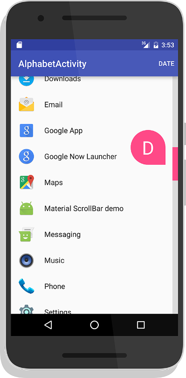
An Android library that brings the Material Design 5.1 scrollbar to pre-5.1 devices. Designed for Android's recyclerView.
Google Play - Test Out the App
Table of Contents
Gradle
allprojects {

  repositories {

maven {
 url 'https://jitpack.io'
}


}

}
dependencies {
     compile 'com.github.turing-tech:MaterialScrollBar:12.+'
}
Documentation
Note: All customisation methods ( setAutoHide, setBarColor, etc) return the materialScrollBar, so they can be chained together if wanted. Alternatively, you can just operate on a variable.
How to use
The library comes in two flavours, drag and touch. Try both out to see which you prefer.
Option 1 - Drag
<com.turingtechnologies.materialscrollbar.DragScrollBar
  android:id="@+id/dragScrollBar"
  android:layout_width="wrap_content"
  app:msb_recyclerView="@id/recyclerView"
  app:msb_lightOnTouch="[[boolean]]"
  android:layout_height="match_parent" />
or
Option 2 - Touch
<com.turingtechnologies.materialscrollbar.TouchScrollBar
  android:id="@+id/touchScrollBar"
  android:layout_width="wrap_content"
  app:msb_recyclerView="@id/recyclerView"
  app:msb_lightOnTouch="[[boolean]]"
  android:layout_height="match_parent" />
Additonal optional attributes:
- msb_handleColor - Color
- msb_barColor - Color
- msb_handleOffColor - Color
- msb_textColor - Color
- msb_barThickness - Integer
- msb_rightToLeft - Boolean
Please note that for both of these configurations, both recyclerView and lightOnTouch* must have a valid value. The recyclerView attribute should point to the id of the recyclerView to which you want to link the scrollbar.
* lightOnTouch behaves like this: A value of true will cause the handle to be grey until pressed, when it will become the normal accent color (as set). A value of false will cause the handle to always have the accent color, even when not being pressed.
My recyclerView elements aren't all the same size! What do I do?
If you are in the situation of using headers of one size and elements of another, we've developed a solution speicifcally for you. Please follow the tutorial here.
If you are in some other situation where you're elements are differently sized, implement ICustomScroller in your adapter and complete the included methods.
Indicators
To add an indicator, simply add the following line of code:
scrollBar.setIndicator({
{
Indicator
}

}
, {
{
addSpace
}

}
);
The indicator should be either AlphatbetIndicator, DateAndTimeIndicator, or CustomIndicator. See below for specific instructions per indicator.
{
{
addSpace
}

}
is a boolean which indicates whether there should be space in between the indicator and the bar. True adds space, as in the latest version of the Google Launcher, while false adds no space, as in the Android 5.1 system scrollbars.
To use an indicator, you MUST make your recyclerView's adapter implement the relevant interface. If you do not, the library will throw a runtime error informing you of your mistake. See documentation for the relevant interface.
Specific Indicators
AlphabetIndicator
Required Interface: INameableAdapter
To implement an AlphabetIndicator, which displays one character usually corresponding to the first letter of each item, add the following to the end of your scroll bar instantiation, or add it as a seperate line.
...setIndicator(new AlphabetIndicator(this));
DateAndTimeIndicator
Required Interface: IDateableAdapter
To implement a DateAndTimeIndicator, which displays any combination of time, day of the month, month, and year, add the following to the end of your scroll bar instantiation, or add it as a seperate line.
...setIndicator(new DateAndTimeIndicator(this, {
{
includeYear
}

}
, {
{
includeMonth
}

}
, {
{
includeDay
}

}
, {
{
includeTime
}

}
));
All of the arguments are booleans (except for this first one obviously). The indicator will dynamically size, add punctuation, and localise for you. All you need to do is provide a Date object for each element in your adapter. You should almost always use miliseconds since the epoch unless you have a good reason not to. Otherwise, the library might crash.
CustomIndicator
Required Interface: ICustomAdapter
To implement a CustomIndicator, which displays any text you want, add the following to the end of your scroll bar instantiation, or add it as a seperate line.
...setIndicator(new CustomIndicator(this));
License
Material Scroll Bar:
Copyright 2016-2017 Turing Technologies, an unincorporated orginisation of Wynne Plaga.  Licensed under the Apache License, Version 2.0 (the "License");
 you may not use this file except in compliance with the License. You may obtain a copy of the License at
  http://www.apache.org/licenses/LICENSE-2.0  Unless required by applicable law or agreed to in writing, software distributed under the License is distributed on an "AS IS" BASIS, WITHOUT WARRANTIES OR CONDITIONS OF ANY KIND, either express or implied. See the License for the specific language governing permissions and limitations under the License.  This licensing is applicable to all code offered as part of this repository, which can be identified by the lisence notice preceding the content AND/OR by its inclusion in a package starting with "com. turingtechnologies.materialscrollbar".
RecyclerView-FastScroll:
 Copyright (C) 2016 Tim Malseed  Licensed under the Apache License, Version 2.0 (the "License");
 you may not use this file except in compliance with the License. You may obtain a copy of the License at
  http://www.apache.org/licenses/LICENSE-2.0  Unless required by applicable law or agreed to in writing, software distributed under the License is distributed on an "AS IS" BASIS, WITHOUT WARRANTIES OR CONDITIONS OF ANY KIND, either express or implied. See the License for the specific language governing permissions and limitations under the License.
Launcher 3:
 Copyright (C) 2010 The Android Open Source Project  Licensed under the Apache License, Version 2.0 (the "License");
 you may not use this file except in compliance with the License. You may obtain a copy of the License at
http://www.apache.org/licenses/LICENSE-2.0 Unless required by applicable law or agreed to in writing, software distributed under the License is distributed on an "AS IS" BASIS, WITHOUT WARRANTIES OR CONDITIONS OF ANY KIND, either express or implied. See the License for the specific language governing permissions and limitations under the License. 