ProgressProfileView
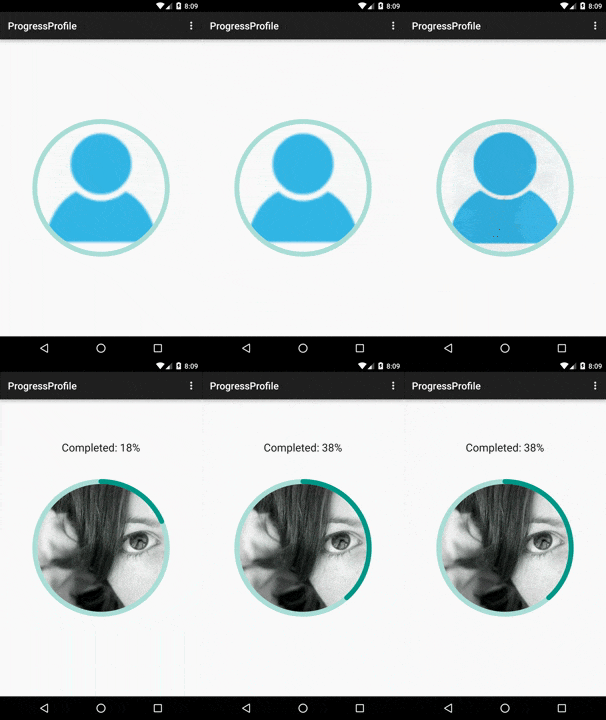
Android custom view to load an avatar or profile image with a progress indicator.
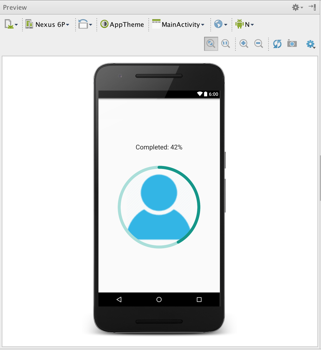
Preview also on Android Studio!
Background
ProgressProfileView inherits from ImageView, so you can set any xml attributes as usual.
Measured both on landscape and portrait.
No need to crop to rounded images!
ProgressProfileView will clip proportionally all images loaded.
Remember to set android:scaleType="centerCrop" and android:adjustViewBounds="true"
Dependency
If you are working with gradle, add the dependency to your build.gradle file:
dependencies{

  compile 'com.kuassivi.view:progressprofile:?.?.?'
}
If you are working with maven, do it into your pom.xml
<dependency>
  <groupId>com.kuassivi.view</groupId>
  <artifactId>progressprofile</artifactId>
  <version>?.?.?</version>
  <type>aar</type> </dependency>
How to:
Add the ProgressProfileView component in the layout.
Set your preferred ImageView attributes on it.
<com.kuassivi.view.ProgressProfileView

android:id="@+id/profile"

android:layout_width="match_parent"

android:layout_height="wrap_content"

android:scaleType="centerCrop"

android:adjustViewBounds="true"

android:src="@drawable/my_avatar"

app:progress="42"

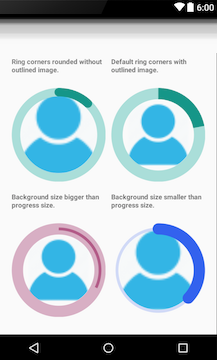
app:progressRingSize="10dp"

app:progressRingCorner="ROUND"

app:progressRingOutline="true"/>
Get the object on your activity or fragment.
ProgressProfileView profile = (ProgressProfileView) findViewById(R.id.profile);
Set your desired progress.
profile.setProgress(59.5f);
To animate the ring, call
#startAnimation()
profile.startAnimation();
If you need to handle the progress animation update or listen to the end of the animation, just get the
ObjectAnimatorcalling thegetAnimator()method from your ProgressProfileView object.
profile.getAnimator().addListener(new AnimatorListener());
profile.getAnimator().addUpdateListener(new AnimatorUpdateListener());
profile.getAnimator().setInterpolator(new AccelerateDecelerateInterpolator());
If you are loading images with Glide or Picasso, do it as usual
// Using Glide as usual Glide.with(this)
  .load("http://your/server/path")
  .placeholder(R.drawable.ic_icon_user_default)
  .into(profile);
Be careful when using
fitCenter()method of Glide, Picasso, or any other similar kind of method, because it will re-scale the bitmap, and the Progress Profile component will loose its original bounds!
Features:
-
`app:max="100"` - Max value for progress indicator -
`app:progress="50"` - Current progress value -
`app:backgroundRingSize="20dp"` - The size of the background ring (not set, means use the same as the <i>progressRingSize</i>) -
`app:progressRingSize="20dp"` - The size of the progress ring -
`app:backgroundRingColor="@color/my_color"` - The color of the background ring (it can be an hex color as well) -
`app:progressRingColor="@color/my_color"` - The color of the progress ring (it can be an hex color as well) -
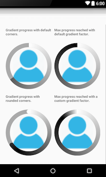
`app:progressGradient="@array/colors"` - An array of colors for a gradient ring (you must provide an array resource reference) [#23](https://github.com/kuassivi/ProgressProfileView/issues/23) -
`app:joinGradient="true"` - Enabling this you get a gradient smooth on the ring corners -
`app:gradientFactor="1.0"` - Adjust the gradient factor of the ring -
`app:progressRingOutline="true"` - Sets the ring as an Outline based on the padding of the ImageView, by default is `false`. -
`app:progressRingCorner="ROUND"` - Sets the corner style of the progress ring (by default is RECT)
License
Copyright 2015 Francisco Gonzalez-Armijo Riádigos
Licensed under the Apache License, Version 2.0 (the "License"); you may not use this file except in compliance with the License. You may obtain a copy of the License at
http://www.apache.org/licenses/LICENSE-2.0
Unless required by applicable law or agreed to in writing, software distributed under the License is distributed on an "AS IS" BASIS, WITHOUT WARRANTIES OR CONDITIONS OF ANY KIND, either express or implied. See the License for the specific language governing permissions and limitations under the License.


