SlideButton 
A simple, elegant and customizable library for implementing the swipe button. Just add this library in your build.gradle and use the SlideButton view to use the slide view. (Scroll down for Screenshots.)
Importing the library
-
Add the jcenter url in your root build.gradle at the end of repositories:
allprojects { repositories { jcenter() } } -
Add the dependency
 dependencies {

compile 'com.shitij.goyal:slide-button:1.0.0'

}
There is a simple sample included in the code to help you jumpstart. Cheers!!
#What all can you customize?
- app:gradient_color_1 = Set the primary color of the Slide button.
- app:gradient_color_2 = Set the secondary color of the Slide button.
- app:gradient_color_3 = Set the tertiary color of the Slide button.
- app:gradient_color_2_width = Set the width of the secondary color.
- app:after_confirmation_background = The background to be shown after the button has been swiped.
- app:button_swipe_text = Set the text to be shown while swiping.
- app:threshold = The threshold to be crossed before a successful swipe is registered. This is between 0 and 1. Higher the value, the more length of the button need to be swiped.
- app:button_confirm_text = Set the text to be just after the swipable threshold has been crossed.
- app:button_post_confirm_text = Set the text to be shown after the user has removed their finger on a successful slide.
- app:swipe_mode = 3 options to choose from. clamp, mirror, repeat. The default value set is clamp. Experiment with the colors and this mode for amazing effects.
Use android:text = "bla bla" to set the initial text.
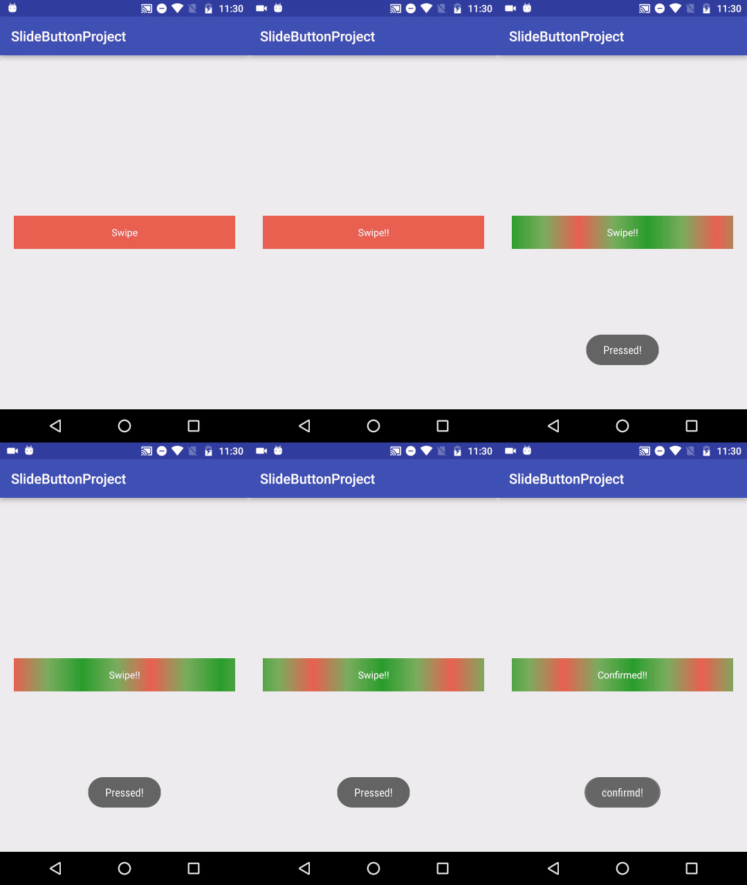
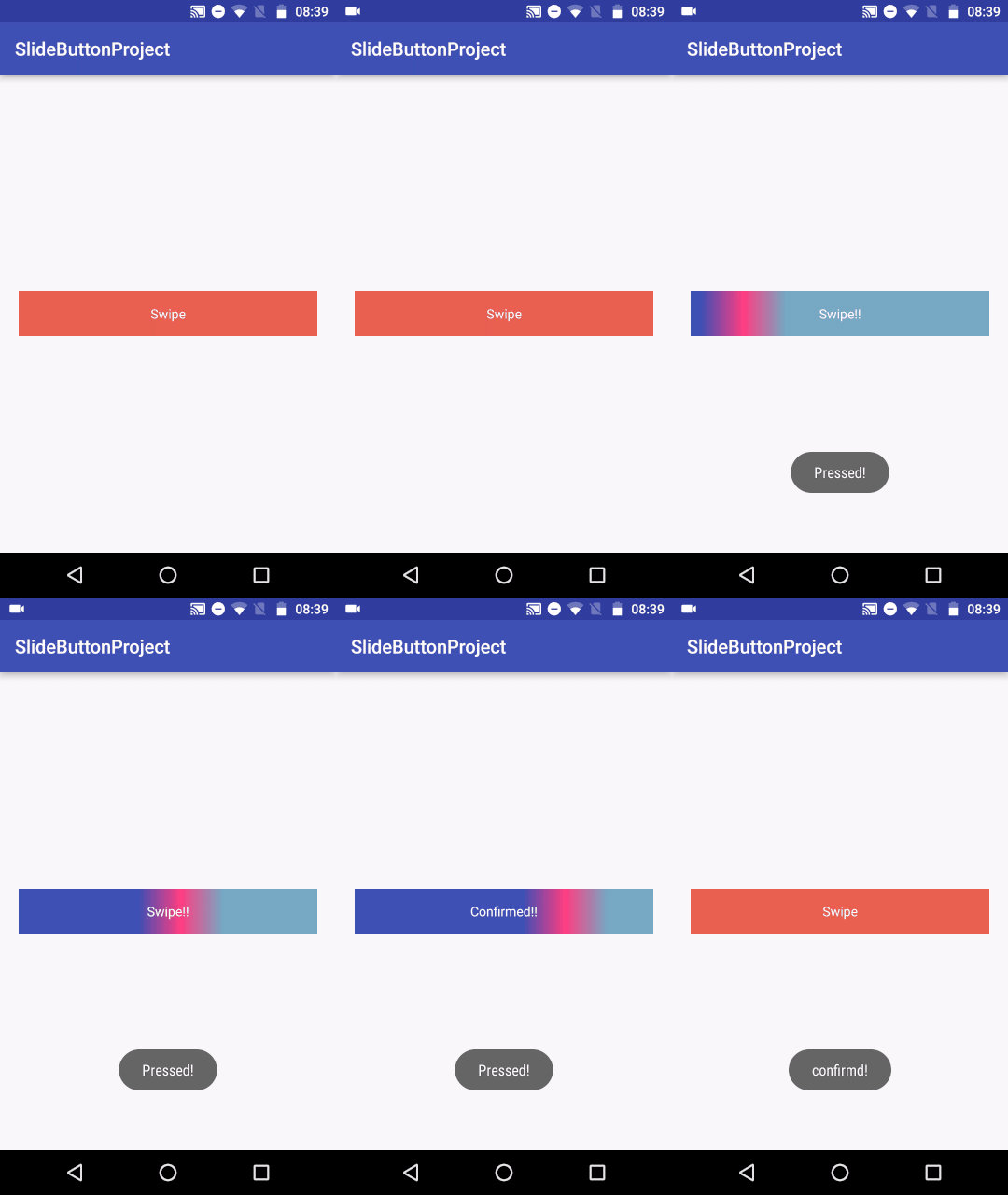
Screenshots
See the melange of colors and the text change when swiping and when swipe is successful!!


