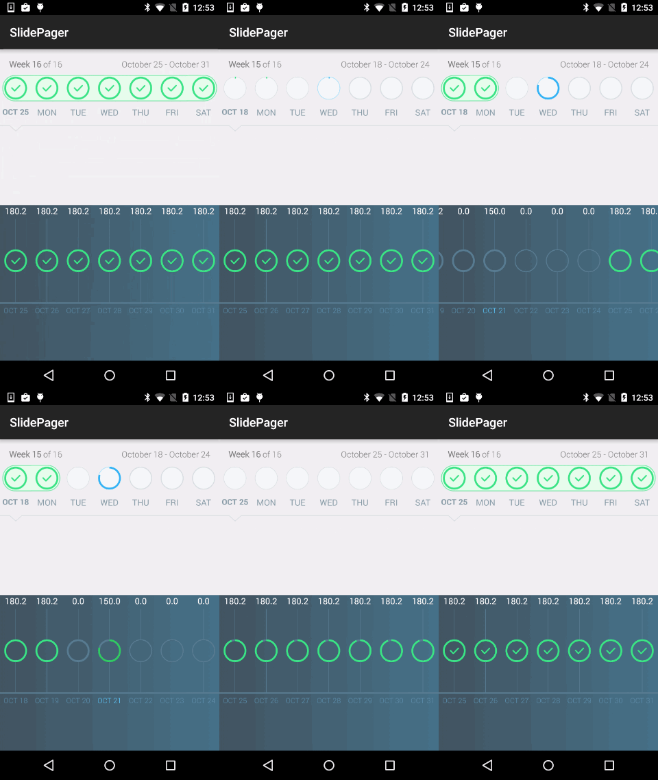
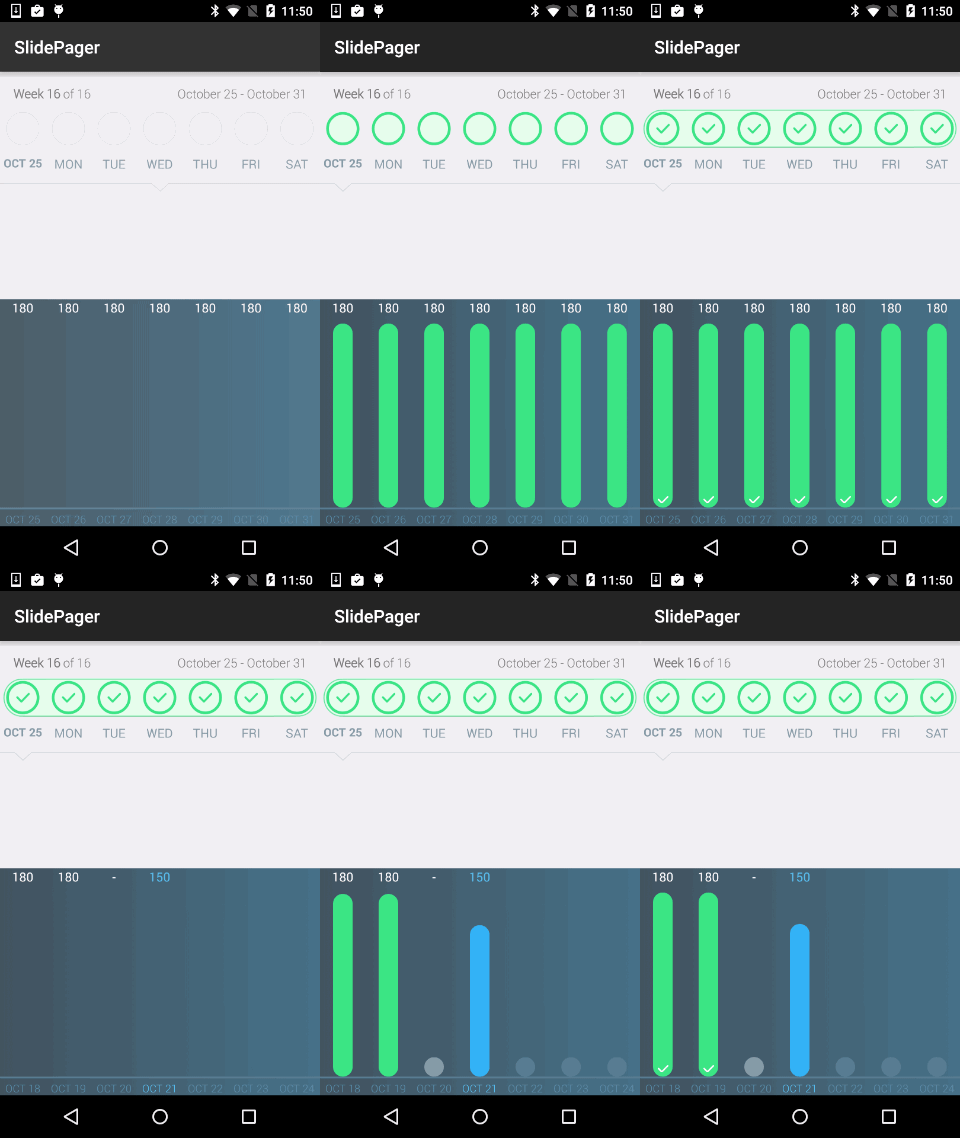
SlidePager 
A ViewPager implementation that is useful for navigating through views that can be grouped, such as days in a week (API 14+).
To include in your project, add this to your build.gradle file:
//SlidePager
 compile 'com.github.omadahealth.slidepager:slidepager:2.5.0@aar'
========
By
Developers: Olivier Goutay, Stoyan Dimitrov and Dae Park
Designers: Yassine Bentaieb
Usage
Look at the example app for a live example on how to use the library. If you want to use the classic SlidePager, use the SlidePagerAdapter to populate your views. If you want to use the chart SlidePager, use the SlideChartPagerAdapter to populate your views.
In XML:
  <com.github.omadahealth.slidepager.lib.SlidePager

 android:id="@+id/slidepager1"

 android:layout_width="match_parent"

 android:layout_height="wrap_content"

 style="@style/SlidePagerStyle"/>
In styles.xml
 <style name="SlidePagerStyle">

<item name="android:layout_height">match_parent</item>

<item name="android:layout_width">match_parent</item>

 <item name="slide_start_at_end">true</item>

<item name="slide_show_streaks">true</item>

<item name="slide_show_week">true</item>

<item name="slide_show_date">true</item>
  </style>
========
Customization
You can change several attributes in the XML file:
- app:slide_pager_reanimate_slide_view [boolean] --> The boolean controlling the animation if the page has already been displayed
- app:slide_progress_completed_fill_color [color hex] --> The fill color when the progress is at 100%
- app:slide_progress_completed_reach_color [color hex] --> The reach color(border) when the progress == 100%
- app:slide_progress_not_completed_reach_color [color hex] --> The reach color(border) when the progress < 100%
- app:slide_progress_not_completed_outline_color [color hex] --> The outline color(border) when the progress < 100%
- app:slide_progress_not_completed_outline_size [dimension] --> The outline size(border) when the progress < 100%
- app:slide_progress_not_completed_future_outline_size [dimension] --> The outline size(border) when the progress is in the future
- app:slide_progress_not_completed_fill_color [color hex] --> The fill color(border) when the progress < 100%
- app:slide_progress_special_reach_color [color hex] --> The reach color(border) when the progress < 100%
- app:slide_progress_special_outline_color [color hex] --> The outline color(border) when the progress < 100%
- app:slide_progress_special_fill_color [color hex] --> The fill color(border) when the progress < 100%
- app:slide_progress_text_color [color hex] --> The color used for the text below the CircularBar
- app:slide_progress_reached_width [dimension] --> The size of the reached progress on the CircularBar
- app:slide_start_at_end [boolean] --> True if you want the pager to start at the last page instead of 0
- app:slide_shake_if_not_selectable [boolean] --> True if you want the SlidePager to shake when a day not selectable is clicked
- app:slide_show_progress_text [boolean] --> True if you want to display the text below the CircularBar
- app:slide_show_progress_plusmark [boolean] --> True if you want to display the plus mark on an empty special day
- app:slide_show_week [boolean] --> True if you want to show the left text view
- app:slide_show_date [boolean] --> True if you want to show the right text view
- app:slide_show_streaks [boolean] --> True if you want the connecting streaks to appear between consecutive 100% progress views
- app:slide_show_selected_bar [boolean] --> True if you want the selected bar to be shown and animated when a day is selected
- app:slide_show_circular_bars [boolean] --> True if you want to show the circular bars, false otherwise
- app:slide_progress_chart_bar_top_text_color [color hex] --> The top text color of the SlideChartView
- app:slide_progress_chart_bar_bottom_text_color [color hex] --> The bottom text color of the SlideChartView
- app:slide_progress_chart_bar_bottom_special_text_color [color hex] --> The bottom text color of the SlideChartView (special progress)
- app:slide_progress_chart_color [color hex] --> The color of the bars in SlideChartView
- app:slide_progress_chart_bar_size [dimension] --> The size of the bars in SlideChartView
-SlideBarChartView
- app:slide_progress_bar_chart_bar_width [dimension] --> The width of the bar
- app:slide_progress_bar_chart_future_color [color hex] --> Color of the bars in the future days
- app:slide_progress_bar_chart_today_color [color hex] --> Color of the bar for today ( only when progress < 100)
- app:attr name="slide_progress_bar_chart_not_completed_color [color hex] --> Color of the bar when progress < 100
- app:slide_progress_bar_chart_completed_color [color hex] --> Color of the bar when progress == 100
- app:slide_progress_bar_chart_null_value_bar_display [boolean] --> If true, it will show a circle for 0 values (same as gif), if false it won't show anything (true by default)
- app:slide_progress_bar_chart_check_mark_visible [boolean] --> If true, a checkmark will show when progress == 100 (true by default)
- app:slide_progress_bar_chart_animation_time [integer] --> Animation duration of the bar
- app:slide_progress_bar_chart_animation_delay [integer] --> Each bar will wait for the duration before start animating
========
Credits
- We used CircularBarPager from OrangeGangsters ( https://github.com/OrangeGangsters/CircularBarPager) for the progress circles
- We used NineOldAndroids from JakeWharton ( https://github.com/JakeWharton/NineOldAndroids/) to use beautiful animations on API 10+
- We used AnimationEasingFunctions from daimajia ( https://github.com/daimajia/AnimationEasingFunctions) to also use beautiful animations on API 10+
========
License
The MIT License (MIT) Copyright (c) 2015 Omada Health, Inc Permission is hereby granted, free of charge, to any person obtaining a copy of this software and associated documentation files (the "Software"), to deal in the Software without restriction, including without limitation the rights to use, copy, modify, merge, publish, distribute, sublicense, and/or sell copies of the Software, and to permit persons to whom the Software is furnished to do so, subject to the following conditions: The above copyright notice and this permission notice shall be included in all copies or substantial portions of the Software. THE SOFTWARE IS PROVIDED "AS IS", WITHOUT WARRANTY OF ANY KIND, EXPRESS OR IMPLIED, INCLUDING BUT NOT LIMITED TO THE WARRANTIES OF MERCHANTABILITY, FITNESS FOR A PARTICULAR PURPOSE AND NONINFRINGEMENT. IN NO EVENT SHALL THE AUTHORS OR COPYRIGHT HOLDERS BE LIABLE FOR ANY CLAIM, DAMAGES OR OTHER LIABILITY, WHETHER IN AN ACTION OF CONTRACT, TORT OR OTHERWISE, ARISING FROM, OUT OF OR IN CONNECTION WITH THE SOFTWARE OR THE USE OR OTHER DEALINGS IN THE SOFTWARE. 
