SublimeNavigationView
... is a complete rewrite of NavigationView (from Design Support library) that enables usage of Checkboxes, Switches & Badges in/as menu items. Menus are defined in good-old XML, and parsed using a custom MenuInflater. SublimeNavigationView works with Parcelable menus which means that state retention is built-in. Moreover, it can support multiple menus while preserving their respective states. Groups added to the menu have the added feature of being collapsible/expandable. Along with this, SublimeNavigationView allows a few options for custom styling.
Gradle dependency
compile 'com.appeaser.sublimenavigationviewlibrary:sublimenavigationviewlibrary:0.0.1' Walkthrough
Screenshots have been taken from the sample application available here:

How the menu looks:
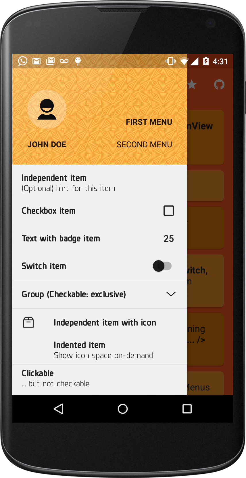
SublimeNavigationView can work with any number of menus. As an example of this, the sample application shows how to handle two of them:

Switching between menus:
| First Menu | Second Menu |
|---|---|
 |  |
SublimeMenu supports grouping of menu items. In addition to the standard features such as defining a checkable policy, ordering etc., a SublimeGroup can be expanded/collapsed - on user input, through XML definition, or programmatically:
| Collapsed | Expanded |
|---|---|
 |  |
XML definitions are quite straight-forward. An example:
<Text
  android:id="@+id/text_item_1"
  android:title="Independent item"
  android:hint="(Optional) hint for this item"/>
This would translate to:

A Text item with an icon - and another, that shows icon space, but doesn't display an icon:
<Text
  android:id="@+id/text_item_2"
  android:title="Independent item with icon"
  android:icon="@drawable/archive" />  <Text
  android:id="@+id/text_item_5"
  android:title="Indented item"
  android:hint="Show icon space on-demand"
  app:showIconSpace="true"/>
Output:
TextWithBadge menu items can be presented in two forms - initialized & uninitialized. In uninitialized form, the item will display an indeterminate ProgressBar in place of badgeText:
<TextWithBadge
  android:id="@+id/text_with_badge_item_1"
  android:title="Text with badge item"
app:valueProvidedAsync="true"/> 
In initialized form, the item will have its badgeText set in XML:
<TextWithBadge
  android:id="@+id/text_with_badge_item_1"
  android:title="Text with badge item"
app:badgeText="25"/> 
This feature can be used if the badgeText is being retrieved through a network call, or if some computation needs to be performed before it can be displayed. Once the text is available, you can display it using:
((SublimeTextWithBadgeMenuItem)snv.getMenu().getMenuItem(R.id.text_with_badge_item_1))

.setBadgeText("25").setValueProvidedAsync(false);
SublimeNavigationView also supports a few styling options. As an example, the sample application uses a custom typeface spicified in the view's xml definition:
<com.appeaser.sublimenavigationviewlibrary.SublimeNavigationView
  ....
  ....
  app:snvHeaderLayout="@layout/nav_header"
  app:snvMenu="@menu/test_nav_menu_1"
  app:snvItemTypefaceFilename="planer_bold_webfont.ttf"
  app:snvHintTypefaceFilename="planer_reg_webfont.ttf"
  app:snvSubheaderItemTypefaceFilename="planer_bold_webfont.ttf"/>
Styling info can also be set programmatically by providing a initialized SublimeThemer.
There were some features that were left out on purpose. One of them was the option to define sub-menus. This feature is essential when used within the ActionBar design pattern, but its importance in a navigation view is lost on me.
The NavigationView from design library adds separators automatically. SublimeNavigationView takes a different approach, and lets you decide where the separators should go. So, to create a divider, add a Separator menu item:
<Separator
  android:id="@+id/separator_item_1" />
Since there are no space concerns, orderInCategory & menuCategory have also been left out.
License
Copyright (c) 2015 Vikram Kakkar  Licensed under the Apache License, Version 2.0 (the "License");
 you may not use this file except in compliance with the License. You may obtain a copy of the License at

 http://www.apache.org/licenses/LICENSE-2.0  Unless required by applicable law or agreed to in writing, software distributed under the License is distributed on an "AS IS" BASIS, WITHOUT WARRANTIES OR CONDITIONS OF ANY KIND, either express or implied. See the License for the specific language governing permissions and limitations under the License.