TriState Toggle Button
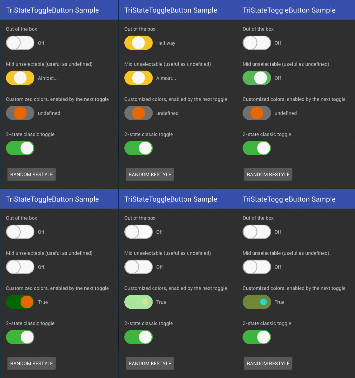
A fully customizable and super-easy tri-state toggle button (switch button if you prefer) for Android, based on iOS look and feel. Can act with three independent states, or with two states like a standard checkbox, or with two states plus one undefined.
- Out-of-the-box working 3-state toggle
- Fully customizable and styleable
- Can become a classic 2-state toggle returning booleans
- Can become a 2.5-state toggle: on/off and an unselectable mid button
- Can be enabled / disabled
- Can be programmatically controlled
- Works both with clicks and with swipes
Setup (Gradle)
In your project's build.gradle file:
allprojects {

  repositories {

...

maven {
 url "https://jitpack.io"
}

...

}

}
In your Application's or Module's build.gradle file:
dependencies {

  ...
  compile 'com.github.BeppiMenozzi:TriStateToggleButton:1.1.4'
  ...
}
Setup (Eclipse)
Whaaaaat?
Minimal usage
Layout:
... xmlns:app="http://schemas.android.com/apk/res-auto" ... <it.beppi.tristatetogglebutton_library.TriStateToggleButton

android:layout_width="80dp"

android:layout_height="40dp"

android:id="@+id/tstb_1"  />
Listener:
... TriStateToggleButton tstb_1 = (TriStateToggleButton) findViewById(R.id.tstb_1);
 tstb_1.setOnToggleChanged(new TriStateToggleButton.OnToggleChanged() {

@Override

public void onToggle(TriStateToggleButton.ToggleStatus toggleStatus, boolean booleanToggleStatus, int toggleIntValue) {

 switch (toggleStatus) {

  case off: break;

  case mid: break;

  case on: break;


}

}


}
);
 ...
Inside onToggle() you can use the ToggleStatus type values, or limit yourself to use booleans or integers (0, 1, 2) if you want it easy.
To have a two-states toggle button:
 <it.beppi.tristatetogglebutton_library.TriStateToggleButton

android:layout_width="80dp"

android:layout_height="40dp"

android:id="@+id/tstb_1"

app:tbIsMidSelectable="false"  />
To have a two-states toggle button, with an undefined starting value:
 <it.beppi.tristatetogglebutton_library.TriStateToggleButton

android:layout_width="80dp"

android:layout_height="40dp"

android:id="@+id/tstb_1"

app:tbIsMidSelectable="false"

app:tbDefaultStatus="mid"  />
Browse the full example here: Example
Attributes description
List of attributes with description:
| tbBorderWidth | Width of the border of the widget |
| tdOffBorderColor | Color of the width that appears with the button in state off. Used also for animations. |
| tbOffColor | Color of the background of the toggle when off |
| tbMidColor | Color of the background of the toggle with in mid position |
| tbOnColor | Color of the background of the toggle when on |
| tbSpotColor | Color of the handle of the toggle |
| tbAnimate | True for animation |
| tbDefaultStatus | Starting value for the toggle |
| tbIsMidSelectable | If false, the toggle becomes a standard two-states toggle, but can still assume the mid value if forced programmatically or set as default |
| tbSwipeSensitivityPixels | Number of pixels a swipe must travel to fire a toggle event. Default is 200. If set to zero, swipes are disabled |
New in 1.1.3
- Fixed: error drawing toggle in mid position when visibility passed from GONE to VISIBLE
New in 1.1.0
- Added swipe gesture management together with normal click
- Gradle update
- More documentation
New in 1.0.5
- Fixed: added super in setEnabled()
New in 1.0.4
- Fixed: setting a boolean value programmatically sometimes didn't update status
New in 1.0.3
- Toggle now can set and return integer values (0, 1, 2)
- Warning: onToggle() changed to include integer values
- Added static functions to convert from/to booleans and integers to/from toggleStatus
Used in
Credits
This project is strongly based on (and contains parts of code of) the very beautiful Toggle Button by zcweng.
Author
- Beppi Menozzi
License
The MIT License (MIT) Copyright (c) 2016 Beppi Menozzi Permission is hereby granted, free of charge, to any person obtaining a copy of this software and associated documentation files (the "Software"), to deal in the Software without restriction, including without limitation the rights to use, copy, modify, merge, publish, distribute, sublicense, and/or sell copies of the Software, and to permit persons to whom the Software is furnished to do so, subject to the following conditions: The above copyright notice and this permission notice shall be included in all copies or substantial portions of the Software. THE SOFTWARE IS PROVIDED "AS IS", WITHOUT WARRANTY OF ANY KIND, EXPRESS OR IMPLIED, INCLUDING BUT NOT LIMITED TO THE WARRANTIES OF MERCHANTABILITY, FITNESS FOR A PARTICULAR PURPOSE AND NONINFRINGEMENT. IN NO EVENT SHALL THE AUTHORS OR COPYRIGHT HOLDERS BE LIABLE FOR ANY CLAIM, DAMAGES OR OTHER LIABILITY, WHETHER IN AN ACTION OF CONTRACT, TORT OR OTHERWISE, ARISING FROM, OUT OF OR IN CONNECTION WITH THE SOFTWARE OR THE USE OR OTHER DEALINGS IN THE SOFTWARE. 
