vector-compat
A support library for VectorDrawable and AnimatedVectorDrawable introduced in Lollipop with fully backwards compatible tint support (api 14+ so far)
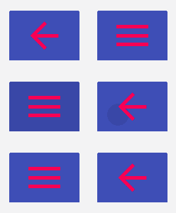
vector-compat provides the necessary tools to make animated icons similar to the new drawer hamburger icon that morphs to a back arrow when clicked. Any other morph animation between icons can be defined purely in xml ( no java code required) and the library takes care of the transformation animation. Because they are in vector format, these drawables can be of any height and width with no resulting pixelation.
The library will transparently fall back to the lollipop implementation of VectorDrawable and AnimatedVectorDrawable on api 21+ devices
##Commonly used animations The library packs some ready-made morph animations developers can use in their code with MorphButton. More will be added soon as this is a work-in-progress. The library has the following morph animations :
- Play-Pause morph animation (bi-directional morph)
- Play-Stop morph animation (bi-directional morph)
- Arrow-Hamburger menu morph animation (bi-directional morph)
The goal is to, with time, create a repo of commonly used morph animations that lots of developers find useful.
If you have requests for particular morph animations, please open a new issue and I'll work on adding them to the library. You are also welcome to create a pull request if you've created some of your own. Please contribute :)
Download
Add the vector-compat dependency to your build.gradle file and make sure to use buildToolsVersion 22 or higher:
android {

  // use version 22 or higher
  buildToolsVersion "22.0.1"
  ...
}
 dependencies {

  compile 'com.wnafee:vector-compat:1.0.5'
  ...
}
Proguard
If you're using proguard for code shrinking and obfuscation, make sure to add the following:
-keep class com.wnafee.vector.** {
 *;
}
Usage
VectorDrawable and AnimatedVectorDrawable xml drawable syntax is exactly the same as the lollipop documentation (can be seen here and here respectively). With 2 caveats:
- Some attributes under the
<vector>nodes must be listed once for theandroid:namespace and once for the local namespace with avc_prefix (e.g.app:vc_fillColor). See example here. (For a complete list ofvc_prefixed attributes see attr.xml for ) - Any
pathTypeanim xml must have theandroid:valueType="pathType"in addition toapp:vc_valueType="pathType"to allow for lollipop implementation fallback. See example here.
Inflation
VectorDrawable and AnimatedVectorDrawable in this support library can be inflated in one of 2 ways:
- Calling static
getDrawable()methods:
//This will only inflate a drawable with <vector> as the root element VectorDrawable.getDrawable(context, R.drawable.ic_arrow_vector);
  //This will only inflate a drawable with <animated-vector> as the root element AnimatedVectorDrawable.getDrawable(context, R.drawable.ic_arrow_to_menu_animated_vector);
  // This will inflate any drawable and will auto-fallback to the lollipop implementation on api 21+ devices ResourcesCompat.getDrawable(context, R.drawable.any_drawable);
If inflating the Drawable in java code, it is recommended to always use ResourcesCompat.getDrawable() as this handles Lollipop fallback when applicable. This allows the system to cache Drawable ConstantState and hence is more efficient
- directly from the
MorphButtonview in xml:
<!-- Insert xmlns:app="http://schemas.android.com/apk/res-auto" in your root layout element --> <com.wnafee.vector.MorphButton
  android:id="@+id/playPauseBtn"
  android:layout_width="wrap_content"
  android:layout_height="wrap_content"
  app:vc_startDrawable="@drawable/ic_pause_to_play"
  app:vc_endDrawable="@drawable/ic_play_to_pause" />
MorphButton
MorphButton is a CompoundButton with 2 states: MorphState.START or MorphState.END. The attributes vc_startDrawable and vc_endDrawable define which foreground drawables to use for the button depending on the button's state. These can be any type of drawable (e.g. BitmapDrawable, ColorDrawable, VectorDrawable, AnimatedVectorDrawable etc.)
To use MorphButton in your app, make sure to include the morphButtonStyle item in your base app theme:
<style name="MyAppTheme" parent="Theme.AppCompat.Light.DarkActionBar">
  <item name="morphButtonStyle">@style/Widget.MorphButton</item> </style>
MorphButtons allow you to tint your foreground drawables (i.e. vc_startDrawable and vc_endDrawable) and background drawable separately in both xml and java. See the following examples for defining MorphButtons:
XML:
<com.wnafee.vector.MorphButton
  android:id="@+id/drawerBtn"
  android:layout_width="wrap_content"
  android:layout_height="wrap_content"
  android:scaleType="fitCenter"
  app:vc_backgroundTint="#f50057"
  app:vc_foregroundTint="#3F51B5"
  app:vc_startDrawable="@drawable/ic_arrow_to_drawer"
app:vc_endDrawable="@drawable/ic_drawer_to_arrow"/>Java:
 MorphButton mb = new MorphButton(this);

  mb.setBackgroundTintList(getResources().getColorStateList(R.color.background_tint_color));

  mb.setForegroundTintList(ColorStateList.valueOf(Color.RED));

  mb.setStartDrawable(R.drawable.ic_pause_to_play);

  mb.setEndDrawable(R.drawable.ic_play_to_pause);

  mb.setState(MorphState.END);
The scaleType attribute defines how to scale the foreground drawable to fill the button's background. This is the same as ImageView.ScaleType which you can take a look at here.
Button clicks will toggle between the foreground drawables. If the drawables happen to implement the Animatable interface (e.g. AnimatedVectorDrawable or AnimationDrawable) then start() will be automatically called to animate between the start and end drawables defined in xml.
MorphButton states can be set manually via setState() methods:
// transition with no animation myMorphButton.setState(MorphState.END)
// ... or transition with animation if drawable is Animatable myMorphButton.setState(MorphState.START, true)
If you need to be informed of button state changes you need to add an OnStateChangedListener:
MyMorphButton.setOnStateChangedListener(new OnStateChangedListener() {

  @Override
  public void onStateChanged(MorphState changedTo, boolean isAnimating) {

// changeTo is the new state

// isAnimating = true if the state changed with animation

// Do something here

}

}
);
License
Copyright 2015 Wael Nafee  Licensed under the Apache License, Version 2.0 (the "License");
 you may not use this file except in compliance with the License. You may obtain a copy of the License at
http://www.apache.org/licenses/LICENSE-2.0 Unless required by applicable law or agreed to in writing, software distributed under the License is distributed on an "AS IS" BASIS, WITHOUT WARRANTIES OR CONDITIONS OF ANY KIND, either express or implied. See the License for the specific language governing permissions and limitations under the License. 

