Deprecated
Please use android.support.v7.app.AlertDialog of support-v7.
AlertDialogPro
Why AlertDialogPro?
Theming Android's AlertDialog is not an easy thing. Because some of its attributes are not avaliable on old platform. Even on newer you still can't use android:layout to specify your own layout, since your views' ids should be consistant with Android's, some of which are not public... AlertDialogPro can make theming a lot easier.
Structure
alertdialogpro-core
Contains core codes for building an AlertDialogPro. Most of it's codes are ported from the latest Android Platform. It doesn't contain any resource file. If you want to implement a brand new theme, use this project directly. Otherwise, you should use alertdialogpro-theme-material or alertdialogpro-theme-holo.
alertdialogpro-theme-material
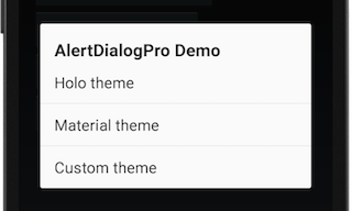
Based on alertdialogpro-core, gives AlertDialogPro a Material theme.
alertdialogpro-theme-holo (Obsolete)
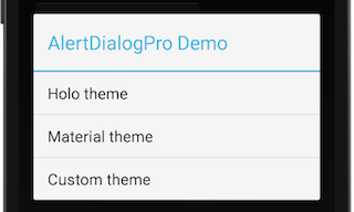
Also based on alertdialogpro-core, gives AlertDialogPro a Holo theme.
Quick Start
Take alertdialogpro-theme-material for example.
Download
Grab latest version via Gradle:
dependencies {

compile 'com.github.fengdai:alertdialogpro-theme-material:0.2.6'
}
or Maven:
<dependency>
<groupId>com.github.fengdai</groupId>
<artifactId>alertdialogpro-theme-material</artifactId>
<version>0.2.6</version> </dependency>
Specify AlertDialogPro's theme
In your app's xml file, use attribute alertDialogProTheme to specify your AlertDialogPro's theme. alertdialogpro-theme-material contains two built-in theme: Theme.AlertDialogPro.Material and Theme.AlertDialogPro.Material.Light. Here, we use the light version:
<style name="YourAppTheme">
 ...
<item name="alertDialogProTheme">@style/Theme.AlertDialogPro.Material.Light</item> </style>
Build an AlertDialogPro
Use AlertDialogPro.Builder to build an AlertDialogPro:
AlertDialogPro.Builder builder = new AlertDialogPro.Builder(getContext());
 builder.setIcon(R.drawable.icon).

setTitle("Title").

setMessage("Message Body").

setNeutralButton("Neutral", null).

setPositiveButton("Positive", null).

setNegativeButton("Negative", null).

show();
With the example codes above, you can create an AlertDialogPro which has an icon, a title, a message body and three option buttons. Look into the sample to see more usages.
Flavor built-in themes
Built-in themes can't meet your requirement? There are several attributes that you can use to make some slight changes. Here is an example to show how to change the positive button's color:
- Define your positive button's style:
<style name="YourButtonStyle" parent="Widget.AlertDialogPro.Material.Light.Button">

<item name="android:textColor">@color/adp_positive_button_color</item> </style>- Specify button style to your AlertDialogPro's theme with attribute
adpButtonBarPositiveButtonStyle:
<style name="FlavoredMaterialLight" parent="Theme.AlertDialogPro.Material.Light">

 ...

<item name="adpButtonBarPositiveButtonStyle">@style/YourButtonStyle</item> </style>- Use it in your app's theme:
<item name="alertDialogProTheme">@style/FlavoredMaterialLight</item>Look into here to see all attributes.
Advanced customization
You can specify your own layout to AlertDialogPro. This can be very useful when you want to use custom views or you want a special dialog layout. Remember to keep your views' ids consistant with AlertDialogPro's ids.
- Define your AlertDialogPro's style:
<style name="YourAlertDialogProStyle" parent="AlertDialogPro.Material.Light">
<!-- Specify your AlertDialogPro's layout -->
<item name="adpLayout">@layout/your_alert_dialog</item>
<!-- Specify your AlertDialogPro's ListView layout. -->
<item name="adpListLayout">@layout/your_list_layout</item>
<!-- Specify your AlertDialogPro's list item layout. -->
<item name="adpListItemLayout">@layout/your_dialog_item</item>
<!-- Specify your AlertDialogPro's multi choice list item layout. -->
<item name="adpMultiChoiceItemLayout">@layout/your_multichoice_dialog_item</item>
<!-- Specify your AlertDialogPro's single choice list item layout. -->
<item name="adpSingleChoiceItemLayout">@layout/your_singlechoice_dialog_item</item> </style>- And add it to your AlertDialogPro's theme:
<style name="YourAlertDialogProTheme" parent="Theme.AlertDialogPro.Material.Light">
...
<item name="alertDialogProStyle">@style/YourAlertDialogProStyle</item> </style>- Use your AlertDialogPro theme in your app's theme:
<item name="alertDialogProTheme">@style/YourAlertDialogProTheme</item>Migrate From AlertDialog
AlertDialogPro's Java API is exactly the same as AlertDialog's. In fact, most of AlertDialogPro's codes are ported from the latest AlertDialog. So the only thing you need to do in your Java codes is replacing AlertDialog.Builder with AlertDialogPro.Builder.
Requirements
AlertDialogPro requires at minimum Android 2.1 (API level 7).
Thanks
- This project contains some code ported from The Android Open Source Project. Apache License, Version 2.0
- Thank vbauer and his awesome site Android-Arsenal
License
Copyright (C) 2014 Feng Dai Copyright (C) 2007 The Android Open Source Project  Licensed under the Apache License, Version 2.0 (the "License");
 you may not use this file except in compliance with the License. You may obtain a copy of the License at
http://www.apache.org/licenses/LICENSE-2.0 Unless required by applicable law or agreed to in writing, software distributed under the License is distributed on an "AS IS" BASIS, WITHOUT WARRANTIES OR CONDITIONS OF ANY KIND, either express or implied. See the License for the specific language governing permissions and limitations under the License. 


