Floating Action Button Library for Android
Description
This Library contains implementation of the Floating Action Button for Android.
Floating action buttons are used for a special type of promoted action. They are distinguished by a circled icon floating above the UI and have special motion behaviors related to morphing, launching, and the transferring anchor point.
Requirements
The Library requires Android SDK version 9 (Gingerbread) and higher.
Gradle Dependency
dependencies {
  compile 'com.scalified:fab:1.1.3'
}
Action Button has a dependency on an external ViewMover library, which in turn has a transitive dependency on the UI Tools library. If any of these libraries are already used in the project they must be excluded as transitive dependencies
Activity Stream
1.1.3 - current
-
Fixed issue #28: move() method smearing on KitKat with snackbar:
- A fix was made within the dependent ViewMover library. Only ActionButton dependency on ViewMover library was updated
-
Changed the standard Android logging API to SLF4J Logging API
1.1.1 - previous
-
Fixed issue #27: Icon is outside the circle:
A call to Canvas.restore() without calling the Canvas.save() first resulted in the unpredictable behaviour. Added call to Canvas.save() before Canvas.restore() in the RippleEffectDrawer class
Features in the next versions:
-
2.0.0:
- API change. Major refactoring. Deprecated API removal.
- New features - confirmed:
Demo
Subscribe the ActionButton YouTube Channel
Button types
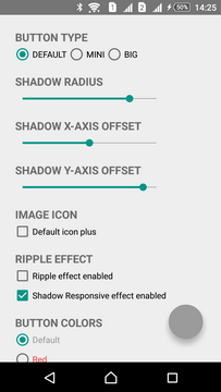
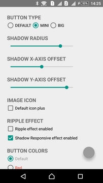
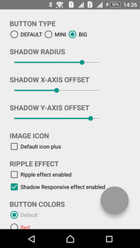
Floating action buttons come in 3 sizes:
- DEFAULT (56dp) - used in most cases
- MINI (40dp) - used to create visual continuity with other elements on the screen
- BIG (72dp) - additional button size, useful for large screens (not covered by Material Design)
| DEFAULT | MINI | BIG |
|---|---|---|
 |  |  |
Color palette
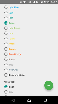
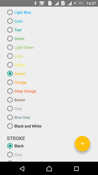
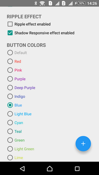
The Library contains all of the colors 500 and 900 of the Material Color Palette.
Colors 500 are used for the NORMAL button state while 900 ones for the PRESSED state:
| Green 500 | Amber 500 | Blue 500 |
|---|---|---|
 |  |  |
Shadow
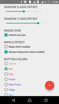
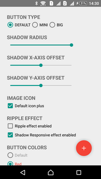
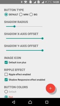
Shadow enabled by default and has standard settings according to Material Design Guidelines. These settings are suitable in most cases. However, shadow can be modified in three ways: radius, X- or Y-axis offset and color.
| Default | Radius | X- and Y- axis offset |
|---|---|---|
 |  |  |
Stroke
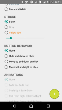
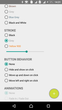
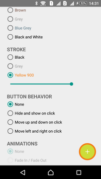
Stroke is disabled by default. Stroke can be modified in two ways: width and color.
| Thin | Medium | Thick |
|---|---|---|
 |  |  |
Effects
Shadow Responsive Effect
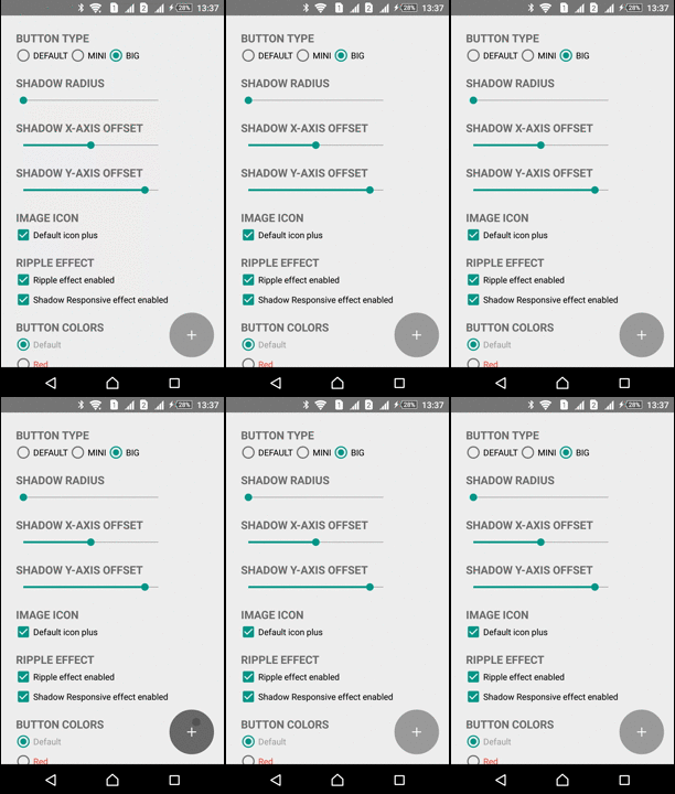
Shadow Responsive Effect means that shadow is changed in response to the user input. Shadow Responsive Effect enabled by default.
Ripple Effect
A touch Ripple Effect indicates where and when a touch occurs within the ActionButton and acknowledges that the touch input was received. Ripple Effect disabled by default.
| Shadow Responsive Effect | Ripple Effect |
|---|---|
 |  |
Moving
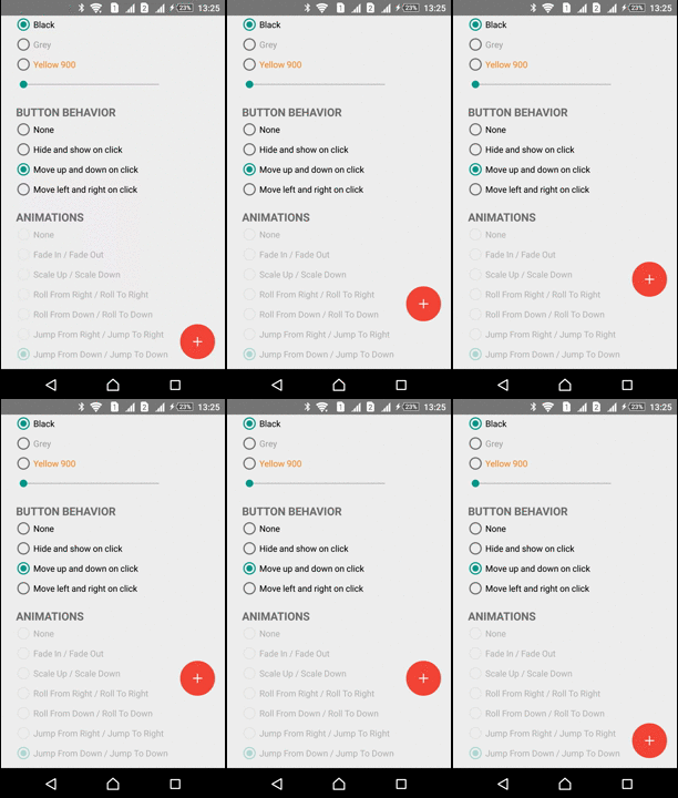
ActionButton can be moved in any direction. ViewMover Library is used for performing the ActionButton moving
| Left-Right Move | Up-Down Move |
|---|---|
 |  |
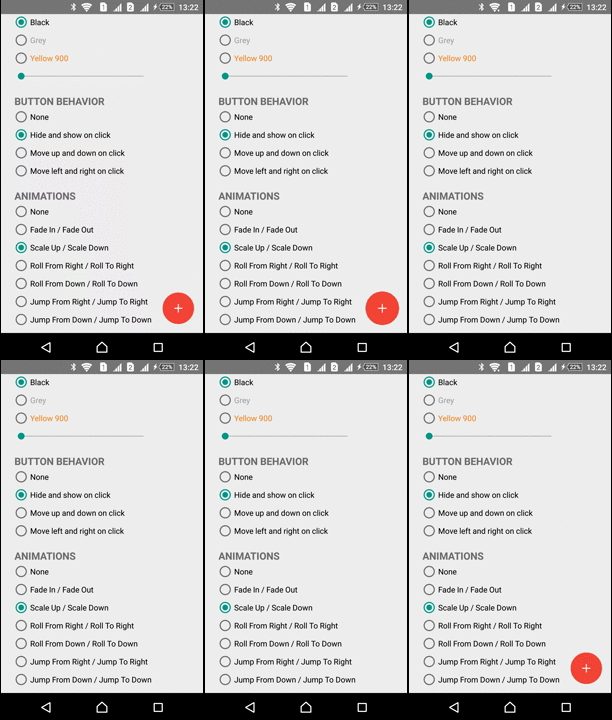
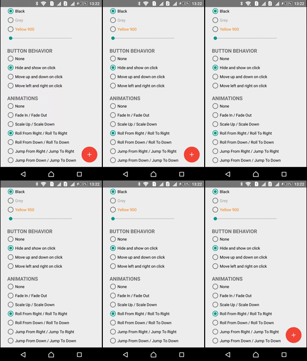
Animations
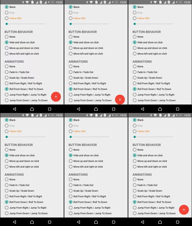
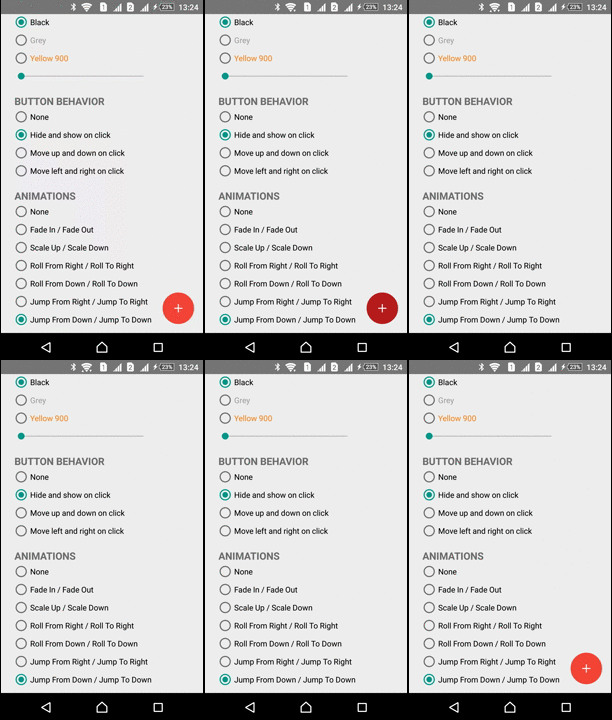
The Library has several predefined animations:
| Fade In - Fade Out | Roll From Down - Roll To Down | Jump From Down - Jump To Down |
|---|---|---|
 |  |  |
| Scale In - Scale Out | Roll From Right - Roll To Right | Jump From Right - Jump To Right |
|---|---|---|
 |  |  |
Usage
Creation
Declaration inside XML resource
ActionButton button can be declared in the XML resource. For instance, using RelativeLayout:
<RelativeLayout

 xmlns:android="http://schemas.android.com/apk/res/android"

xmlns:fab="http://schemas.android.com/apk/res-auto"

android:layout_width="match_parent"

android:layout_height="match_parent"

>

<com.scalified.fab.ActionButton

  android:id="@+id/action_button"

 android:layout_width="wrap_content"

 android:layout_height="wrap_content"

 android:layout_alignParentBottom="true"

  android:layout_alignParentRight="true"

 android:layout_marginRight="@dimen/fab_margin"

 android:layout_marginBottom="@dimen/fab_margin"

 /> </RelativeLayout>
// And then find it within the content view: ActionButton actionButton = (ActionButton) findViewById(R.id.action_button);
There are no required configuration parameters for it. All of the configuration parameters are optional.
Programmatically
Context context = getContext();
 ActionButton actionButton = new ActionButton(context);
 // And then add it to the content view
Button actions
Showing and Hiding
Action Button can be shown, hidden or completely dismissed:
actionButton.show();

 // shows the button if it is hidden and plays the show animation if set actionButton.hide();

 // hides the button if it is shown and plays the hide animation if set actionButton.dismiss();
 // completely dismisses the button and plays the hide animation if set
After dismissal the button is completely removed from its parent view, so any calls to show() etc. won't be processed.
The current status of the button can be checked with the help of:
// To check whether button is shown (inherited from android.view.View class): boolean shown = actionButton.isShown();
  // To check whether button is hidden: boolean hidden = actionButton.isHidden();
  // To check whether button is dismissed: boolean dismissed = actionButton.isDismissed();
Playing animations
There are some cases when you need to force playing the animation without calling the show(), hide() or dismiss() methods. For instance, when your button appears within layout in the Activity for the first time. In such cases animations can be played apart from showing, hiding, or dismissing the button:
actionButton.playShowAnimation();

// plays the show animation actionButton.playHideAnimation();

// plays the hide animation
Animations are played only if set. By default animations are not set.
The best way to play the animation with the Activity launching is to override the onWindowFocusChanged(boolean) and call either playShowAnimation() or playHideAnimation() within it
Moving ActionButton
ActionButton can be moved within its parent container. While moving, translate animation is used. There are methods for moving ActionButton in 4 standard directions:
// Initialize the moving distance int distance = 100.0f // in density-independent pixels  // Move ActionButton left actionButton.moveLeft(distance);
  // Move ActionButton up actionButton.moveUp(distance);
  // Move ActionButton right actionButton.moveRight(distance);
  // Move ActionButton down actionButton.moveDown(distance);
The above methods will cover the most cases, however movement can also be customized in more advanced way:
// Initialize the moving parameters int xAxisDelta = 100.0f // in density-independent pixels int yAxisDelta = 100.0f // in density-independent pixels long animationDuration = 500L Interpolator animationInterpolator = new AccelerateInterpolator();
  // Create the moving parameters instance MovingParams params = new MovingParams(getContext(), xAxisDelta, yAxisDelta, animationDuration, animationInterpolator);
  // Move the ActionButton actionButton.move(params);
ViewMover Library is used for performing the ActionButton moving.
For API lower than Jelly Bean (version code 16) moving is guaranteed to work as expected with FrameLayout and RelativeLayout. Working as expected with other layouts not guaranteed
Customization
Button types
There are three types of Action Button, which you can work with:
- DEFAULT (56dp)
- MINI (40dp)
- BIG (72dp)
By default the button type is set to DEFAULT.
To work with button types use:
// To set the button type: actionButton.setType(ActionButton.Type.MINI);
  // To get the button type: ActionButton.Type type = actionButton.getType();
Button size
To work with ActionButton size use:
// To get the ActionButton size float size = actionButton.getSize();
  // To set the ActionButton size actionButton.setSize(60.0f);
 // in density-independent pixels
Changing the default size of the button breaks the rules of Material Design
Setting the button size explicitly means, that button types with its default sizes are completely ignored. Do not use this method, unless you know what you are doing
Button states
There are two button states, which Action Button may reside in:
- NORMAL
- PRESSED
To work with button states use:
// To set the button state: actionButton.setState(ActionButton.State.PRESSED);
  // To get the button state: ActionButton.State state = actionButton.getState();
Button colors
Button colors can be set as for the NORMAL state, so for the PRESSED one. By default the following colors are set:
- #FF9B9B9B for the NORMAL state
- #FF696969 for the PRESSED state
To work with button colors use:
// To set button color for normal state: actionButton.setButtonColor(getResources().getColor(R.color.fab_material_lime_500));
  // To get button color for normal state: int buttonColor = actionButton.getButtonColor();
  // To set button color for pressed state: actionButton.setButtonColorPressed(getResources().getColor(R.color.fab_material_lime_900));
  // To get button color for pressed state: int buttonColorPressed = actionButton.getButtonColorPressed();
Shadow
Shadow can be customized in three ways: color, radius and offset. By default shadow enabled and has the following default values:
- shadowColor = #42000000 (~ light-grey)
- shadowRadius = 8.0f (in density-independent pixels)
- shadowXOffset = 0.0f (in density-independent pixels)
- shadowYOffset = 8.0f (in density-independent pixels)
To work with shadow use:
// To check whether shadow is present: boolean hasShadow = actionButton.hasShadow();
  // To set the shadow color: actionButton.setShadowColor(getResources().getColor(R.color.fab_material_grey_500));
  // To get the shadow color: int shadowColor = actionButton.getShadowColor();
  // To set the shadow radius: actionButton.setShadowRadius(5.0f);
  // To get the shadow radius: float shadowRadius = actionButton.getShadowRadius();
  // To set the shadow X-axis offset: actionButton.setShadowXOffset(3.5f);
  // To get the shadow X-axis offset: float shadowXOffset = actionButton.getShadowXOffset();
  // To set the shadow Y-axis offset: actionButton.setShadowYOffset(3.0f);
  // To get the shadow Y-axis offset: float shadowYOffset = actionButton.getShadowYOffset();
  // To remove shadow: actionButton.removeShadow();
Shadow radius and offset must be specified in density-independent pixels.
For API 21 Lollipop and higher elevation can be enabled. In this case the default shadow becomes disabled and configuration of any of its parameters will be ignored.
Image
Action Button can have an image centered inside. By default the image absent. Any image can be used for adding. The Library has fab_plus_icon drawable, which can also be used. When an image is set its width and height are changed to the default values, which both are set to 24.0dp (according to material design guidelines). However this size is also adjustable.
To work with image use:
// To check whether image is present: boolean hasImage = actionButton.hasImage();
  // To set an image (either bitmap, drawable or resource id): actionButton.setImageBitmap(bitmap);
 actionButton.setImageDrawable(getResource.getDrawable(R.drawable.fab_plus_icon));
 actionButton.setImageResource(R.drawable.fab_plus_icon);
  // To get an image: Drawable image = actionButton.getImage();
  // To set the image size (which is by default 24.0dp): actionButton.setImageSize(30.0dp);
  // To get the image size: float imageSize = actionButton.getImageSize();
  // To remove the image: actionButton.removeImage();
Image size must be specified in density-independent pixels.
Changing the image size breaks the rules of Material Design
Stroke
Stroke can be customized in two ways: width and the color. Stroke disabled by default, however it has the default values:
- strokeColor = Color.BLACK
- strokeWidth = 0.0f (no stroke)
To work with stroke use:
// To check whether stroke enabled: boolean hasStroke = actionButton.hasStroke();
  // To set stroke color: actionButton.setStrokeColor(getResources().getColor(R.color.fab_material_blue_grey_500));
  // To get stroke color: int strokeColor = actionButton.getStrokeColor();
  // To set stroke width: actionButton.setStrokeWidth(1.5f);
  // To get stroke width: float strokeWidth = actionButton.getStrokeWidth();
  // To remove the stroke: actionButton.removeStroke();
Stroke width must be specified in density-independent pixels
Effects
Shadow Responsive Effect
Shadow Responsive Effect means that shadow is changed in response to the user input. When user clicks the button and holds it, shadow radius increased to a certain value. Then, when user releases the button, shadow radius decreased to its initial value. Shadow Responsive Effect enabled by default.
To work with the Shadow Responsive Effect use:
// To check whether Shadow Responsive Effect enabled: boolean shadowResponsiveEffectEnabled = actionButton.isShadowResponsiveEffectEnabled();
  //To enable or disable Shadow Responsive Effect: actionButton.setShadowResponsiveEffectEnabled(true);
 actionButton.setShadowResponsiveEffectEnabled(false);
For API 21 Lollipop and higher elevation can be enabled. Shadow Responsive Effect won't be available in this case.
Shadow maximum radius value is calculated by multiplying the shadow initial radius and shadow response factor, which is by default 1.75f. Shadow response factor can't be changed.
Note, that having Shadow Responsive Effect enabled leads to increasing of the ActionButton general view size. In this case view size calculated based on the maximum value of the shadow radius. This means, that even if there is a place near the ActionButton unfilled, it is actually used by Shadow Responsive Effect
Ripple Effect
A touch Ripple Effect indicates where and when a touch occurs within the ActionButton and acknowledges that the touch input was received. Ripple Effect disabled by default. Ripple Effect color by default is a darken variant ( 20% darker) of the color for the PRESSED state
To work with Ripple Effect use:
// To check whether Ripple Effect enabled: boolean rippleEffectEnabled = actionButton.isRippleEffectEnabled();
  // To enable or disable Ripple Effect: actionButton.setRippleEffectEnabled(true);
 actionButton.setRippleEffectEnabled(false);
  // To set button color ripple: actionButton.setButtonColorRipple(getResources().getColor(R.color.fab_material_grey_900));
  // To get button color ripple: int buttonColorRipple = actionButton.getButtonColorRipple();
Animations
Action Button supports 2 animation types: animation, which is played while showing the button and animation, which is played while hiding the button. By default neither show animation, nor hide animation are set.
To work with animations use:
// To set show animation: actionButton.setShowAnimation(getResources().getAnimation(R.anim.fab_fade_in));
 actionButton.setShowAnimation(ActionButton.Animations.FADE_IN);
  // To get show animation: Animation animation = actionButton.getShowAnimation();
  // To remove show animation: actionButton.removeShowAnimation();
  // To set hide animation: actionButton.setHideAnimation(getResources().getAnimation(R.anim.fab_fade_out));
 actionButton.setHideAnimation(ActionButton.Animations.FADE_OUT);
  // To get hide animation: Animation animation = actionButton.getHideAnimation();
  // To remove hide animation: actionButton.removeHideAnimation();
XML full configuration example
Firstly add the namespace:
xmlns:fab="http://schemas.android.com/apk/res-auto"Then refer the added namespace to configure Action Button parameters
<com.scalified.fab.ActionButton

  android:id="@+id/action_button"

 android:layout_width="wrap_content"

 android:layout_height="wrap_content"

 android:layout_marginRight="@dimen/fab_margin"

 android:layout_marginBottom="@dimen/fab_margin"

 fab:type="DEFAULT"

 fab:button_color="@color/fab_material_lime_500"

 fab:button_colorPressed="@color/fab_material_lime_900"

 fab:image="@drawable/fab_plus_icon"

 fab:image_size="24dp"

 fab:shadow_color="#757575"

 fab:shadow_radius="1.0dp"

 fab:shadow_xOffset="0.5dp"

 fab:shadow_yOffset="1.0dp"

 fab:stroke_color="@color/fab_material_blue_grey_500"

 fab:stroke_width="1.0dp"

 fab:button_colorRipple="@color/fab_material_black"

 fab:rippleEffect_enabled="false"

 fab:shadowResponsiveEffect_enabled="true"

 fab:show_animation="@anim/fab_roll_from_down"

 fab:hide_animation="@anim/fab_roll_to_down"

 />
The above example contains all of the configuration parameters for Action Button, so there is no need to configure all of them, because they all have default values
Logging
To enable logging:
-
Add the following dependency:
dependencies { compile 'com.github.tony19:logback-android-classic:1.1.1-3' } -
Create the logback.xml file in the src/main/assets with the sample configuration:
<?xml version="1.0" encoding="UTF-8"?> <configuration>  <appender name="LOGCAT" class="ch.qos.logback.classic.android.LogcatAppender">
<tagEncoder>
 <pattern>%logger{
0
}
</pattern>
</tagEncoder>
<encoder>
 <pattern>%d{
HH:mm:ss.SSS
}
 [%thread] [%logger{
0
}
] - %msg%n</pattern>
</encoder>  </appender>
<root level="TRACE" additivity="false">
<appender-ref ref="LOGCAT" />  </root> </configuration>
You may wish to configure different appenders with different log levels for packages, classes etc.
More information about LOGBack can be found @ LOGBack Project Site
-
Add the following InvalidPackage ignore rule into lint.xml file (located @ the root of the project):
<issue id="InvalidPackage" > <ignore path="**/logback-android-core/*" /> </issue>
Applications that use ActionButton Library
If You would like your application to be added to this list please write me or create the pull request
| Icon | Application |
|---|---|
| CodeBuddy | |
| Temperature Metric Converter |
License
  Copyright 2016 Scalified <http://www.scalified.com>
 Licensed under the Apache License, Version 2.0 (the "License");

you may not use this file except in compliance with the License.
You may obtain a copy of the License at

  http://www.apache.org/licenses/LICENSE-2.0
 Unless required by applicable law or agreed to in writing, software
distributed under the License is distributed on an "AS IS" BASIS,
WITHOUT WARRANTIES OR CONDITIONS OF ANY KIND, either express or implied.
See the License for the specific language governing permissions and
limitations under the License.