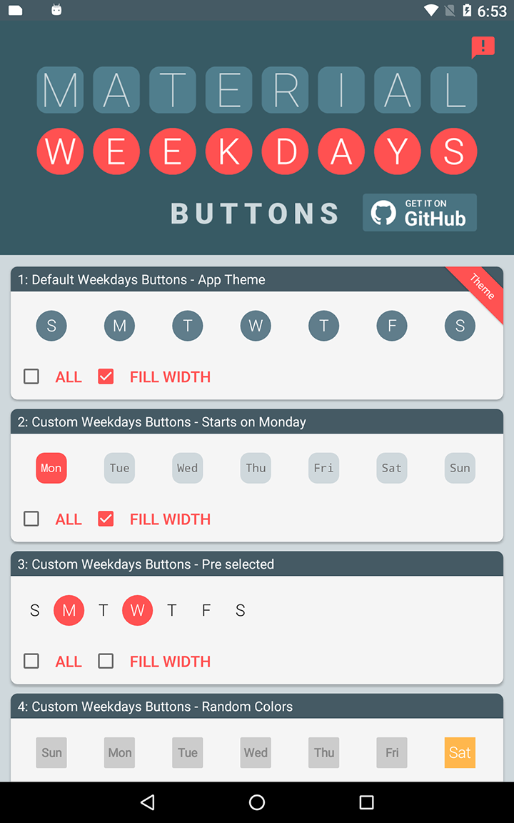
Material Weekdays Buttons Bar
Lets you easily implement a customizable and flexible weekdays 'button bar' in your app.
Sample App
The included sample app can be tested on Google Play
Gradle Dependency
The following goes in your module's build.gradle file:
repositories {

  maven {
 url "https://jitpack.io"
}

}
  dependencies {

// ... other dependencies here

 dependencies {

 compile 'com.github.TouchBoarder:weekdays-buttons-bar:v1.0.2'

}

}
Implement
This library attaches to your Activity by taking the place of a ViewStub in your Activity layout. For an example:
<?xml version="1.0" encoding="utf-8"?> <LinearLayout xmlns:android="http://schemas.android.com/apk/res/android"
  xmlns:app="http://schemas.android.com/apk/res-auto"
  xmlns:tools="http://schemas.android.com/tools"
  android:layout_width="match_parent"
  android:layout_height="match_parent"
  android:orientation="vertical">

<!--This ViewStub will be replaced by a RecyclerView displaying the weekdays -->

<ViewStub

android:id="@+id/weekdays_stub"

android:layout_width="match_parent"

android:layout_height="?actionBarSize" />

<android.support.v7.widget.RecyclerView

android:id="@+id/list"

android:layout_width="match_parent"

android:layout_height="match_parent"

android:scrollbars="vertical" />  </LinearLayout>
You attach Weekdays Buttons to the Activity like this:
WeekdaysDataSource wds = new WeekdaysDataSource(this, R.id.weekdays_stub)
  .start(this);
R.id.weekdays_stub references the ViewStub, which is replaced with the WeekdaysDataSource RecyclerView when start() is called.
Note that the parameter in start() is a Callback interface implementer which receives WeekdaysDataSource events.
Selection Callbacks
Whether it's an Activity that implements the Callback interface, or an inline callback, it implements these methods:
new WeekdaysDataSource.Callback() {

 @Override

 public void onWeekdaysItemClicked(int attachId,WeekdaysDataItem item) {

  // Do something if today is selected?

  Calendar calendar = Calendar.getInstance();

  if(item.getCalendarDayId()==calendar.get(Calendar.DAY_OF_WEEK)&&item.isSelected())

  Toast.makeText(MainActivity.this,"Carpe diem",Toast.LENGTH_SHORT).show();


}

  @Override

 public void onWeekdaysSelected(int attachId,ArrayList<WeekdaysDataItem> items) {

 //Filter on the attached id if there is multiple weekdays data sources

 if(attachId==R.id.weekdays_stub_4){

 // Do something on week 4?


}


}


}
;
Properties
This code chains calls to properties that would be commonly used:
weekdaysDataSource = new WeekdaysDataSource(this, R.id.weekdays_stub)
  .setDrawableType(WeekdaysDrawableProvider.MW_ROUND_RECT)
  .setFirstDayOfWeek(Calendar.MONDAY)
  .setSelectedDays(Calendar.MONDAY, Calendar.WEDNESDAY)
  .setSelectedColorRes(R.color.my_weekday_selected_color)
  .setUnselectedColor(Color.TRANSPARENT)
  .setTextColorUnselectedRes(R.color.colorSecondaryText)

.setFontTypeFace(Typeface.MONOSPACE)
  .setFontBaseSize(14)
  .setNumberOfLetters(3)
  .start(this);
Note that most of the property setters have different variations for literal values, dimension resources, and attribute IDs.
You can also check whether or not all weekdays are selected:
WeekdaysDataSource wds = // ...  if (wds.isAllDaysSelected()) {

  // Do something
}
Global Theming
<style name="AppTheme" parent="Theme.AppCompat.Light.DarkActionBar">

  <!--

  Changes the default width for all Weekdays Buttons.

  Defaults to 36dp.
 -->
  <item name="weekdays_item_width">40dp</item>

 <!--

  Changes the default height for all Weekdays Buttons.

  Defaults to 36dp.
 -->
  <item name="weekdays_item_height">40dp</item>

 <!--

  Changes the default margin spacing for all Weekdays Buttons.

  Defaults to 2dp.
 -->
  <item name="weekdays_item_margin">0dp</item>
  <!--

  Changes the default selected color for all Weekdays Buttons.

  Defaults to the default value of ?colorAccent (the AppCompat theme attribute).
 -->
  <item name="weekdays_selected_color">?colorPrimary</item>

<!--

  Changes the default unselected color for all Weekdays Buttons.

  Defaults to the default value of ?colorPrimary (the AppCompat theme attribute).
 -->
  <item name="weekdays_unselected_color">?colorPrimaryDark</item>

<!--

  Changes the default text selected color for all Weekdays Buttons.

  Defaults to the default value of ?titleTextColor (the AppCompat theme attribute).
 -->
  <item name="weekdays_text_selected_color">?colorAccent</item>

<!--

  Changes the default text unselected color for all Weekdays Buttons.

  Defaults to the default value of ?titleTextColor (the AppCompat theme attribute).
 -->
  <item name="weekdays_text_unselected_color">?colorAccent</item>

<!--

 Changes the default layout padding for all Weekdays Buttons.

 Defaults to 0dp.
-->
  <item name="weekdays_layout_padding">8dp</item>
  <!--

  Changes the default background color for the Weekdays Buttons Bar (RecyclerView).

  Defaults to the default value of ?colorPrimary (the AppCompat theme attribute).
 -->
  <item name="weekdays_background_color">?colorPrimaryDark</item>

 </style>
Saving and Restoring States
In order to keep the weekdays selections and all of its current properties, you have to save and restore the WeekdaysDataSource state during configuration changes.
It works like this in an Activity:
private WeekdaysDataSource mWeekdaysButtons;  @Override protected void onCreate(Bundle savedInstanceState) {

  super.onCreate(savedInstanceState);

// ... other initialization for an Activity

if (savedInstanceState != null) {

// Restore the weekdays buttons state, save a reference to mWeekdaysButtons.

mWeekdaysButtons = WeekdaysDataSource.restoreState("wds_tag",savedInstanceState, this, this);


}
 else {

// No previous state, first creation.

weekdaysDataSource = new WeekdaysDataSource(this, R.id.weekdays_stub)

 .start(this);


}

}
  @Override protected void onSaveInstanceState(Bundle outState) {

  super.onSaveInstanceState(outState);

  if (mWeekdaysButtons != null) {

// If the mWeekdaysButtons isn't null, save it's state for restoration in onCreate()

mWeekdaysButtons.saveState("wds_tag",outState);


}

}
Library depends on following external libraries:
Update v1.0.2: com.github.afollestad:TextDrawable have been removed from GitHub so it have been replaced with com.amulyakhare.textdrawable:1.0.1
The difference:
- The TextDrawable.builder constructor do no longer require a context
- It does not support Resource values directly for colors. So instead use: ContextCompat.getColor(mContext, R.color.your_res_color)
New TextDrawable Library: https://github.com/amulyakhare/TextDrawable This library is used to create the drawables for the buttons: If you want to take full control of this you can use the WeekdaysDataSource.TextDrawableListener
 new WeekdaysDataSource(this, R.id.weekdays_stub)

  .setNumberOfLetters(3)

  .setOnTextDrawableListener(new WeekdaysDataSource.TextDrawableListener() {

@Override

public Drawable onDrawTextDrawable(int attachId, int calendarDayId, String label, boolean selected) {

 return TextDrawable.builder()

.beginConfig()

.useFont(Typeface.DEFAULT)

.fontSize(WeekdaysDrawableProvider.toPx(MainActivity.this, 14))//px

.textColor(selected ? Color.DKGRAY : Color.GRAY)

.bold()

.endConfig()

.buildRect(label, selected ?

 ContextCompat.getColor(mContext, R.color.red)

 : ContextCompat.getColor(mContext, R.color.grey));

}


}
)

  .start(this);
Inspired by:
Library is inspired by the attach implementation code in the 'material-cab' library designed by Aidan Follestad. If you need a Contextual Action Bar with similar api? look it up.
Material Contextual Action Bar Library: https://github.com/afollestad/material-cab
