MaterialViewPager
Material Design ViewPager easy to use library
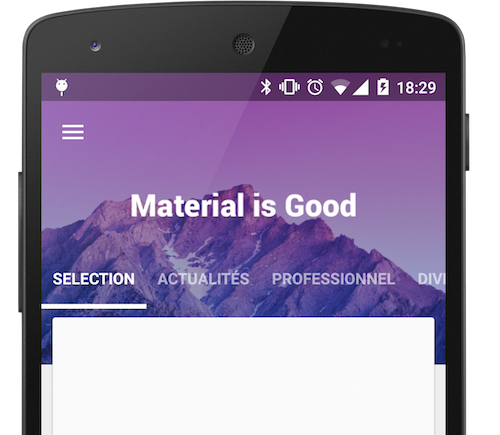
Sample
And have a look on a sample Youtube Video : Youtube Link
Download
In your module
compile 'com.github.florent37:materialviewpager:1.2.3' //dependencies compile 'com.flaviofaria:kenburnsview:1.0.7' compile 'com.jpardogo.materialtabstrip:library:1.1.0' compile 'com.github.bumptech.glide:glide:4.0.0'Usage
Add MaterialViewPager to your activity's layout
<com.github.florent37.materialviewpager.MaterialViewPager
  android:id="@+id/materialViewPager"
  android:layout_width="match_parent"
  android:layout_height="match_parent"
  app:viewpager_logo="@layout/header_logo"
  app:viewpager_logoMarginTop="100dp"
  app:viewpager_color="@color/colorPrimary"
  app:viewpager_headerHeight="200dp"
  app:viewpager_headerAlpha="1.0"
  app:viewpager_hideLogoWithFade="false"
  app:viewpager_hideToolbarAndTitle="true"
  app:viewpager_enableToolbarElevation="true"
  app:viewpager_parallaxHeaderFactor="1.5"
  app:viewpager_headerAdditionalHeight="20dp"
  app:viewpager_displayToolbarWhenSwipe="true"
  app:viewpager_transparentToolbar="true"
  app:viewpager_animatedHeaderImage="true"
  app:viewpager_disableToolbar="false"

/>
with header_logo.xml
<?xml version="1.0" encoding="utf-8"?> <TextView xmlns:android="http://schemas.android.com/apk/res/android"
  android:id="@+id/logo_white"
  android:layout_width="wrap_content"
  android:layout_height="@dimen/materialviewpager_logoHeight"
  android:text="Material is Good"
  android:textSize="30sp"
  android:textColor="@android:color/white"/>
You will see on Android Studio Preview :
To get a beautiful screen and enable preview, you theme may follow
<style name="AppBaseTheme" parent="@style/Theme.AppCompat.Light"> </style>  <style name="AppTheme" parent="AppBaseTheme">
  <item name="android:textColorPrimary">@android:color/white</item>
 <item name="drawerArrowStyle">@style/DrawerArrowStyle</item>
 <item name="android:windowTranslucentStatus" tools:targetApi="21">true</item>
  <item name="android:windowContentOverlay">@null</item>
 <item name="windowActionBar">false</item>
 <item name="windowNoTitle">true</item>
  <!-- Toolbar Theme / Apply white arrow -->
 <item name="colorControlNormal">@android:color/white</item>
 <item name="actionBarTheme">@style/AppTheme.ActionBarTheme</item>
  <!-- Material Theme -->
 <item name="colorPrimary">@color/colorPrimary</item>
 <item name="colorPrimaryDark">@color/colorPrimaryDark</item>
 <item name="colorAccent">@color/accent_color</item>
  <item name="android:navigationBarColor" tools:targetApi="21">@color/navigationBarColor</item>
 <item name="android:windowDrawsSystemBarBackgrounds" tools:targetApi="21">true</item>  </style>  <style name="AppTheme.ActionBarTheme" parent="@style/ThemeOverlay.AppCompat.ActionBar">
  <!-- White arrow -->
  <item name="colorControlNormal">@android:color/white</item> </style>  <style name="DrawerArrowStyle" parent="Widget.AppCompat.DrawerArrowToggle">
  <item name="spinBars">true</item>
  <item name="color">@color/drawerArrowColor</item> </style>
Retrieve the MaterialViewPager
You can use MaterialViewPager as an usual Android View, and get it by findViewById
public class MainActivity extends ActionBarActivity {

private MaterialViewPager mViewPager;

@Override
  protected void onCreate(Bundle savedInstanceState) {

super.onCreate(savedInstanceState);

setContentView(R.layout.activity_main);

 mViewPager = (MaterialViewPager) findViewById(R.id.materialViewPager);


}

}
Customisation
First choose your color and height
<com.github.florent37.materialviewpager.MaterialViewPager

android:id="@+id/materialViewPager"

android:layout_width="match_parent"

android:layout_height="match_parent"

...

app:viewpager_color="@color/colorPrimary"

app:viewpager_headerHeight="200dp"

...

/>
Set your logo
<com.github.florent37.materialviewpager.MaterialViewPager

...

app:viewpager_logo="@layout/header_logo" <-- look custom logo layout

app:viewpager_logoMarginTop="100dp" <-- look at the preview

...

/>
Titlebar Logo
Your logo's layout must
- layout_height="@dimen/materialviewpager_logoHeight"
header_logo.xml
<ImageView xmlns:android="http://schemas.android.com/apk/res/android"
  android:id="@+id/logo_white"
  android:layout_width="200dp"
  android:layout_height="@dimen/materialviewpager_logoHeight"
  android:fitsSystemWindows="true"
  android:adjustViewBounds="true"
  android:layout_centerHorizontal="true"
android:src="@drawable/logo_white" /><com.github.florent37.materialviewpager.MaterialViewPager`
...
app:viewpager_hideLogoWithFade="false"
...
/> Fading Logo
header_logo.xml
<FrameLayout xmlns:android="http://schemas.android.com/apk/res/android"
  android:layout_width="80dp"
  android:layout_height="80dp"
  android:layout_centerHorizontal="true"
  android:background="@drawable/circle">

<ImageView

android:layout_width="30dp"

android:layout_height="30dp"

android:fitsSystemWindows="true"

android:adjustViewBounds="true"

android:layout_gravity="center"

android:src="@drawable/flying" /> </FrameLayout><com.github.florent37.materialviewpager.MaterialViewPager`
...
app:viewpager_hideLogoWithFade="true"
...
/>Toolbar Animation
Hide Logo and Toolbar
<com.github.florent37.materialviewpager.MaterialViewPager`

...

app:viewpager_hideToolbarAndTitle="true"

...

/>
Sticky Toolbar
<com.github.florent37.materialviewpager.MaterialViewPager`

...

app:viewpager_hideToolbarAndTitle="false"

...

/>
Transparent Toolbar
<com.github.florent37.materialviewpager.MaterialViewPager`

...

app:viewpager_transparentToolbar="true"

...

/>
Header Layout
You can replace the header
<com.github.florent37.materialviewpager.MaterialViewPager`

...

app:viewpager_header="@layout/myHeader"

...

/>
Moving Header
Or use the default header, with a KenBurns animation
<com.github.florent37.materialviewpager.MaterialViewPager`

...

app:viewpager_animatedHeaderImage="true"

...

/>
Static Header
Or simply use an ImageView as header
<com.github.florent37.materialviewpager.MaterialViewPager`

...

app:viewpager_animatedHeaderImage="false"

...

/>
Custom Tab Bar
You can set you own tab bar, by default I provided 2 implementations
Standard
<com.github.florent37.materialviewpager.MaterialViewPager`

...

app:viewpager_pagerTitleStrip="@layout/material_view_pager_pagertitlestrip_standard"

...

/>
News Stand
<com.github.florent37.materialviewpager.MaterialViewPager`

...

app:viewpager_pagerTitleStrip="@layout/material_view_pager_pagertitlestrip_newstand"

...

/>
Or create your own tab bar
Create your own layout using a PagerSlidingTabStrip
my_tabs.xml
<com.astuetz.PagerSlidingTabStrip
  xmlns:android="http://schemas.android.com/apk/res/android"
  xmlns:app="http://schemas.android.com/apk/res-auto"
  xmlns:tools="http://schemas.android.com/tools"
  android:id="@id/materialviewpager_pagerTitleStrip"
  android:layout_width="match_parent"
  android:layout_height="match_parent"
  app:pstsPaddingMiddle="true"
  app:pstsDividerPadding="20dp"
  app:pstsIndicatorColor="#FFF"
  app:pstsIndicatorHeight="2dp"
  app:pstsShouldExpand="true"
  app:pstsTabPaddingLeftRight="10dp"
  app:pstsTabTextAllCaps="true"
  tools:background="#A333"

/>
Don't forget to give it id="@id/materialviewpager_pagerTitleStrip"
<com.github.florent37.materialviewpager.MaterialViewPager

...

app:viewpager_pagerTitleStrip="@layout/my_tabs"

...

/>
Animate Header
Simply add a listen to the ViewPager
mViewPager.setMaterialViewPagerListener(new MaterialViewPager.Listener() {

 @Override

 public HeaderDesign getHeaderDesign(int page) {

  switch (page) {

case 0:

 return HeaderDesign.fromColorResAndUrl(

R.color.blue,

"http://cdn1.tnwcdn.com/wp-content/blogs.dir/1/files/2014/06/wallpaper_51.jpg");

case 1:

 return HeaderDesign.fromColorResAndUrl(

R.color.green,

"https://fs01.androidpit.info/a/63/0e/android-l-wallpapers-630ea6-h900.jpg");

case 2:

 return HeaderDesign.fromColorResAndUrl(

R.color.cyan,

"http://www.droid-life.com/wp-content/uploads/2014/10/lollipop-wallpapers10.jpg");

case 3:

 return HeaderDesign.fromColorResAndUrl(

R.color.red,

"http://www.tothemobile.com/wp-content/uploads/2014/07/original.jpg");


}

//execute others actions if needed (ex : modify your header logo)

return null;


}

}
);
Available
HeaderDesign.fromColorAndUrl(Color.BLUE,"http:...);
 HeaderDesign.fromColorResAndUrl(R.color.blue,"http:...);
 HeaderDesign.fromColorAndDrawable(Color.BLUE,myDrawable);
 HeaderDesign.fromColorResAndDrawable(R.color.blue,myDrawable);
Toolbar
Toolbar toolbar = mViewPager.getToolbar();
  if (toolbar != null) {

setSupportActionBar(toolbar);

 ActionBar actionBar = getSupportActionBar();

actionBar.setDisplayHomeAsUpEnabled(true);

actionBar.setDisplayShowHomeEnabled(true);

actionBar.setDisplayShowTitleEnabled(true);

actionBar.setDisplayUseLogoEnabled(false);

actionBar.setHomeButtonEnabled(true);

}
ViewPager
ViewPager viewPager = mViewPager.getViewPager();
 viewPage.setAdapter(...);
  //After set an adapter to the ViewPager mViewPager.getPagerTitleStrip().setViewPager(mViewPager.getViewPager());
RecyclerView
mRecyclerView.addItemDecoration(new MaterialViewPagerHeaderDecorator());
 mRecyclerView.setAdapter(yourAdapter);
ScrollView
The ScrollView must be an NestedScrollView`
MaterialViewPagerHelper.registerScrollView(getActivity(), mScrollView, null);
And include @layout/material_view_pager_placeholder` as first child
<android.support.v4.widget.NestedScrollView
  xmlns:android="http://schemas.android.com/apk/res/android"
  android:id="@+id/scrollView"
  android:layout_width="match_parent"
  android:layout_height="match_parent">

<LinearLayout

android:layout_width="match_parent"

android:layout_height="wrap_content"

android:orientation="vertical">

 <include layout="@layout/material_view_pager_placeholder"/>

 ...your content...

</LinearLayout> </android.support.v4.widget.NestedScrollView>
CHANGELOG
1.2.0
- header decorator instead of Adapter
1.1.3
- header is now clickable
- fixed some scrolling issues
1.1.2
- quick scroll fix
- can set a custom viewpager with app:viewpager_viewpager (the viewpager id must be id/materialviewpager_viewpager)
1.1.0
- orientation change fix
- header image display fix
- elements on header are now clickable
- notifyHeaderChanged
1.0.8
- added attribute viewpager_disableToolbar
1.0.7
- fix bug on low resolutions
1.0.6
- added attribute transparentToolbar
- added attribute animatedHeaderImage
- fixed bug when page is too small to scroll
- modified HeaderDesign implementation
1.0.5
- smoother toolbar scrolling
- fixed bug with fitSystemWindow
- added HeaderDesign to modify the header color & image
- added displayToolbarWhenSwipe attribute
1.0.4
Fixed :
- Orientation changed
- Memory Leak
- Android >2.3 with NineOldAndroid
- Removed ListView usage
1.0.3
Fixed : Rapid scrolling results in varying Toolbar height
RecyclerViewMaterialAdapter can handle a custom placeholder cells count (usefull for GridLayoutManager)
public RecyclerViewMaterialAdapter(RecyclerView.Adapter adapter, int placeholderSize)1.0.2
Added attributes
app:viewpager_parallaxHeaderFactor="1.5" app:viewpager_headerAdditionalHeight="20dp"parallaxHeaderFactor Modify the speed of parallax header scroll (not the speed of KenBurns effect) parallaxHeaderFactor Set up the height of the header's layout displayed behind the first cards view
Fixed issue when scroll down & scroll up multiples time while hideToolbarAndTitle="true"
1.0.1
Added attributes
viewpager_headerAlpha="0.6"Community
Looking for contributors, feel free to fork !
Tell me if you're using my library in your application, I'll share it in this README
Dependencies
- Glide (from Bumptech)
- KenBurnsView (from flavioarfaria)
- Material PagerSlidingTabStrip (from jpardogo, forked from astuetz)
Credits
Author: Florent Champigny http://www.florentchampigny.com/
Blog : http://www.tutos-android-france.com/


License
Copyright 2015 florent37, Inc.  Licensed under the Apache License, Version 2.0 (the "License");
 you may not use this file except in compliance with the License. You may obtain a copy of the License at
  http://www.apache.org/licenses/LICENSE-2.0  Unless required by applicable law or agreed to in writing, software distributed under the License is distributed on an "AS IS" BASIS, WITHOUT WARRANTIES OR CONDITIONS OF ANY KIND, either express or implied. See the License for the specific language governing permissions and limitations under the License.