PinLockView
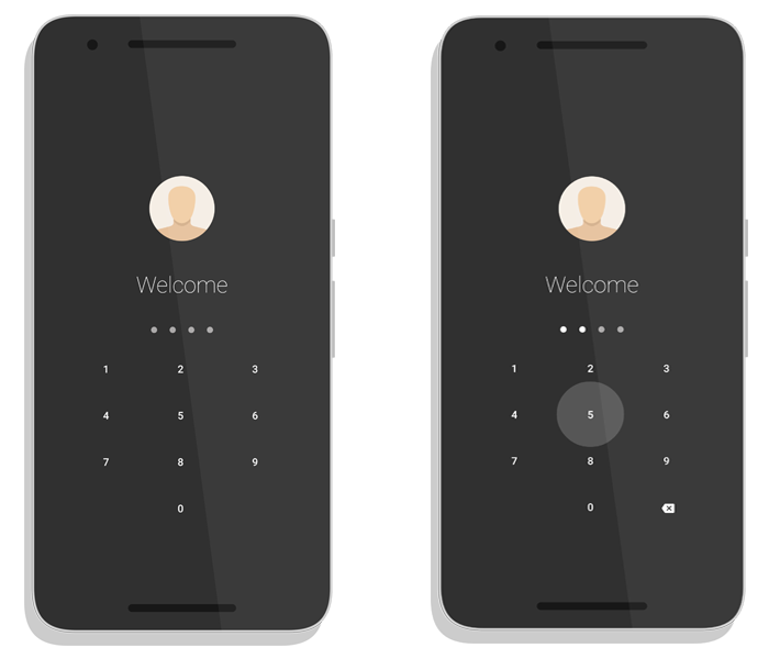
A clean, minimalistic, easy-to-use and highly customizable pin lock custom view for Android.
Specs
This library allows you to implement a pin lock mechanism in your app easily and quickly. There are plenty of customization options available to change the look-and-feel of this view to match your app's theme.
You can also use it as a dial pad to dial numbers. There are several other use cases of this library and is not restricted to only pin locking.
Download
This library is available in jCenter which is the default Maven repository used in Android Studio.
Gradle
dependencies {

  // other dependencies here

 compile 'com.andrognito.pinlockview:pinlockview:2.1.0'
}
Maven
<dependency>
<groupId>com.andrognito.pinlockview</groupId>
<artifactId>pinlockview</artifactId>
<version>2.1.0</version>
<type>pom</type> </dependency>
Usage
We recommend you to check the sample app to get a complete understanding of the library. The step-by-step implementation guide is as follows.
Step 1
Place the view in your XML layout file.
 <com.andrognito.pinlockview.PinLockView

android:id="@+id/pin_lock_view"

android:layout_width="wrap_content"

android:layout_height="wrap_content" />
Step 2
Reference the view in code and add a listener to it.
 mPinLockView = (PinLockView) findViewById(R.id.pin_lock_view);

  mPinLockView.setPinLockListener(mPinLockListener);
Implement the listener interface as follows,
private PinLockListener mPinLockListener = new PinLockListener() {

  @Override
  public void onComplete(String pin) {

Log.d(TAG, "Pin complete: " + pin);

}

@Override
  public void onEmpty() {

Log.d(TAG, "Pin empty");


}

@Override
  public void onPinChange(int pinLength, String intermediatePin) {

 Log.d(TAG, "Pin changed, new length " + pinLength + " with intermediate pin " + intermediatePin);


}

}
;
And that's it! Your PinLockView is ready to rock.
But the good thing is that the PinLockView comes with a whole lot of customization options which you can use to customize the view in any way you want.
Customization
IndicatorDots (Addon)
PinLockView comes bundled with an addon view, IndicatorDots which can be optionally attached with the PinLockView to indicate pin changes visually to the user.
This view has been decoupled from the PinLockView so that you can optionally add it, if necessary. Suppose you are implementing a dial pad, then you will certainly not need this IndicatorView.
Add the view to you XML layout, generally placed above your PinLockView,
 <com.andrognito.pinlockview.IndicatorDots

android:id="@+id/indicator_dots"

android:layout_width="wrap_content"

android:layout_height="wrap_content" />
then find a reference to the view and attach it to the parent PinLockView,
mIndicatorDots = (IndicatorDots) findViewById(R.id.indicator_dots);
 mPinLockView.attachIndicatorDots(mIndicatorDots);
You MUST attach it to the PinLockView, otherwise it will be simply ignored.
Theming
There are several theming options available through XML attributes which you can use to completely change the look-and-feel of this view to match the theme of your app.
  app:pinLength="6"

// Change the pin length
app:keypadTextColor="#E6E6E6"

// Change the color of the keypad text
app:keypadTextSize="16dp"

 // Change the text size in the keypad
app:keypadButtonSize="72dp"

  // Change the size of individual keys/buttons
app:keypadVerticalSpacing="24dp"

// Alters the vertical spacing between the keypad buttons
app:keypadHorizontalSpacing="36dp"

 // Alters the horizontal spacing between the keypad buttons
app:keypadButtonBackgroundDrawable="@drawable/bg"

 // Set a custom background drawable for the buttons
app:keypadDeleteButtonDrawable="@drawable/ic_back"

// Set a custom drawable for the delete button
app:keypadDeleteButtonSize="16dp"

  // Change the size of the delete button icon in the keypad
app:keypadShowDeleteButton="false"

 // Should show the delete button, default is true
app:keypadDeleteButtonPressedColor="#C8C8C8"

// Change the pressed/focused state color of the delete button

app:dotEmptyBackground="@drawable/empty"

 // Customize the empty state of the dots
app:dotFilledBackground"@drawable/filled"

// Customize the filled state of the dots
app:dotDiameter="12dp"

 // Change the diameter of the dots
app:dotSpacing="16dp"

  // Change the spacing between individual dots
app:indicatorType="fillWithAnimation"

 // Choose between "fixed", "fill" and "fillWithAnimation"
Contribution
This library is quite exhaustive and offers a lot of customization options. If you find a bug or would like to improve any aspect of it, feel free to contribute with pull requests.
About The Author
Aritra Roy
Android & Backend Developer. Blogger. Designer. Fitness Enthusiast.
License
Copyright 2017 aritraroy  Licensed under the Apache License, Version 2.0 (the "License");
 you may not use this file except in compliance with the License. You may obtain a copy of the License at
http://www.apache.org/licenses/LICENSE-2.0 Unless required by applicable law or agreed to in writing, software distributed under the License is distributed on an "AS IS" BASIS, WITHOUT WARRANTIES OR CONDITIONS OF ANY KIND, either express or implied. See the License for the specific language governing permissions and limitations under the License. 
