SlideView
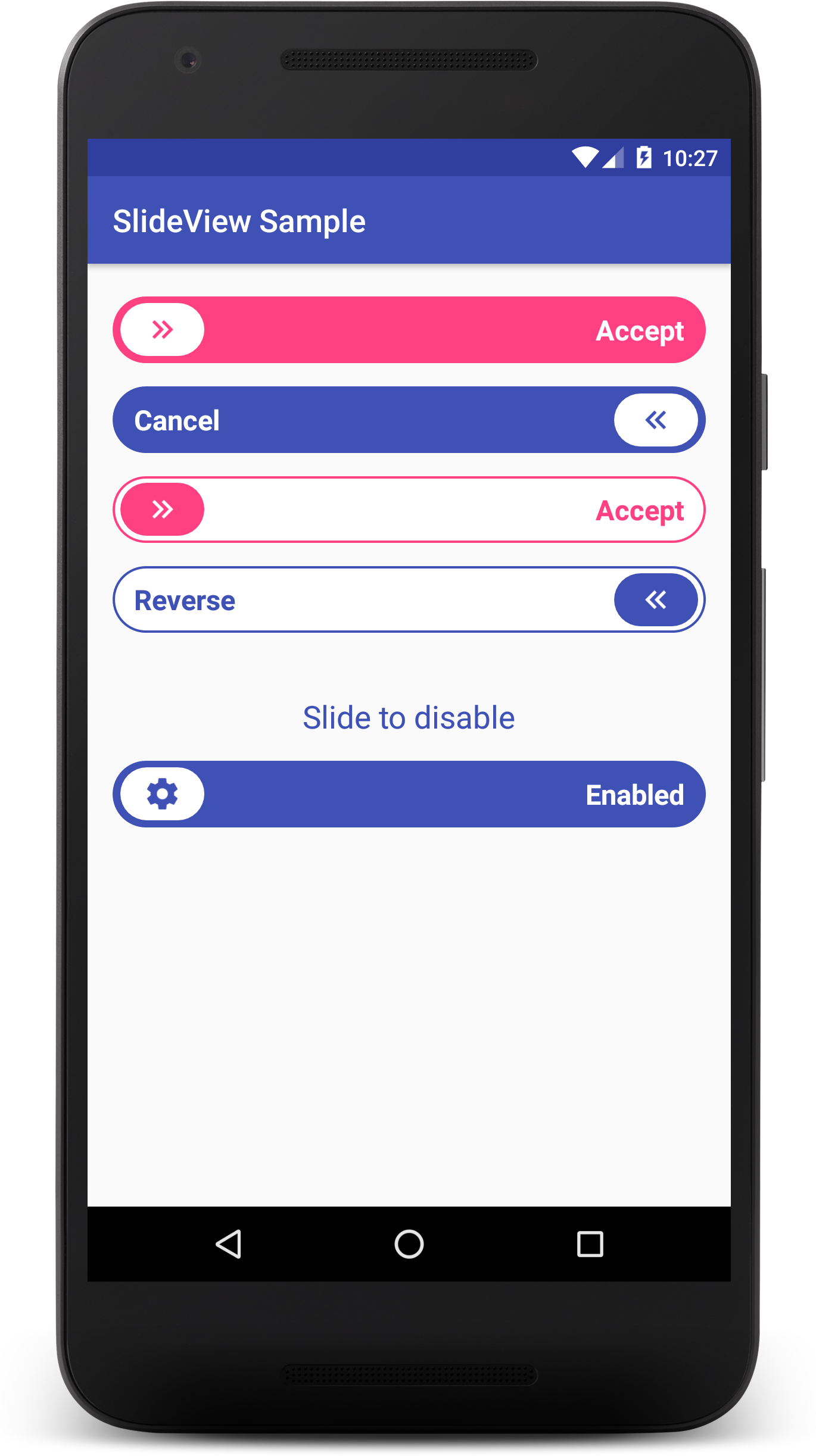
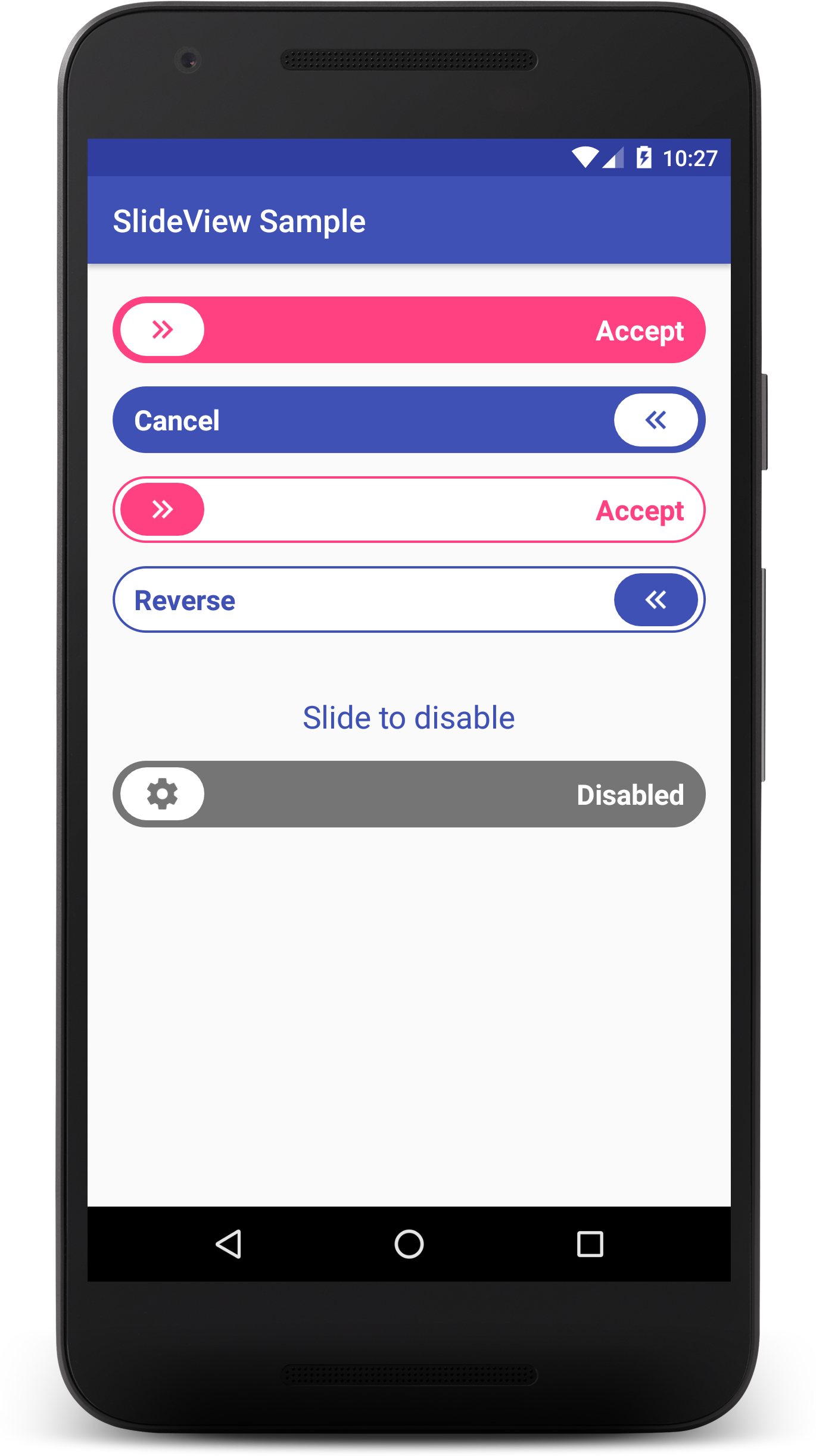
A simple, yet awesome sliding button for Android.
Preview
Get the sample apk here
Setup
Gradle
Add this to your project level build.gradle:
allprojects {
  repositories {

  jcenter()
  maven {
 url "https://jitpack.io"
}

}

}
Add this to your app build.gradle:
dependencies {
  compile 'com.github.MAXDeliveryNG:slideview:1.0.2'
}
Usage
The SlideView is very easy to use. Just add it to your layout like any other view.
Via XML
Here's a basic implementation.
 <ng.max.slideview.SlideView

android:id="@+id/slideView"

android:layout_width="match_parent"

android:layout_height="wrap_content"

app:buttonBackgroundColor="@color/button_bg_color"

app:buttonImage="@drawable/button_img"

app:slideBackgroundColor="@color/slide_bg_color"

app:slideText="@string/slide_text"

app:slideTextColor="@color/slide_text_color" />
Here's an example with all the view attributes.
<ng.max.slideview.SlideView

android:id="@+id/slideView"

android:layout_width="match_parent"

android:layout_height="wrap_content"

app:buttonBackgroundColor="@color/button_bg_color"

app:buttonImage="@drawable/button_img"

app:slideBackgroundColor="@color/slide_bg_color"

app:slideText="@string/slide_text"

app:slideTextColor="@color/slide_text_color"

app:slideTextSize="16sp"

app:animateSlideText="true"

app:reverseSlide="false"

app:strokeColor="@color/slide_stroke_color"

app:buttonImageDisabled="@drawable/button_img_disabled" />
Attributes information
| Attribute name | Description | Default value |
|---|---|---|
| slideBackgroundColor | The slide background color | #3F51B5 |
| buttonBackgroundColor | The slide button background color | #FFFFFF |
| slideTextColor | The color of the slide label | #FFFFFF |
| buttonImage | The drawable on the button | double chevron icon |
| slideText | The slide label | none |
| slideTextSize | The label's size | 16sp |
| animateSlideText | If true, the label fades out while the slide is in progress | true |
| strokeColor | If set, a stroke is drawn around the slide background | none |
| reverseSlide | If true, the SlideView is reversed | false |
| buttonImageDisabled | The drawable to be used as the button image when the SlideView is disabled | the default drawable |
Note: All color attributes can be replaced with a ColorStateList so the SlideView can use the appropriate colors for the enabled and disabled states. See the sample module for examples.
Listening for slide actions on the SlideView
You can set a listener to be notified when the user slides across the SlideView. An example is shown below.
SlideView slideView = (SlideView) findViewById(R.id.slider);
 slideView.setOnSlideCompleteListener(new SlideView.OnSlideCompleteListener() {

 @Override

 public void onSlideComplete(SlideView slideView) {

  // vibrate the device

  Vibrator vibrator = (Vibrator) getSystemService(Context.VIBRATOR_SERVICE);

  vibrator.vibrate(100);

// go to a new activity

  startActivity(new Intent(MainActivity.this, NewActivity.class));


}

}
);
Setting the view attributes via code
For convenience, many of the SlideView attributes can be set via code.
 // set the label  setText(CharSequence text);

  // set the text size  setTextSize(int size);

 // set the drawable for the button  setButtonImage(Drawable image);

 // set the label color  setTextColor(@ColorInt int color) ;
 // set the label color with a ColorStateList  setTextColor(ColorStateList colors);

 // set the button drawable for disabled state  setButtonImageDisabled(Drawable image);

 // set the button background color  setButtonBackgroundColor(ColorStateList color);

 // set the slide background color  setSlideBackgroundColor(ColorStateList color);
Note: for the methods that take a ColorStateList, you can easily use a single color by converting it to a ColorStateList with the method ColorStateList.valueOf(int color);
Caveat
The view height is currently fixed so you should use wrap_content when defining the view height in your layout.
Author
Kizito Nwose ( [email protected], @kizitonwose)
Contributing
If you find any bugs, please feel free to fix it and send a pull request or open an issue.
License
Copyright (c) 2017 MAXDeliveryNG Permission is hereby granted, free of charge, to any person obtaining a copy of this software and associated documentation files (the "Software"), to deal in the Software without restriction, including without limitation the rights to use, copy, modify, merge, publish, distribute, sublicense, and/or sell copies of the Software, and to permit persons to whom the Software is furnished to do so, subject to the following conditions: The above copyright notice and this permission notice shall be included in all copies or substantial portions of the Software. THE SOFTWARE IS PROVIDED "AS IS", WITHOUT WARRANTY OF ANY KIND, EXPRESS OR IMPLIED, INCLUDING BUT NOT LIMITED TO THE WARRANTIES OF MERCHANTABILITY, FITNESS FOR A PARTICULAR PURPOSE AND NONINFRINGEMENT. IN NO EVENT SHALL THE AUTHORS OR COPYRIGHT HOLDERS BE LIABLE FOR ANY CLAIM, DAMAGES OR OTHER LIABILITY, WHETHER IN AN ACTION OF CONTRACT, TORT OR OTHERWISE, ARISING FROM, OUT OF OR IN CONNECTION WITH THE SOFTWARE OR THE USE OR OTHER DEALINGS IN THE SOFTWARE. 
