Under the Hood - Android App Debug View Library
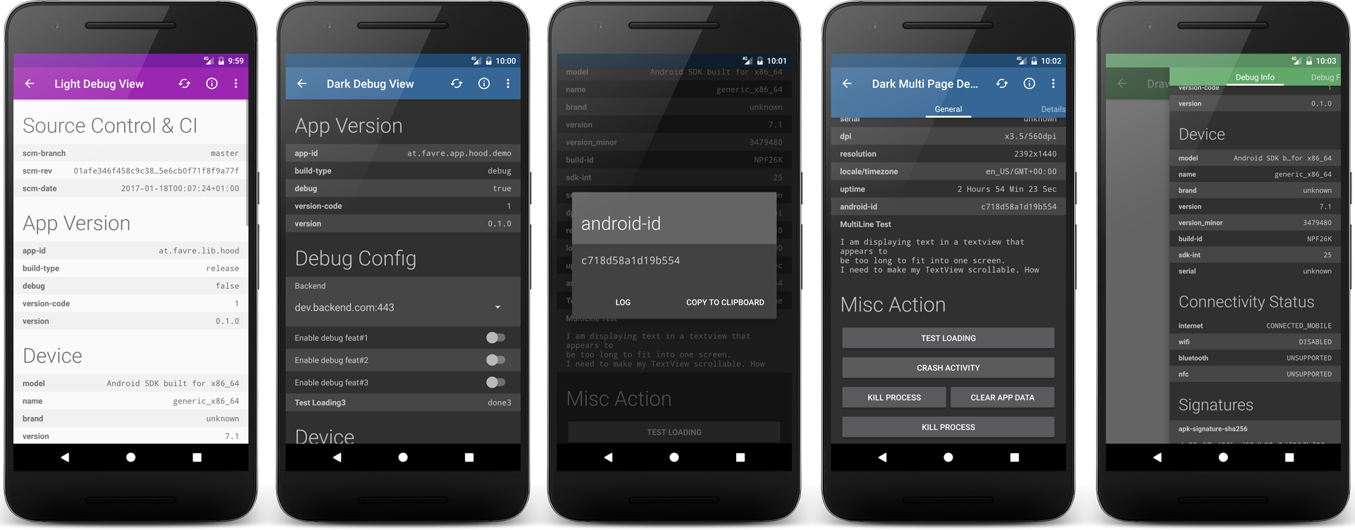
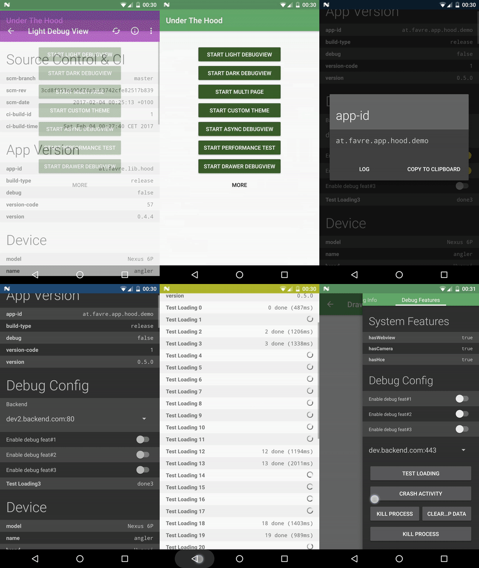
Under the Hood is a flexible and powerful Android debug view library. It uses a modular template system that can be easily extended to your needs, although coming with many useful elements built-in. There is a lot of "default" debug data that can be easily embedded (e.g. current runtime-permission status, app version and device info). There are 2 basic themes (dark and light) which can be customized to your needs. The lib is divided into 2 modules: hood-core containing the basic view that can be embedded anywhere and hood-extended which comes with a ready-to-use activity with a lot of convenience features. The lib has also a null-safe no-op flavor indented to be used in release builds, disabling all debug features without error-prone if-debug chains.
To check it out, download the demo app from the Playstore . Lib and demo app require SDK 14+.
Features
- Extensible template based view including property, button, switch and spinner views
- Extensible dark and light theme
- Plentiful default debug data (app version, permissions, system features, etc.)
- Use as activity or standalone view embeddable into your layouts
- Lightweight and uses minimal dependencies using core module
- No-op flavor of the lib for your release build
- Shake listener and Multi Click Listener
Quick Start
Add the following to your dependencies ( add jcenter to your repositories if you haven't)
compile 'at.favre.lib.hood:hood-extended:0.5.1'Create an activity and extend PopHoodActivity. Define it in your AndroidManifest:
<activity
  android:name="com.example.your.MyDebugActivity"
  android:theme="@style/HoodThemeDark"> </activity>
Implement the config and page setter in the Activity:
public class MyDebugActivity extends PopHoodActivity {

  @Override
  public Pages getPageData(@NonNull Pages pages) {

Page firstPage = pages.addNewPage();

firstPage.add(Hood.get().createHeaderEntry("System Features"));

firstPage.add(Hood.get().createPropertyEntry("The Key", "The value"));

firstPage.add(DefaultProperties.createSectionBasicDeviceInfo());

firstPage.add(Hood.get().createActionEntry(DefaultButtonDefinitions.getGlobalSettingsAction()));

firstPage.add(new PackageInfoAssembler(PackageInfoAssembler.Type.PERMISSIONS, PackageInfoAssembler.USES_FEATURE).createSection(this, true));

  return pages;

}

@Override
  public Config getConfig() {

return Config.newBuilder().setLogTag("MyDebugActivity").build();


}

}
See demo app for extended samples.
Using only the View
Add the view to your layout:
<at.favre.lib.hood.view.HoodDebugPageView

android:id="@+id/debug_view"

android:layout_width="match_parent"

android:layout_height="match_parent"

android:theme="@style/CustomHoodViewOverlayDark" />
Create the following style:
<style name="CustomHoodViewOverlayDark" parent="ThemeOverlay.AppCompat.Dark">

<item name="android:background">?android:windowBackground</item>
  <item name="hoodZebraColor">@color/hoodlib_zebra_color_dark</item>
  <item name="hoodTextSizeNormal">@dimen/hoodlib_standard_text_size</item>
  <item name="hoodTextSizeHeader">@dimen/hoodlib_header_text_size</item>
  <item name="hoodViewpagerTabTextColor">@android:color/primary_text_dark</item>
  <item name="hoodViewpagerTabBackgroundColor">?attr/colorPrimary</item> </style>
Set up in your controller ( Activity or Fragment):
HoodDebugPageView debugView = (HoodDebugPageView) findViewById(R.id.debug_view);
  Pages pages = Hood.get().createPages(Config.newBuilder().setShowHighlightContent(false).build());
 Page firstPage = pages.addNewPage("Debug Info");
 firstPage.add(Hood.get().createActionEntry(DefaultButtonDefinitions.getCrashAction()));
 ... Page secondPage = pages.addNewPage("Debug Features");
 secondPage.add(DefaultProperties.createSectionConnectivityStatusInfo(this));
 secondPage.add(new PackageInfoAssembler(PackageInfoAssembler.Type.APK_INSTALL_INFO, PackageInfoAssembler.Type.PERMISSIONS).createSection(this, true));
 ... debugView.setPageData(pages);
Showcase Demo App
The HoodAPI
The main interface of the App is the HoodAPI or HoodAPI.Extension accessed through the Hood singleton. It is required to use these interfaces to take advantage of using the no-op flavor.
The interface is used with the Hood singleton:
Hood.get().* Hood.ext().* For default properties/actions/etc checkout the classes in
at.favre.lib.hood.util.defaults.* as well as PackageInfoAssembler.
The DebugView
Responsible for rendering and the main interface for the Activity/Fragment to the debug pages is the HoodDebugPageView. Define it in your view
<at.favre.lib.hood.view.HoodDebugPageView
  ... />
For themes see section below.
To initialize the view it needs a Pages object:
debugView.setPageData(pages);
If there is more than 1 page the pages are rendered in a ViewPager with simple tabs on top, otherwise it will just show as a single page.
With
debugView.refresh() the entries can be refreshed (see DynamicValue). To block the view and show a progress bar you can use:
debugView.setProgressBarVisible(true) Note that your Activity should implement IHoodDebugController to enable all features. This is necessary so external ui elements (like DialogFragments) can communicate with the debug view.
Config
The config object must be created with the provided builder:
Config.newBuilder() (...) .build() Following configs can be changed:
- showing zebra pattern in ui (coloring every odd row)
- automatically log all of the entries in the view
- automatically refresh the view after x ms
- set your log tag for all logging features
- show tab indicator if more than 1 page
Template Concept
The template has the following main components
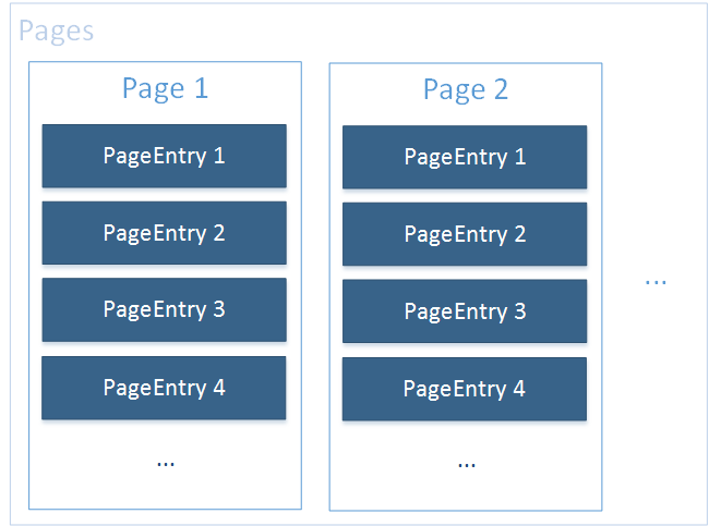
Pagesis responsible for creating and managing a collection ofPageand contains the main configPageis responsible for managing a list ofPageEntryPageEntryis a row displaying content in aPage. PageEntry is responsible for how its data is rendered in the UI.
Additionally there is an element that groups a bunch of PageEntry entries with additional convenience logic, like displaying an optional error message.
Creating a simple page is easy:
 Pages pages = Hood.get().createPages(Config.newBuilder().build());

  Page firstPage = pages.addNewPage("Title Page 1");

  firstPage.add(...);

  ...

Page secondPage = pages.addNewPage("Title Page 2");

  secondPage.add(...);

  ...
PageEntry elements, that can be added to a Page can be created like this:
 page.add(Hood.get().createHeaderEntry(...))
  page.add(Hood.get().createPropertyEntry(...))
  page.add(Hood.get().createActionEntry(...))
  page.add(Hood.get().createSwitchEntry(...))
  page.add(Hood.get().createSpinnerEntry(...))
Built-In PageEntry Elements
Property Entry
Create with:
Hood.get().createPropertyEntry("The Key", "The value")Will render a row with a the key string on the one side and the value on the other. Supports dynamic values (ie. every refresh will be reevaluated), multi-line layout for longer values and custom on-tap-actions and background evaluating values.
For example a property element that will show the uptime (which will get update if the DebugView will be refreshed) and a toast message when the user clicks on it:
 Hood.get().createPropertyEntry("uptime", new DynamicValue<String>() {

 @Override

 public String getValue() {

  return HoodUtil.millisToDaysHoursMinString(SystemClock.elapsedRealtime());


}

}
, Hood.ext().createOnClickActionToast(),false);
If you want the lib to evaluate the value in background instead of the main thread use DynamicValue.Async instead of DynamicValue
Default actions are: Toast, Dialog, Start-Intent and ask runtime permission.
For a lot of default data, e.g. device info, set permissions and build data, see DefaultProperties.* and PackageInfoAssembler
ActionEntry
Will be rendered as a simple button starting a custom action on click. Supports single and double column actions (ie. having two buttons in the same row)
Here is a simple example:
 Hood.get().createActionEntry(new ButtonDefinition("Click me", new OnClickAction() {

 @Override

 public void onClick(View v, Map.Entry<CharSequence, String> value) {

  Toast.makeText(v.getContext(), "On button clicked", Toast.LENGTH_SHORT).show();


}

}
));
For a lot of default actions, e.g. android settings, app-info or uninstall and kill process, see DefaultButtonDefinitions class.
ConfigBoolEntry & ConfigSpinnerEntry
For interactive debug features the standard implementations for switches and spinner can be used. The logic for the switch can be anything that implements the ChangeableValue interface. Spinner can also be customized to your demands.
For a simple switch that changes a boolean in the shared preference see this example:
 Hood.get().createSwitchEntry(

DefaultConfigActions.getBoolSharedPreferencesConfigAction(

 getPreferences(MODE_PRIVATE),

 "SHARED_PREF_KEY", "Enable debug feat#1", false));
This code will create a simple backend switcher:
 Hood.get().createSpinnerEntry(

DefaultConfigActions.getDefaultSharedPrefBackedSpinnerAction(

"Backend", getPreferences(MODE_PRIVATE),

"BACKEND_ID", null, getBackendElements())));

private List<SpinnerElement> getBackendElements() {

  //return your backends

}
There is a standard implementation for ConfigBoolEntry in DefaultConfigActions backed by shared preferences.
Header and Message
Group your entries with a header
Hood.get().createHeaderEntry("App Version")To display a simple message use the following:
Hood.get().createSimpleMessageEntry("This is a simple message shown in ui")Custom PageEntries
A PageEntry must implement the interface with the same name. It holds a distinct value, can be refreshed and returns a loggable string. The most important part, though, is the ViewTemplate that defines how this entry is rendered. The constructView and setContent are similar to the onCreateViewHolder and onBindViewHolder in a RecyclerView. It is important that ViewTemplate must return a distinct type as int (values over 65536 are reserved by the lib)
Library Modules and Flavours
The library comes in 2 modules:
Module hood-core
Contains only the base code without the default implementation of the debug activity. The advantage is that there is only minimal dependencies on support* libraries and therefore very lightweight, not adding too much methods or res to your app.
The core module comes in 2 flavours (or classifier):
release
The standard version of the lib with all features. You could use this version in only in your debug builds with:
compile("at.favre.lib.hood:hood-core:x.x.x")noop
The no-op version of the lib internally using null-safe no-op versions of the main template system. All creator methods of HoodAPI ( Hood.get()) and HoodAPI.Extension ( Hood.ext()) support the no-op switch and return dummy implementations. If you use implementation from at.favre.lib.hood.page.** directly this will have no effect.
Here is a piratical example to use default flavor in debug and noop in release:
 debugCompile('at.favre.lib.hood:hood-core:x.x.x')
  releaseCompile(group: 'at.favre.lib.hood', name: 'hood-core', version: 'x.x.x', classifier: 'noop', ext: 'aar', transitive: true)
The PopHoodActivity will also respect the no-op switch and just finish. The no-op state can be checked with Hood.isLibEnabled() from any caller.
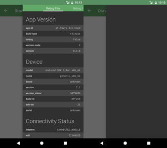
Here is a example of a noop view being rendered
Module hood-extended
Extends the hood-core with a default implementation of a debug activity using appcompat-v7 support library.
If you want to use the noop version in release use something like this:
 debugCompile('at.favre.lib.hood:hood-extended:x.x.x')
  releaseCompile('at.favre.lib.hood:hood-extended:x.x.x') {

 exclude group: 'at.favre.lib.hood', module: 'hood-core'

 releaseCompile(group: 'at.favre.lib.hood', name: 'hood-core', version: 'x.x.x',

 classifier: 'noop', ext: 'aar', transitive: true)

}
Theme
The lib defines some required attributes, so they need to be set in order to be able to render the view. The easiest way is to use the build-in themes ( hood-extended) for Activities (which extend from Theme.AppCompat)
HoodThemeLightHoodThemeDark
and overlays for standalone views:
HoodLibThemeOverlay.DarkHoodLibThemeOverlay.LightHoodLibThemeOverlay.Dark.SmallHoodLibThemeOverlay.Light.Small
You can also define your own theme (extending Theme.AppCompat or ThemeOverlay.AppCompat) but you must define the following attributes in it:
hoodToolbarTextColor: toolbar text and icon colorhoodZebraColor: highlighting color for odd rowshoodTextSizeNormal: default text sizehoodTextSizeHeader: header text sizehoodViewpagerTabTextColor: text color pager tabs labels (only relevant for 2+ pages)hoodViewpagerTabBackgroundColor: background of pager tabs (only relevant for 2+ pages)
Here is an example with useful defaults:
 <style name="HoodThemeDark" parent="Theme.AppCompat.NoActionBar">

...

<item name="hoodToolbarTextColor">@android:color/primary_text_dark</item>

<item name="hoodZebraColor">@color/hoodlib_zebra_color_dark</item>

<item name="hoodTextSizeNormal">@dimen/hoodlib_standard_text_size</item>

<item name="hoodTextSizeHeader">@dimen/hoodlib_header_text_size</item>

<item name="hoodViewpagerTabTextColor">@android:color/primary_text_dark</item>

<item name="hoodViewpagerTabBackgroundColor">?attr/colorPrimary</item>
  </style>
Additional Features
Using the Shake Detector to open the Debug View
Use the HoodAPI.Extension interface to register your intent:
 shakeControl = Hood.ext().registerShakeToOpenDebugActivity(this,

PopHoodActivity.createIntent(this, MyDebugActivity.class));
Then start/stop the detector onResume()/ onPause()
 @Override
  protected void onResume() {

super.onResume();

shakeControl.start();


}

@Override
  protected void onPause() {

super.onPause();

shakeControl.stop();


}
Using the Arbitrary Tap ClickListener
If you want to obfuscate the access point of your debug view with e.g. a triple click on a view that does not look clickable use the following code:
 myView.setOnTouchListener(Hood.ext().createArbitraryTapListener(3, new View.OnClickListener() {

 @Override

 public void onClick(View v) {

  PopHoodActivity.start(WrappingActivity.this, MyDebugActivity.class);


}

}
));
Possible conflicts and things to mind
This lib uses Timber lib, but will only add DebugTree if there is none found (added the first time the Hood singleton is called).
All res assets are prefixed with hoodlib_ so there should be no conflict when merging the resources.
Proguard
The lib includes it's own proguard consumer rules and should work out of the box with obfuscated builds.
Recipes
Suggestions on what Properties/Actions to add to your Page
Apart from DefaultProperties the following could be useful:
git-hash, git-branch, CI build no, build time, login-data, internal states
The following debug actions might be useful:
clear (image) caches, manually calling requests, updating ui, changing shared pref states, directly open activities
Start your debug activity through adb
Add android:exported="true" to your activity definition and use the following adb call:
adb shell am start -n com.example.your.app-id/com.example.your.app.pacakge.DebugActivity Have certain debug features only in debug builds
Use a static boolean (e.g. BuildConfig.DEBUG) in an if like
if(BuildConfig.DEBUG) {

  page.addAction(...)
}
Although verbose, the advantage is that the compiler will remove the unreachable code in release builds similar to using C macros.
Build
Assemble the lib with the following command
./gradlew :hood-core:assemble ./gradlew :hood-extended:assemble The .aar files can then be found in /hood-*/build/outputs/aar folder
Libraries & Credits
Similar Projects:
- Bee - Debug and QA tool for android
- DebugDrawer - Android Debug Drawer for faster development
- debugdrawer - Debug Drawer for android debug builds
License
Copyright 2017 Patrick Favre-Bulle
Licensed under the Apache License, Version 2.0 (the "License"); you may not use this file except in compliance with the License. You may obtain a copy of the License at
http://www.apache.org/licenses/LICENSE-2.0 Unless required by applicable law or agreed to in writing, software distributed under the License is distributed on an "AS IS" BASIS, WITHOUT WARRANTIES OR CONDITIONS OF ANY KIND, either express or implied. See the License for the specific language governing permissions and limitations under the License.


