😊 JPTabBar 😊
?????? ?????
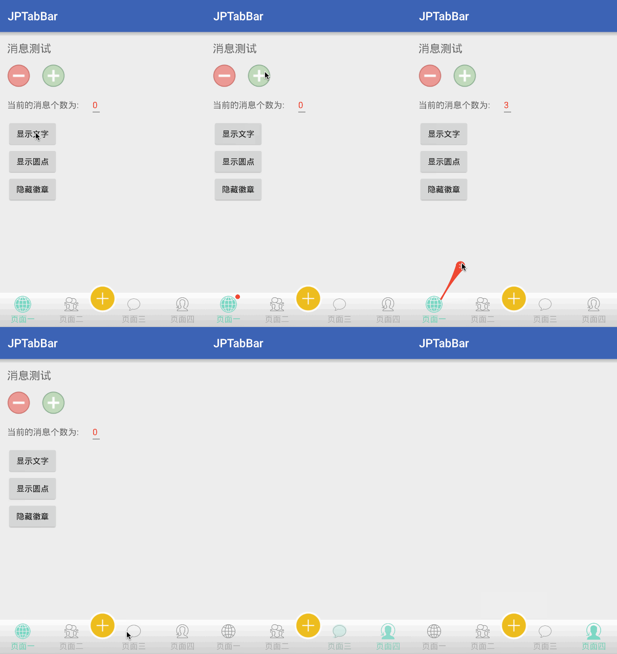
ScreenShots:
Main functions and features:
-
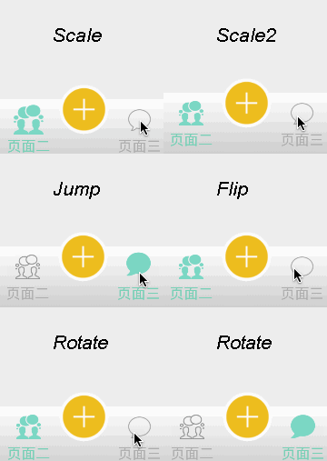
More Animation effects of multiple Tab switching
-
Implements the effect of the middle button of the bottom navigation
-
Implements like Wechat icon filter and provide animation change.
-
Implements the red mark on the TabBar, and can drag
-
Provide listening to the click event, middle click and badge is dragged away the interface
-
Reference annotation method, construction TabBarItem
Dependencies
Usage:
1.Introducing Gradle dependency
 repositories {

jcenter()

}

dependencies{

compile 'com.jpeng:JPTabBar:1.3.3'

}
2.Add JPTabBar to your main interface layout
<com.jpeng.jptabbar.JPTabBar

android:id="@+id/tabbar"

android:layout_width="match_parent"

android:layout_height="56dp"

android:background="#fff"

 jp:TabTextSize="12sp"

/>
3.In your main interface using an array of variables to declare an array of variables, the internal reflection to generate TabItem, attention is:NorIcons are required, the length of each array should be consistent
 @Titles
  private static final String[] mTitles = {
"???","???","???","???"
}
;

@SeleIcons
  private static final int[] mSeleIcons = {
R.mipmap.tab1_selected,R.mipmap.tab2_selected,R.mipmap.tab3_selected,R.mipmap.tab4_selected
}
;

@NorIcons
  private static final int[] mNormalIcons = {
R.mipmap.tab1_normal, R.mipmap.tab2_normal, R.mipmap.tab3_normal, R.mipmap.tab4_normal
}
;
Or, you can init in the oncreate
  mTabbar.setTitles(R.string.tab1, R.string.tab2, R.string.tab3, R.string.tab4)

  .setNormalIcons(R.mipmap.tab1_normal, R.mipmap.tab2_normal, R.mipmap.tab3_normal, R.mipmap.tab4_normal)

  .setSelectedIcons(R.mipmap.tab1_selected, R.mipmap.tab2_selected, R.mipmap.tab3_selected, R.mipmap.tab4_selected)

  .generate();
After above, the layout of the TabBar basically has been built. If you want to achieve Wechat kind of gradual change as there are automatically ViewPager to change the function of the page, only in the oncreate Activity method, adding a line of code:(Of curse,If you don't use ViewPager,You needn't use this method)
 //The parameters must be extends ViewPager
  mTabbar.setContainer(mPager);
In addition, if you want to achieve the effect of the highlight button, you need to add the following code in the current widget of the XML, you can use getMiddleView method to get the view you custom in attribute.
jp:TabMiddleView="@layout/..." Protruding button:
1.if you want to achieve the effect of a raised button, you first need to append the following node attribute to the XML control of layout, which represents your custom tabbar button layout
jp:TabMiddleView="@layout/..." 2.in Java , you can get layout objects by the getMiddleView method, and you can optionally set the monitor for the layout inside the layout
View middleView = mJPTabBar.getMiddleView();
3.make sure that the tabbar parent control uses RelativeLayout or FrameLayout as the root node because the highlighted button is added to the parent layout
  <?xml version="1.0" encoding="utf-8"?>
<!--Use RelativeLayout or FrameLayout --!>
<RelativeLayout
  xmlns:android="http://schemas.android.com/apk/res/android"
  xmlns:jp="http://schemas.android.com/apk/res-auto"
  android:layout_width="match_parent"
  android:layout_height="match_parent"
  >
  <!--TabBar --!>

  </RelativeLayout>
Method and node description:
The Main Method Of JPTabBar:
  /**

* Show the BadgeView With Text

* default is false ,cannot drag

*/
  public void showBadge(int position,String text);

 /**

* It is the same with the up method,But the different is,

* The Badge Can draggable when you use true.

*/
  public void showBadge(int position,String text,boolean draggable);

  /**

* set the icon and title filter when scroll page and click the tab

* default value is false

*/
  public JPTabBar setUseFilter(boolean filter);

  /**

* Set the boolean If Need the PageAnimate

* default value is false

*/
  public JPTabBar setUseScrollAnimate(boolean scrollAnimate);

 /**

 *Show the Circle point

 */

public void showCircleBadge(int pos);

 /**

 * Set the Badge Message Count Limit

 * If you use ShowBadge(int position,int count)

 * If the Second parameters > limit , it will show "limit+"

 * you can see the screenshots

 */
  public void setCountLimit(int limit);

/**

* Hide the OVAL Badge

*/
  public void hideBadge(int position);

/**

* Switch Tab page

*/
  public void setSelectTab(int index);

/**

* Set the Observer of the Click Tab Event

*/
  public void setTabListener(OnTabSelectListener listener);

/**

* set the CallBack of the Badge Dragging Dismiss

*/
  public void setDismissListener(BadgeDismissListener listener);

  /**

 * get the TabMiddleItem View that you set in "TabMiddleView" attribute

*/
  public View getMiddleView();
Attribute Explain:
| Attribute Name | Attribute Explain | Parameter Type | Default Value |
|---|---|---|---|
| TabNormalColor | Font and icon of the normal color | color | 0xffAEAEAE(Gray) |
| TabSelectColor | Font and icon of the selected color | color | 0xff59D9B9(Cyan) |
| TabTextSize | the textsize of the bottom text | dimension | 14sp |
| TabIconSize | the icon size of the tab | dimension | 24dp |
| TabIconFilter | Set the icon change by the font color | boolean | true |
| TabMargin | Set the icon distance above and below the distance from the text | dimension | 8dp |
| TabSelectBg | Set the TabItem Selected bg | color | transparent |
| TabAnimate | The animate type of the Tab Switch(None,Scale,Jump....) | enum | None |
| TabMiddleView | The middle View of the tab | layout | ? |
| TabMiddleBottomDis | Midlle icon bottomMargin from TabBar | dimension | 20dp |
| TabMiddleHMargin | MiddleIcon both the left and right margin | dimension | 24dp |
| BadgeColor | The background of the badgeView | color | #f00(RED) |
| BadgePadding | The background expansion distance of the badge | dimension | 4dp |
| BadgeTextSize | The textSize of the Badge | dimension | 10dp |
| BadgeVerticalMargin | The badge vertical margin | dimension | 3dp |
| BadgeHorticalMargin | The badge hortical margin | dimension | 20dp |
Matters needing attention
1.If you have given setContainer TabBar, do not setOnPageChangeListener to ViewPager
  /**
  *If you already have the TabBar set up the container,

*and then call this method,
  *the kind of WeChat that drag the gradient effect and automatically switch the page will be invalid
  *If you want to listen to the page to change the event, you can use the TabListener
 */
mPager.setOnPageChangeListener(this);
2.If you want to Disable the scroll of ViewPager,you can use NoScrollViewPager in my demo
The existence problem:
1.About badge function can not drag, drag, disappear and so on, this problem occurred in a part of millet mobile phone model, the original author is Through the suspension window to achieve the explosive effect of badges, such mobile phones by default does not open the suspension window permissions
2.Flip animation failure problem, because HUAWEI Part 7 mobile phones do not support setRotationY and setRotationX,The Flip animation is called setRotationY
Update Log
V1.1.2
- Add the Bouncing of the Animation
- Reverse don't click when have no Pager in the Adapter
V1.1.4
- Reverse the Bug of When the Pagers count of ViewPager less than or more than the count of tab
- Add the Color FIlter to the Tab Icon When user Switch Tab
- Add the Another init item method
- solve the drawable in the same memory problem,Every time finish the activity,have no Icon show.
V1.1.5
- Remove the limit of the titles,You can set without titles
- Fix the position of the badge again
- Add some methods and Update some method's name
V1.1.6
- Add the title Filter
- Remove the BadgeDraggable Attribute,and replace with the ShowBadge method
- Add several methods to reduce the TabBar limit
V1.1.7
- Fix the problem of height and remove the TabHeight attribute
- Fix BUG, when the app run gradient problem
V1.1.9
- Fix Bug,When setUseScrollAnimate (false), the slide TAB animation is not restored
- Change the Filter and ScrollAnimate default is not open
- Change the location of the Badge to the top of the level, in order to adapt to the screen adaptation
V1.2.0
- Fix the bug of Touch outside area not responseable in the MiddleIcon Click Event
- Add some dymanic Methods in TabBar
- Add Attributes in MiddleIcon set
V1.2.3
- Fix some problems or bugs.
- Updated RotateAnimater
- Add Custom Middle View to replace only Icon
V1.2.5
- Add another way to get the StatusbarHeight
- Fix the bug of Customview Layoutparams
V1.3.0
- Add another Scale Animation
- Add a new feature that tabbar's icon can display animtion when user pressdown or touchout tabbaritem
- Fix some animations effects
V1.3.2
- Fix a crash when pressing down and not using animation
- Update the default animation is None
About Me
A college student, is still in the study of various techniques...
E-mail: [email protected]
License
Copyright 2016 JPeng  Licensed under the Apache License, Version 2.0 (the "License");
 you may not use this file except in compliance with the License. You may obtain a copy of the License at

http://www.apache.org/licenses/LICENSE-2.0 Unless required by applicable law or agreed to in writing, software distributed under the License is distributed on an "AS IS" BASIS, WITHOUT WARRANTIES OR CONDITIONS OF ANY KIND, either express or implied. See the License for the specific language governing permissions and limitations under the License. 
